July 19, 2023
My Top 5 Wedding Invitation Suites (Plus a Bonus!)
Your invitation is the first peek your guests have into your wedding, and it has the power to build anticipation and set the stage for the most memorable day. Today I’m recalling five of my favorite invitation suites, plus I’m throwing in a bonus suite that I’m ultra proud of that was for a non-wedding event because it deserves extra airtime 🙂🤠
Why are these particular suites my favorites? AM+Co Creative Studio has had the privilege of embarking on unique creative journeys with each couple, facing new challenges and learning valuable lessons along the way. We’re proud of every piece of work we create; after all, we say that we make everything with “lots of love, always.” But these six suites hold a special place in our hearts because they pushed us creatively to incorporate new techniques or elements. So, without further ado, here are our top five favorite invitation suites (plus one)!
No. 1 | Maggie + Garrett
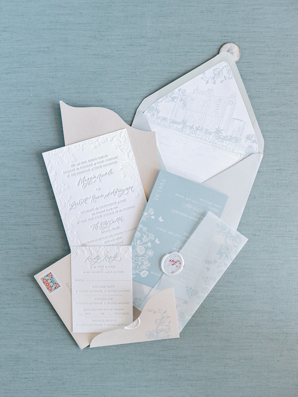
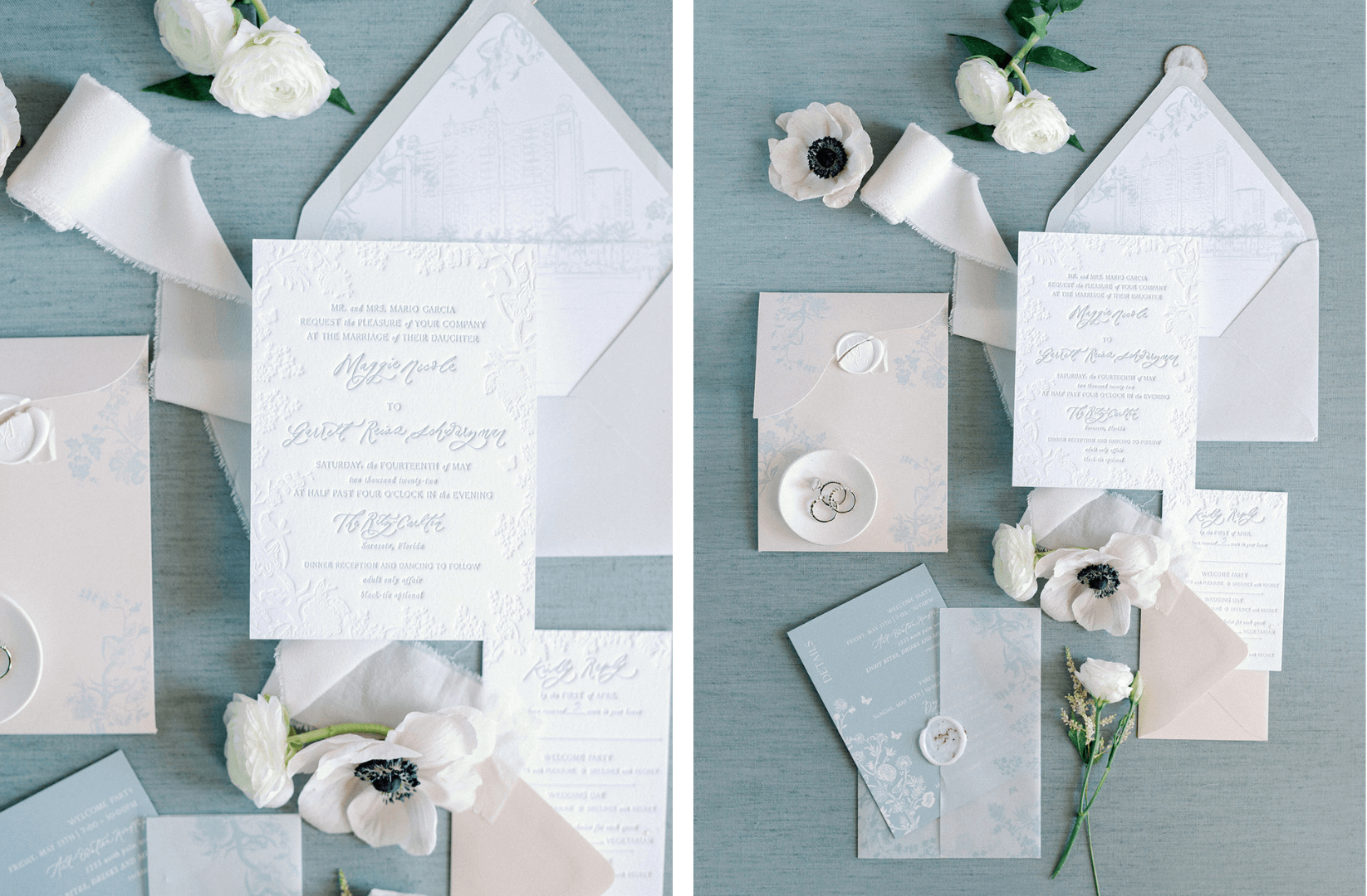
Maggie truly spared no expense on her invitations, and it shows! This was the first time we used blind deboss printing, which creates depth and texture without ink. The invitation had a double pocket and was wrapped in vellum, then sealed with a rosebud-imprinted wax seal. That went into another pocket with a blue pattern on it with a second wax seal, which went into an envelope with another wax seal 😅 And then all of these pieces went into yet another envelope! For a guest, opening these invitations was an event in itself that paved the way for the ultimate event, Maggie and Garret’s special day!
No. 2 | Brooke + Matthew
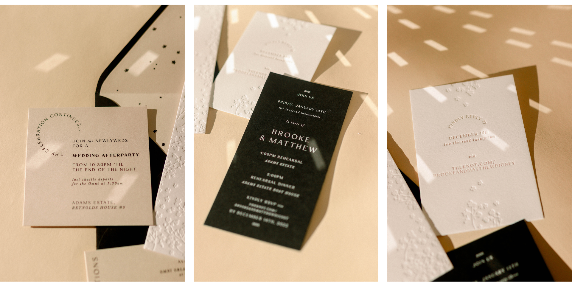
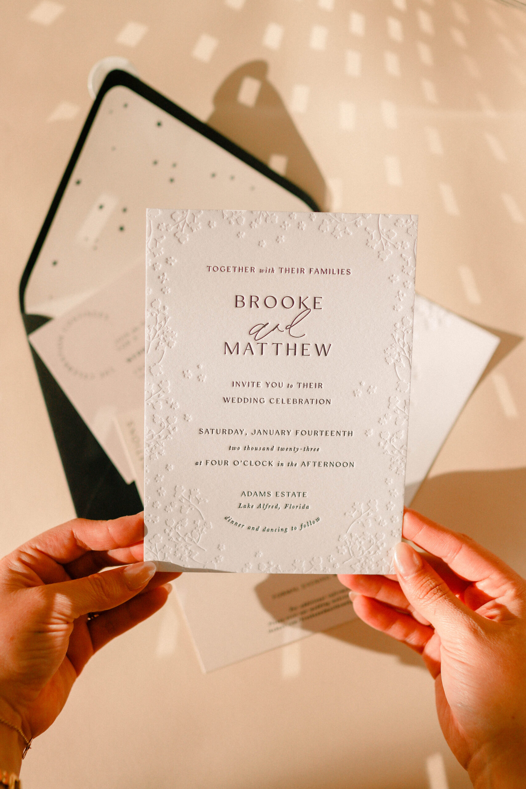
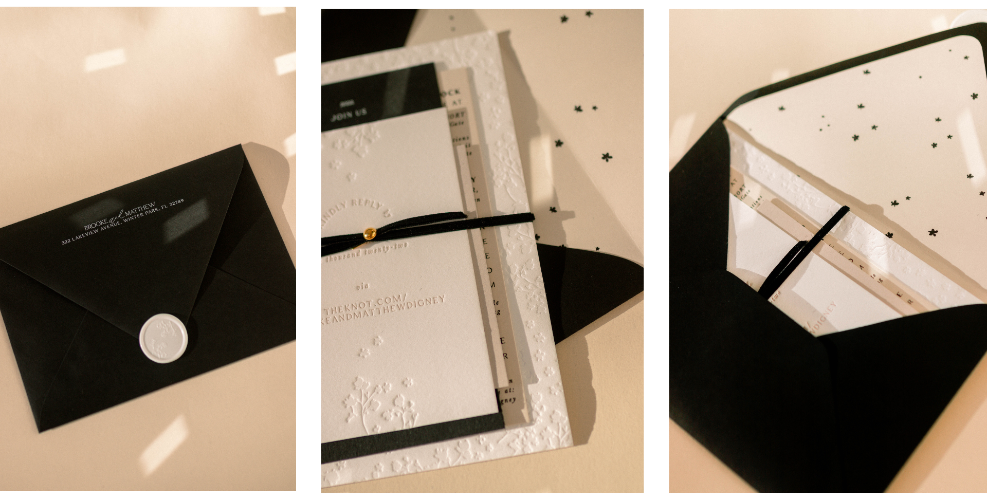
It was the color palette for me with Brooke and Matthew’s invitations. I love how neutral and clean these were (and any bride that allows me to incorporate ✨stars✨ is automatically a favorite). The blind deboss, coupled with black and taupe, created such a modern and clean moment that I still love. This suite photographed so well!
No. 3 | Mona + Jordan
Mona and Jordan had a really fun wedding. In fact, you may remember this one from my blog and Instagram posts because they had the interactive margarita wall where you could ring a bell and get the party started with a margarita delivered in hand. This was the first suite we did with blind deboss underneath letterpress wording. I remember being so nervous because I had no idea how it would print. When we received them from the printer, I was blown away! The texture really sets these apart!
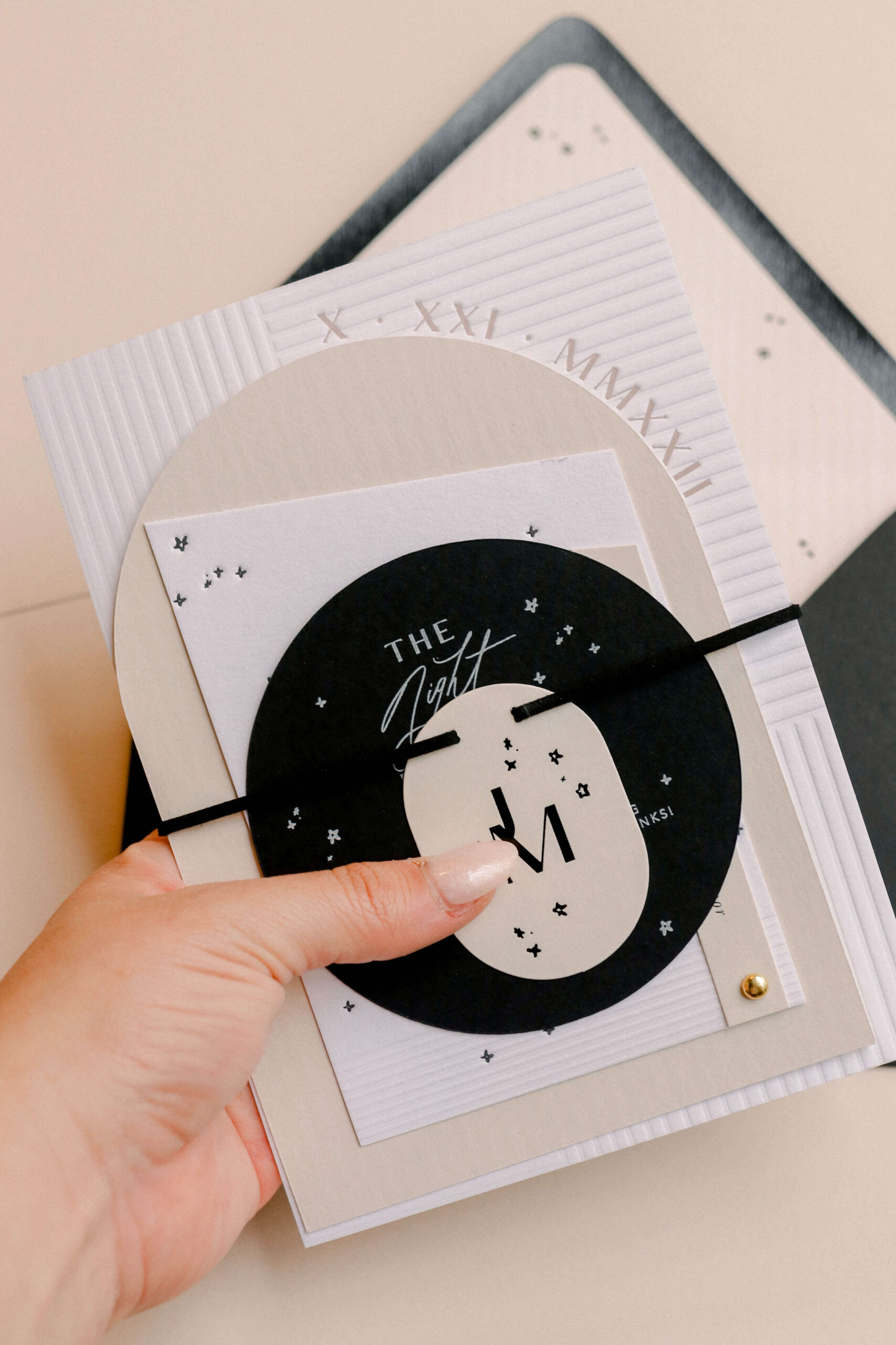
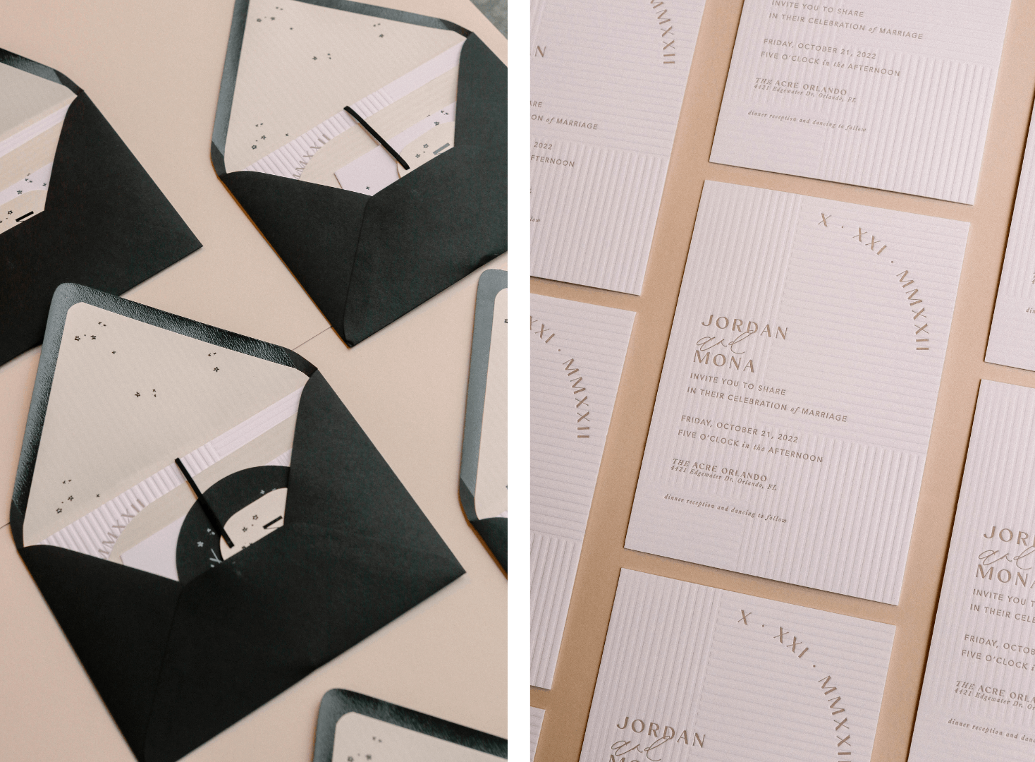
The differing shapes of each element of this suite, like the rectangular debossed invite, the pill-shaped monogrammed embellishment, the arch-shaped details card, and the circular rehearsal dinner card created contrast and elegance. And, of course… the stars.✨
No. 4 | Parvin + Gurjeet
This was an Indian wedding, so I did quite a bit of research into lush, vibrant colors and patterns used in Indian architecture and textiles. My main inspiration was a beautiful book called The Patterns of India, which is a visual feast. Parvin added a nod to Harry Potter with The Golden Snitch on her invitation, which you can see if you look closely at the invite. This is the benefit of custom invitations. The original artwork can incorporate hidden elements that speak to things you and your future spouse love. This creates delight and surprise for your guests.
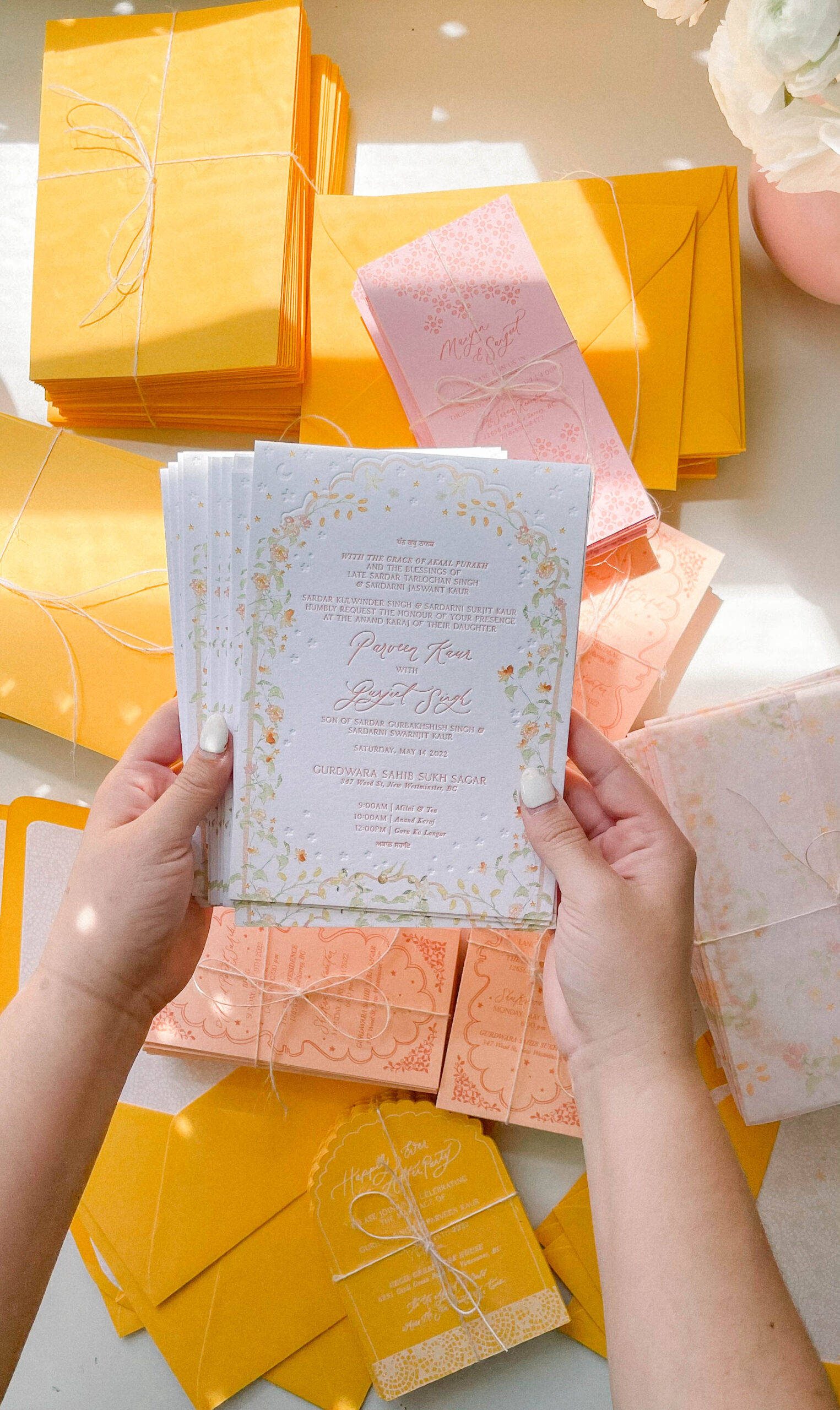
This is the most colorful suite we’ve ever done, which is why it made the top five! The trend we see now is very muted, with black, taupe, and off-white. This suite was a fun departure, with pink, orange, yellow, and many patterns. We haven’t done anything that colorful since, but we want to, so reach out if this is your vibe and let’s dream up something brilliant together.
View this post on Instagram
No. 5 | Carley + Travis
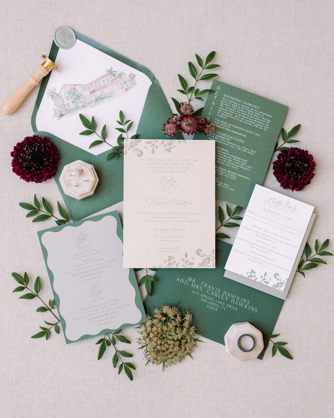
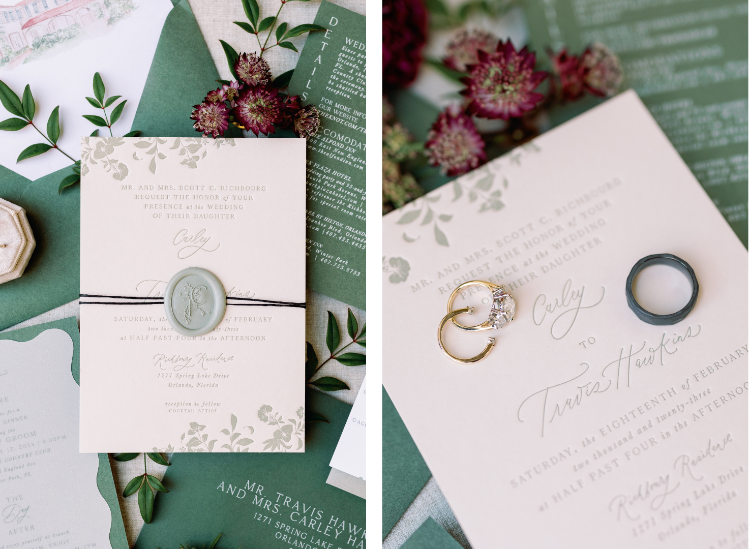
I would describe Carley and Travis’ wedding in two words: simple [yet] elevated. This suite included fun shapes like the squiggle, and I adored the colors we used. The sage and green matched really well and then translated perfectly into everything we created for the day of. Their wedding was so awesome, and I loved each piece we created for it. My favorite thing about this suite is the use of black chunky thread!

BONUS | The Ring Club Ceremony Invites
Since the Ring Club Ceremony wasn’t a wedding but rather a corporate event, it allowed us to push the limits of our creativity to create something elegant that made a statement. The organizers gave us free rein with creative direction for everything we made, including the invites. What we created for them was my first idea, so that was a huge win! 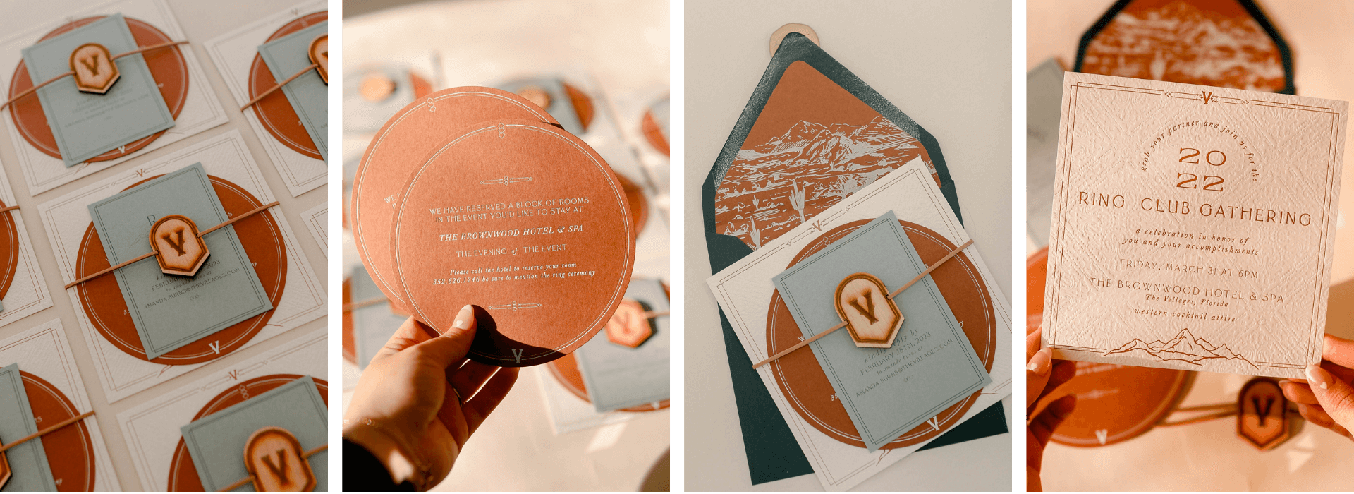
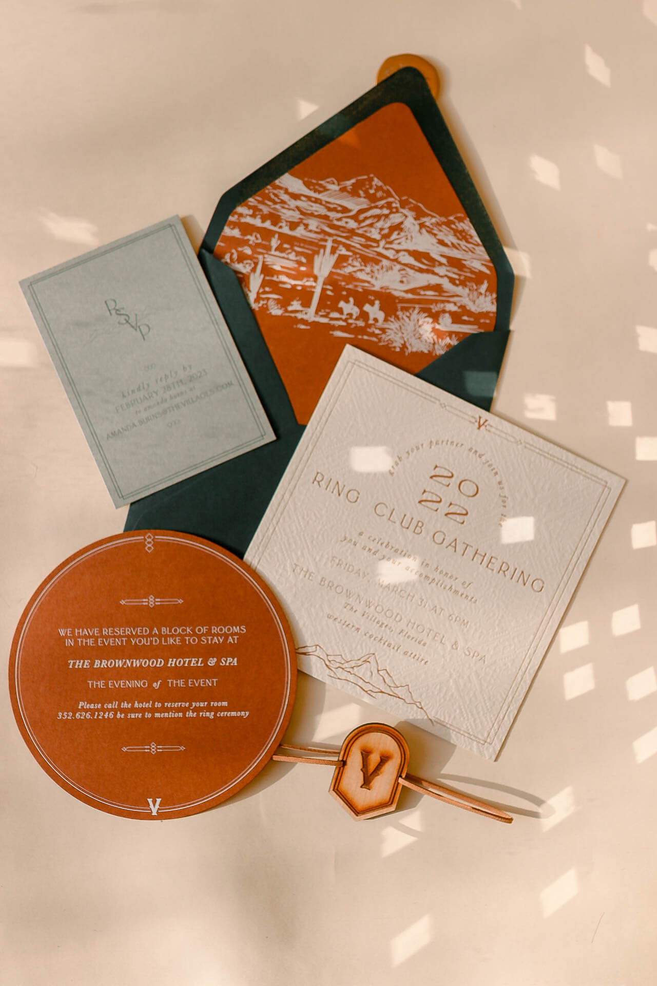
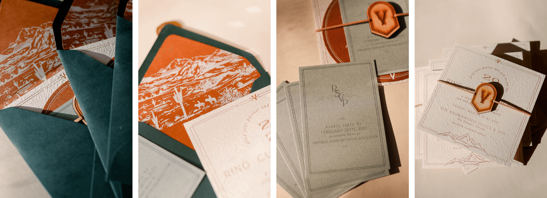
This was the first time we had done square invitations, which were digitally printed. I was challenged to create something textural and exciting, so this is where the wood medallion came into play. I also loved the opportunity to utilize colors we don’t get to use regularly, like terra cotta and dark green. This Yellowstone-themed event is one I won’t soon forget, and my heart still flutters a little when I see photos of these invitations!
Make a Statement With Custom Invites
Custom wedding invitations encapsulate the beauty of your love story and set the stage for an unforgettable celebration. These bespoke suites, crafted with love by our creative studio, are functional for sharing the details of your day and become a keepsake for years to come. With custom invitations, you are not just inviting guests to your special day; you are inviting them to anticipate a moment in time where every detail is thoughtfully curated. Contact us today if you want to embrace extraordinary for your wedding invites and push the creative envelope! Let’s dream and work together!
