May 16, 2022
A Branded Wedding Experience: Maggie and Garrett
I have been so eager to share this wedding with you because it has been months in the making! We began working with Maggie and Garrett in October of 2021 on their May 2022 wedding, held at the Ritz Carlton Sarasota. Maggie and her planner, NK Productions, brought us on board to do a branded wedding experience, and we could not be more thrilled with how it turned out.
Branded weddings are our absolute favorite because, in these weddings, the clients trust us to create an intentional, custom look. This creates a seamless experience from start to finish, with no detail overlooked. If you follow me on Instagram, you know that this was one of five weddings we had on the same weekend – it was a lot of work, but in the end, it was so worth it!
The Invitations
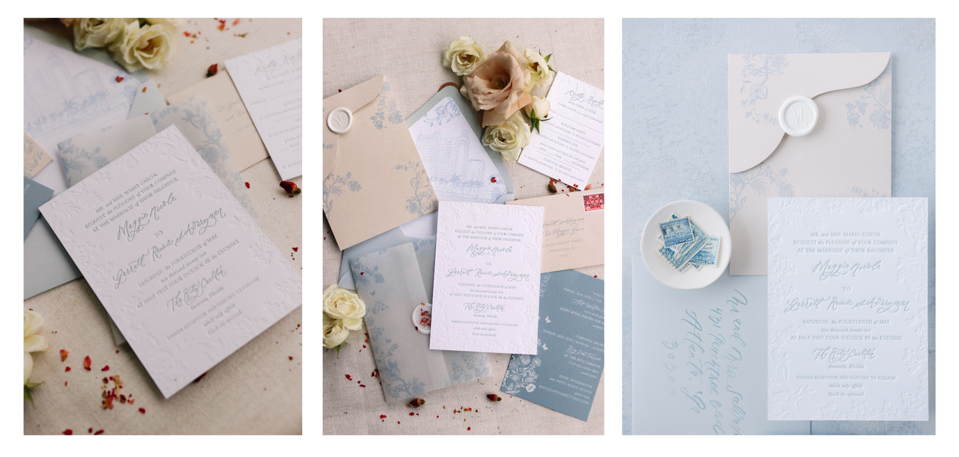
Image on right by Kristen Weaver Photography
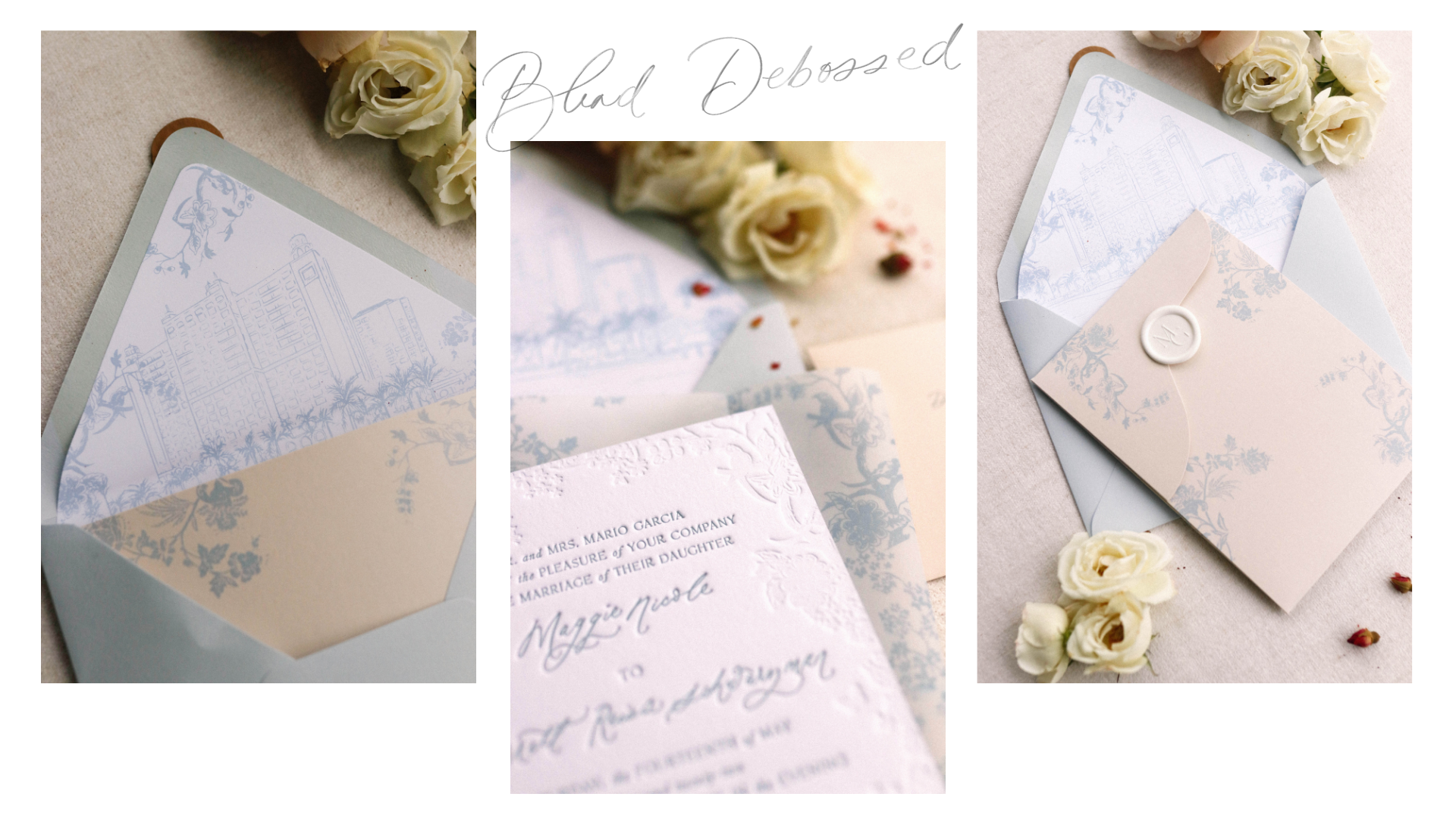
Maggie pushed us to create something new and different from what we ever had before. I love when clients allow us to tap into our creativity more deeply. Once she saw the invitation proof, she trusted us completely and gave us free rein over her wedding. Her invitations featured a custom pocket with blind deboss and letterpress printing and a dusty blue details card with foil. I drew a venue illustration of The Ritz Carlton for the envelope liner. These invitations featured a custom wax stamp and three wax seals total per invitation (including ghost wax with dried floral – so beautiful!).
View this post on Instagram
Talk about building anticipation for the wedding day – opening these invitations was an event in itself! I shared this reel on Instagram of what it was like to open one from a guest’s perspective and have never had such a response!
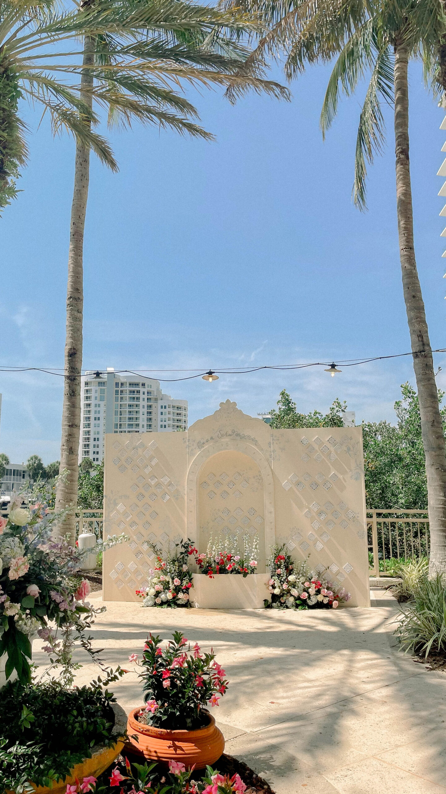
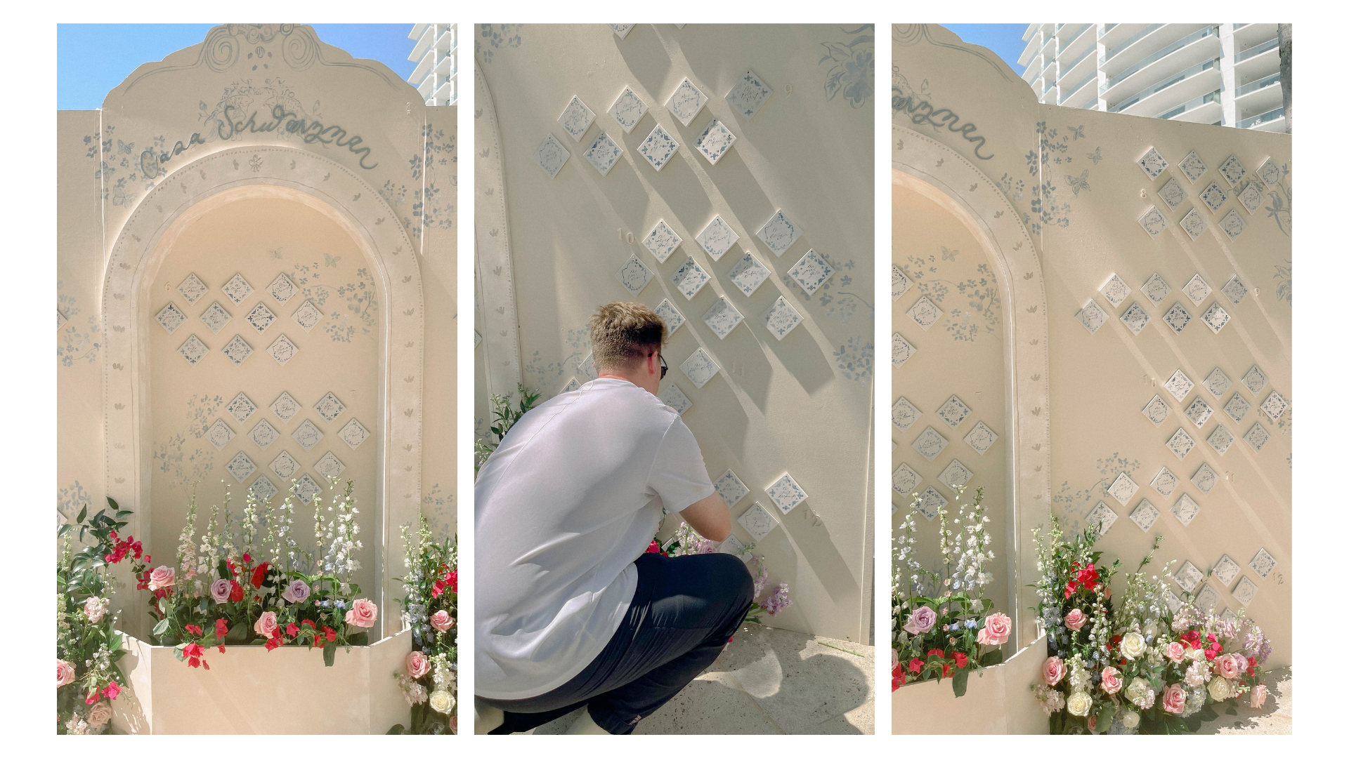
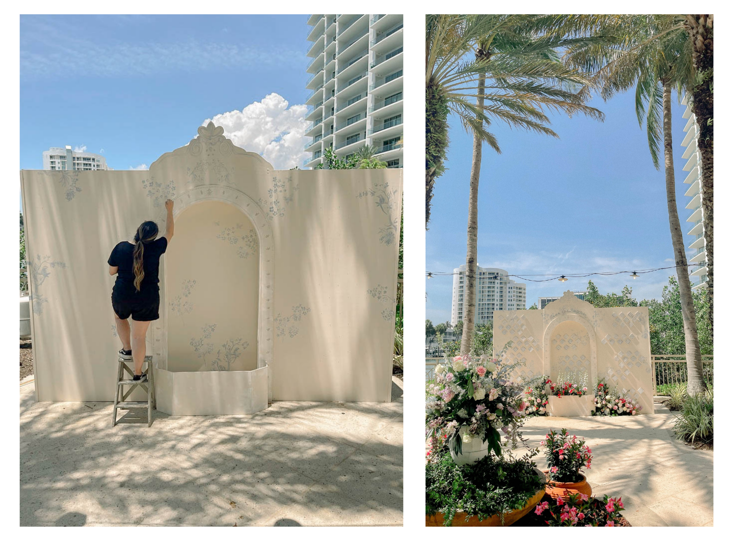
The Seating Chart
The seating chart was inspired by Portuguese walls, called Azulejos, which date back to the 13th century. They feature glazed ceramic tiles in blue and white and are a signature part of the architecture in Portugal. The wall included 120 ceramic tiles that turned into coasters (which made a memorable favor for guests!). The tiles were cork-backed and hand-painted with blue accents and calligraphy to match the invitations.
The seating chart was inspired by Portuguese walls, called Azulejos, which date back to the 13th century. They feature glazed ceramic tiles in blue and white and are a signature part of the architecture in Portugal. Our wall included 120 ceramic tiles that turned into coasters (which made a memorable favor for guests!). The tiles were cork-backed and hand-painted with blue accents and calligraphy to match the invitations.
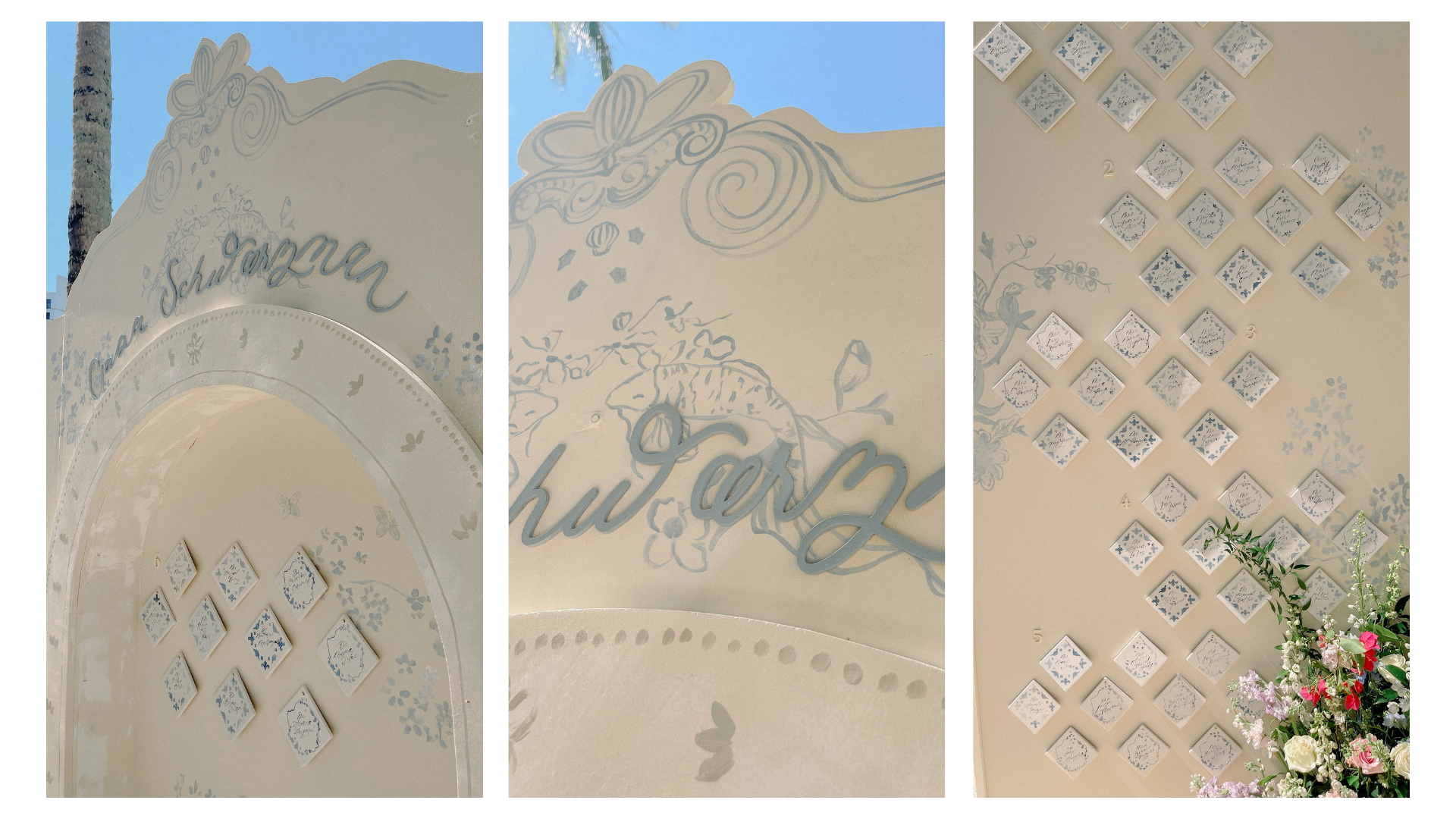
I noticed in my research that many of the walls in Portugal would say “Casa [last name]” to indicate the name of the family who lived there. So instead of writing “Kindly find your seat” as we would normally, I calligraphed and then laser-cut “Casa Schwarzman” for the top of the arch. And how cute are the hand-painted fish at the top of the structure?
Big Dimension(s)
This seating chart was a huge structure. Usually, our structures are 8-foot by 8-foot, but this was a whopping 12-foot by 10-foot in size! The glory of this structure is the details Tyler included. The arched alcove, textured surface, and geometrical flower box made it stand out and created a dimensional experience that a flat surface simply could not. Tyler put a lot of love into this structure (and about four days of work!).
Location is Everything
Maggie was incredibly detail-oriented and was very thoughtful about where her seating chart would be located. She strategized its placement by the water and we even considered the paint colors of the hotel before finalizing what it would look like. No detail was overlooked! I don’t think it would have had the same wow factor if it were placed in a ballroom.
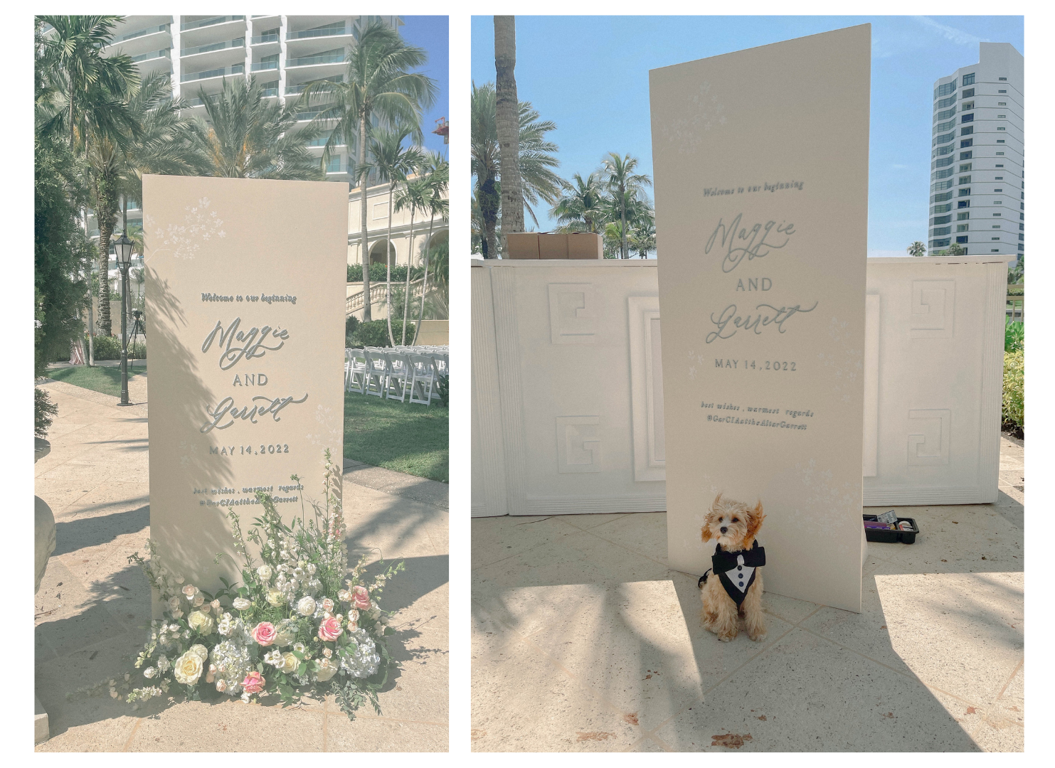
The Welcome Sign
Their welcome sign featured pretty dusty blue lace cut-out letters and white hand-painted flowers, which called back to the invitations for their guests’ first impression of the wedding. I can’t say it enough – florals make all the difference in making your wedding signage pop! Florals are required to be included in all of our signs because our work doesn’t reach its full potential without them. The florals by Botanica Design Studio were the perfect accent to both the welcome signage and the seating chart.
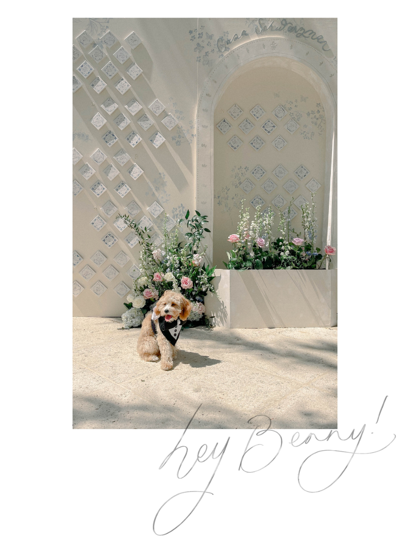
Bar Sign with a Side of Benny
As a dog mom myself, I adore when couples find a way to work their pups into their weddings. Maggie and Garret have an especially cute and photogenic dog (Benny), who they named a cocktail after – The Benny Ben-Hattan. For the bar sign, I included an illustration of their pup.
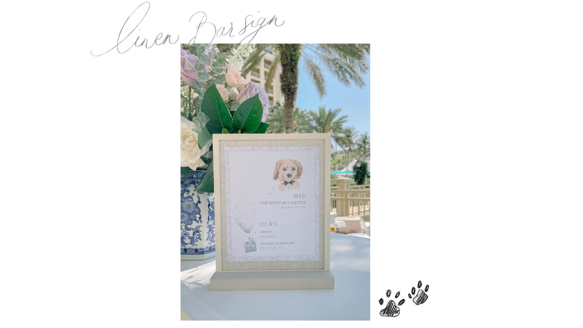
We backed the smaller signs, including the bar sign, in linen for a softer look. We didn’t use any acrylic in this wedding to make it more natural.
The Menus
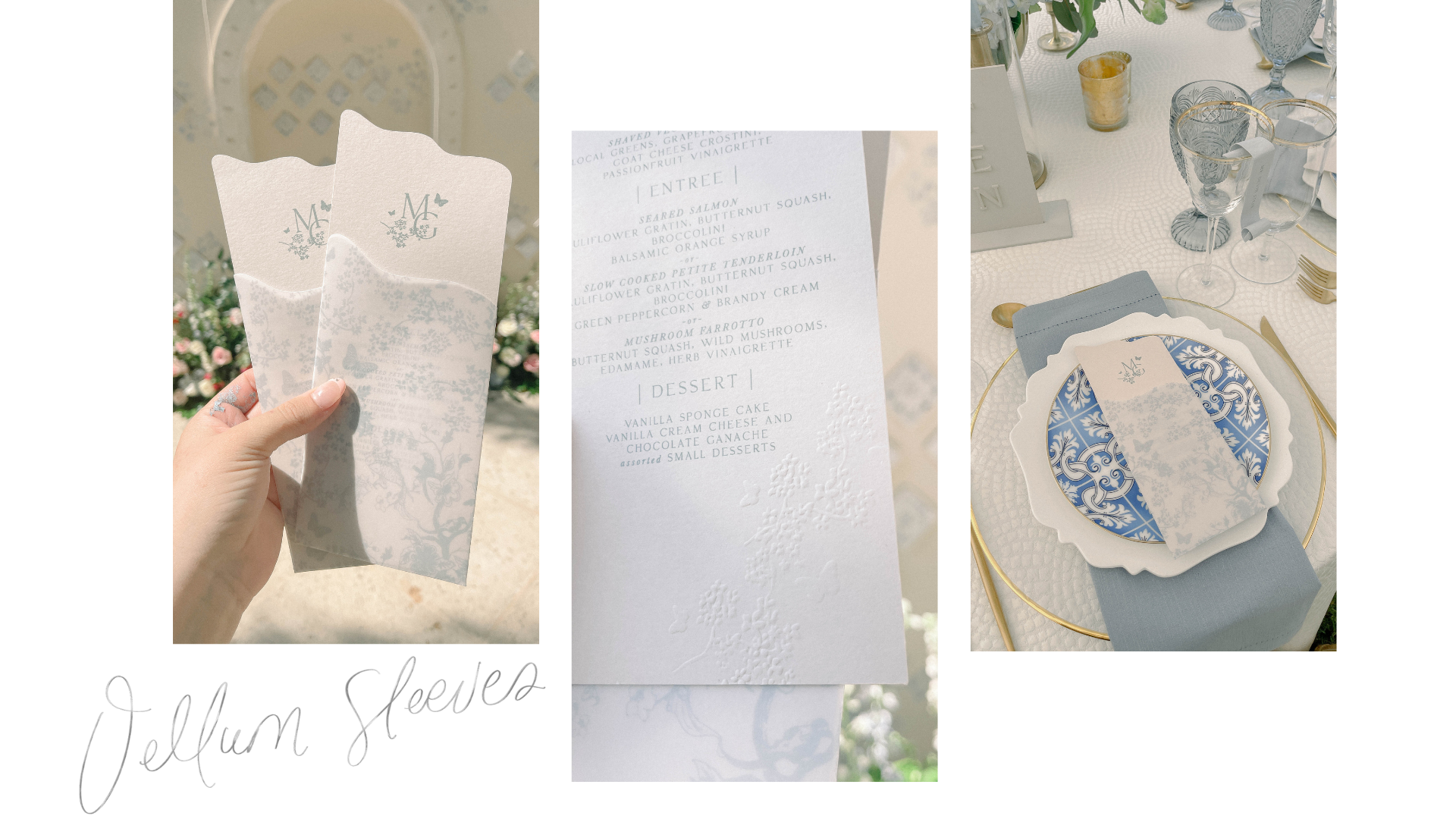
We carried over the debossing from the invitations to the menus. The menus had their monogram and a vellum sleeve with the same pattern as the invitations and seating chart. We worked in a squiggle shape to make them more natural and less rigid on the plate. When you slipped the menu out from its vellum sleeve, an embossed stamp was at the bottom.
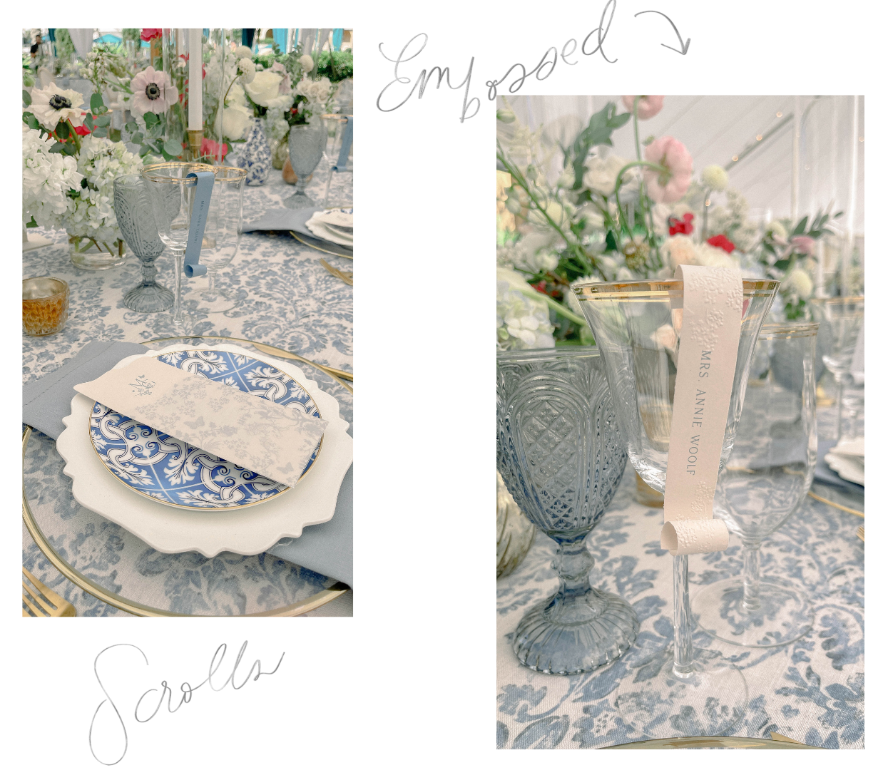
Place Cards
The place cards were color-coded to indicate the meal the guest selected. We created paper scrolls with a blind emboss. We used blind deboss everywhere else, so that was a little detail that not many people would notice, but I feel it made a huge difference.
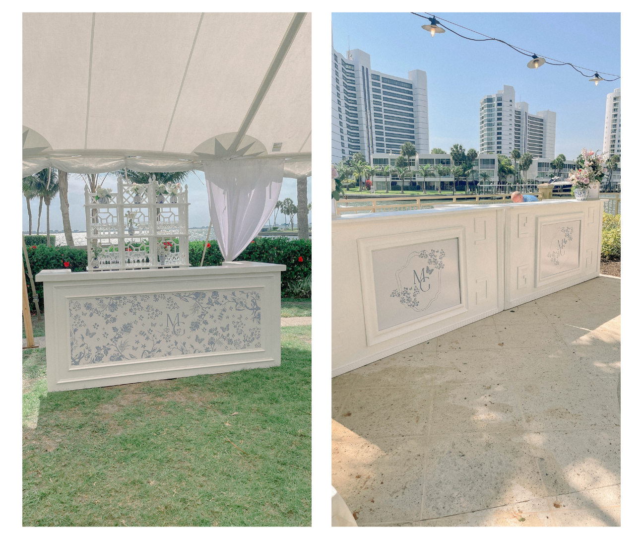
The Bar
The bar itself came from the florist, and we created two different designs for the bar wrap. We utilized the monogram we created for the couple in both designs. One design was used for the reception, and one was used for cocktail hour.
The Shoe Area
Nothing kills the party faster than aching feet from uncomfortable shoes. The typical go-to for a wedding is to provide guests with flip flops, but Maggie put a unique twist on this idea. She contacted each female guest ahead of time to get their shoe size and bought slides for each one in their own personal size.
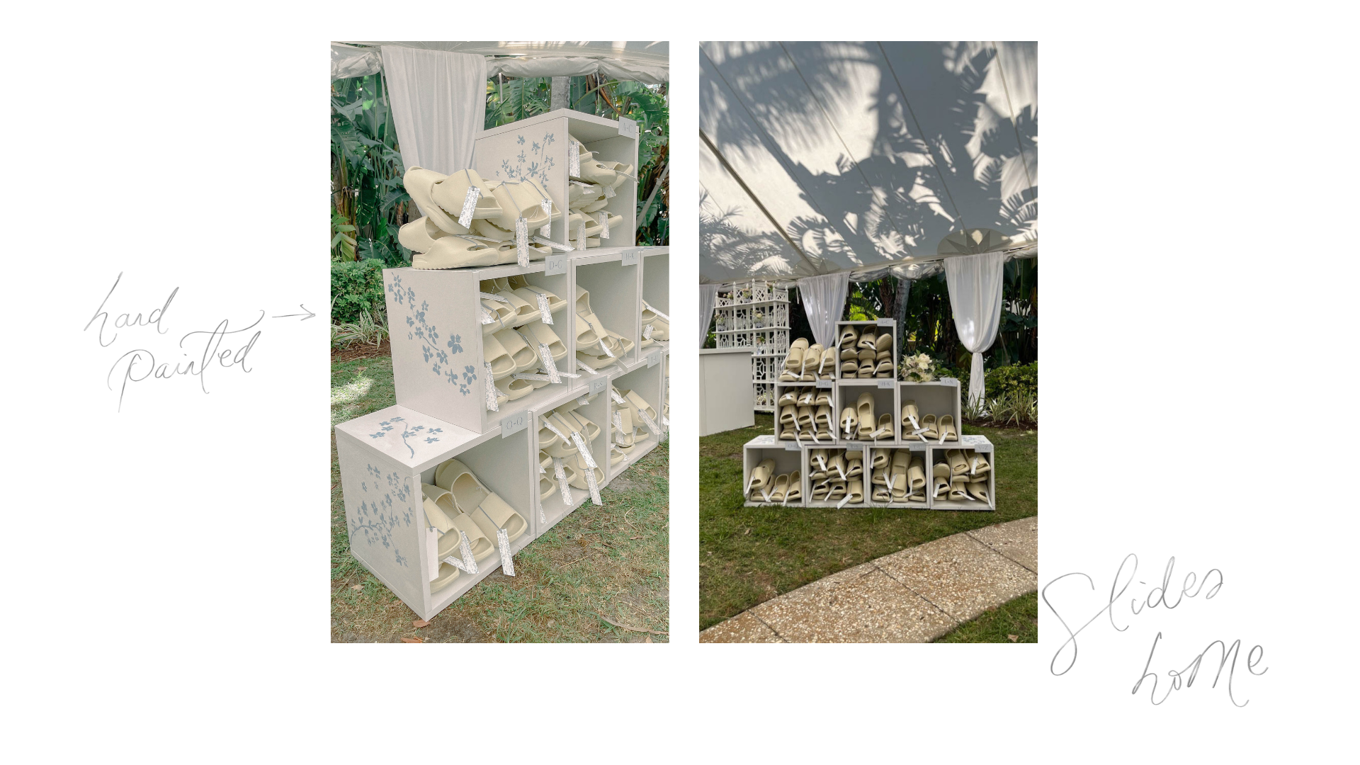
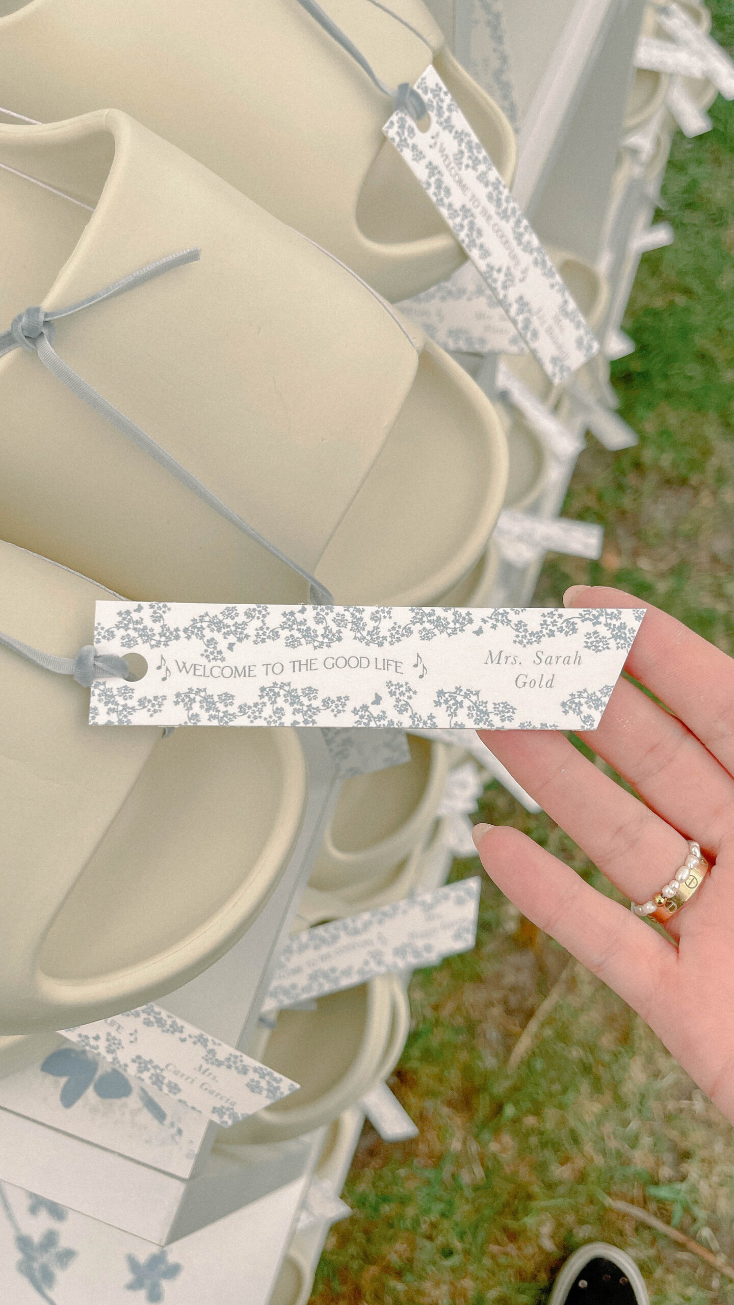 We created tags to attach to the shoes with each guest’s name and tied them on with a dusty blue velvet ribbon. We also made boxes to display the shoes so they looked neat and organized and hand-painted them to match the motif that ran throughout the rest of the wedding.
Table Numbers
These monochromatic stone table numbers are also a part of our rental collection. Our rentals are only available for delivery (we aren’t able to ship our rentals). 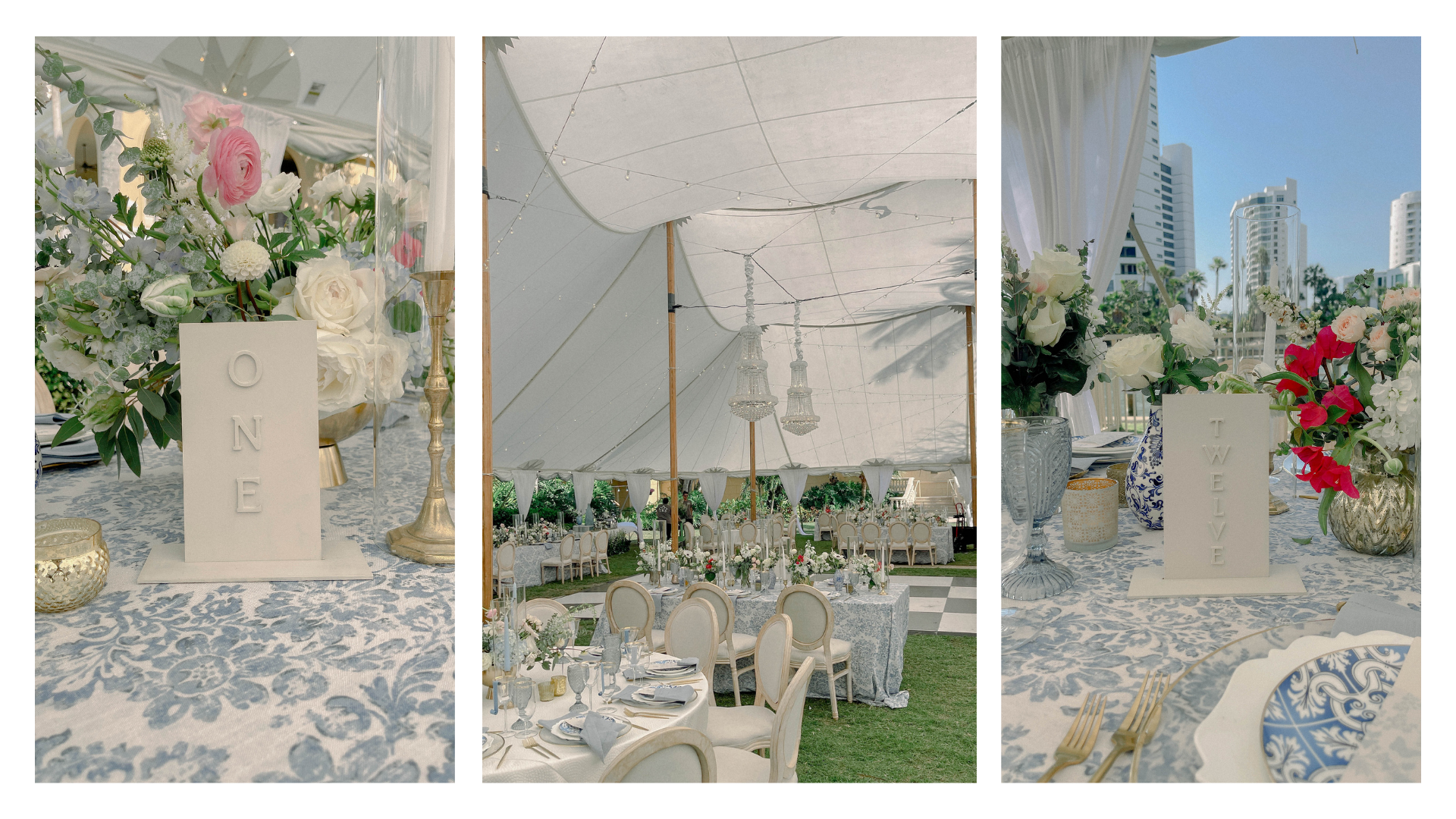
I am so proud of how beautifully this wedding turned out and the ways it pushed us to new levels of creativity. I hope Maggie and Garrett had the most memorable day of their lives, so far!
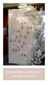
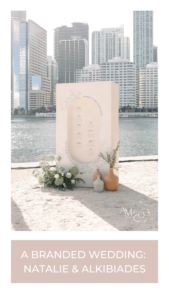
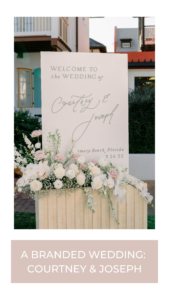
If you’d like to explore what a branded wedding could look like for your special day, we’d love to chat! Reach out to us using our contact form and check out a few of our other branded weddings:


Leave a Reply
You must be logged in to post a comment.


[…] Maggie and Garrett’s wedding was the perfect fusion of a to-die-for location with gorgeous and unique aesthetics. Their seating chart structure was a massive 12 feet by 10 feet in size when typically our structures are eight by eight feet. […]