March 2, 2023
A Whimsical Woodland-Inspired Branded Wedding
When we talk about ideal weddings, our dream is to work with clients committed to branding even the most minor details to create a cohesive day. Carley and Travis’ woodland-inspired branded wedding was precisely that – ✨ to die for ✨. We did the whole nine yards for them, from save-the-dates to day-of items, down to the smallest detail. I was highly impressed with their commitment to fully brand their wedding.
Fun fact: I didn’t meet (or speak to) Carley until the wedding day! And when I did talk to her, it was by chance because I ran into her. Throughout the planning process, her mom, Kim, was our go-to and was with us every step of the way as we planned and executed this jaw-dropping event. Kim worked with wedding planner Debbie from Party Perfect Orlando. Debbie was a sweetheart; amazing to work with, very kind and patient, but highly detail-oriented, which is what you want in a wedding planner! I was honored that she brought us on board!
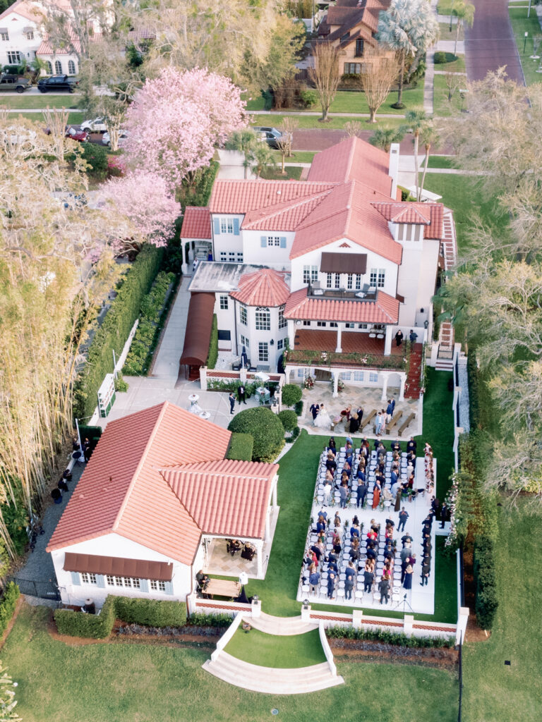
Photo by Nate Puhr
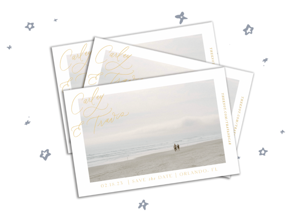
Intimate Save-The-Dates
Carly’s save-the-dates were simple but unique and beautiful. We used a photo of her and Travis walking on the beach where they were barely visible. It was a departure from the usual type of photos couples use on their save the dates of their faces, but the look was very intimate. I loved the originality. We incorporated gold foil for a romantic touch.
A Change of Plans
When we first signed on to this wedding, we planned to digitally print the invitations (similar to what we do with our semi-custom suites). Early in the planning process, we had an in-person consultation with Kim at our studio, which is unusual for us. We usually meet via zoom or telephone. But Kim is very visual and tactile and wanted to see and feel the paper types before placing her order. After she viewed our portfolio in person, she upgraded EVERYTHING.
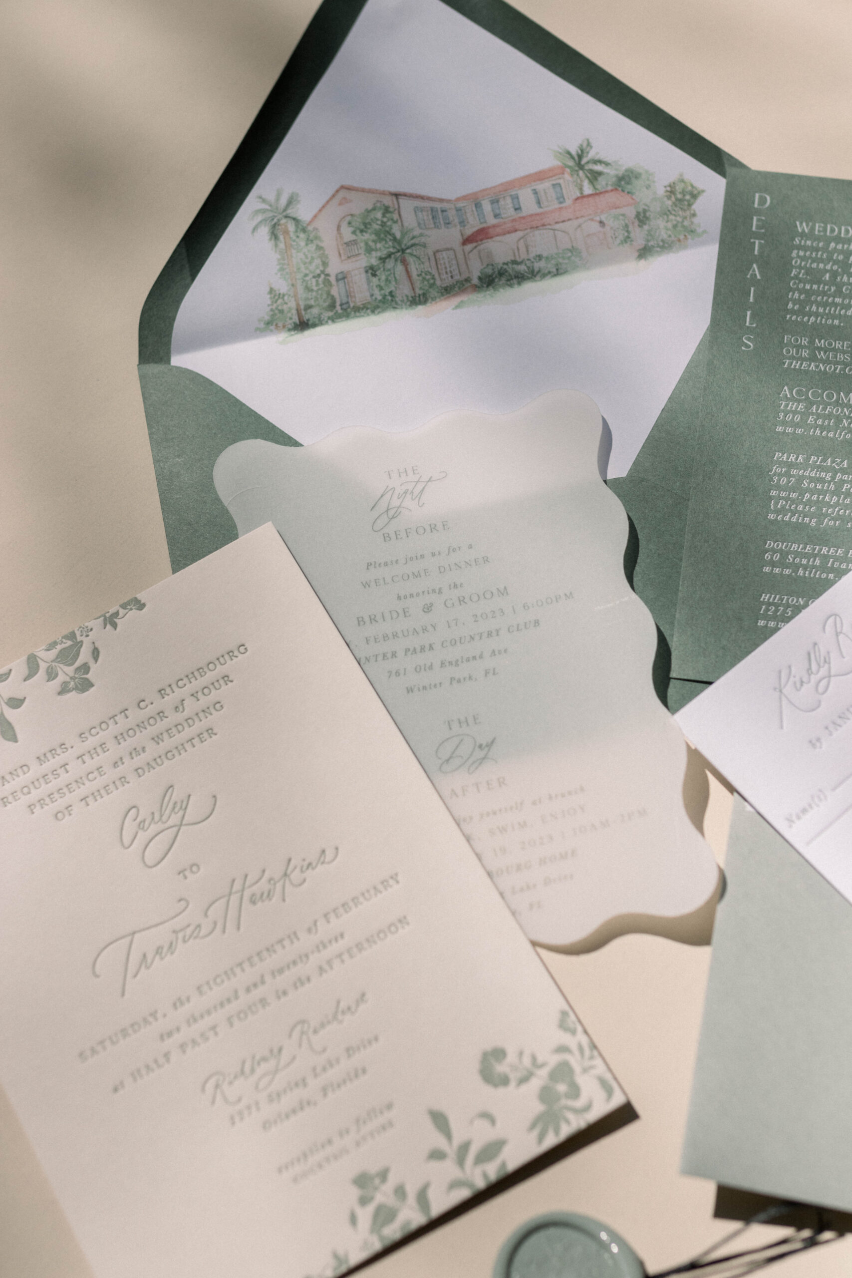
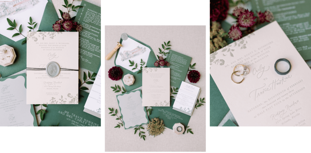
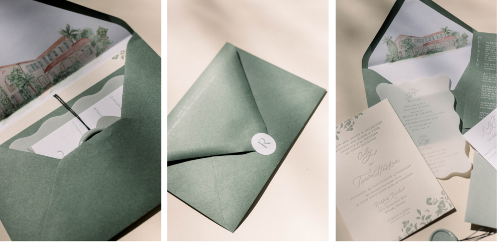
The Invitations
For her invitations, we used sage green letterpress on chardonnay-colored paper. We incorporated super-pretty soft florals since a whimsical woodland forest inspired their wedding theme. We brought the whimsical aspect with the squiggle Night-Before card and Day-After card, which only some guests received. Others who weren’t in the wedding party or involved in day-before or day-after events received a version with a special quote. We added a green details card that matched the envelope color.
Photos by Nate Purh
A chunky black thread wrapped the invitation, which gave it a pop of contrast and held every element together, and then we used a sage-green wax seal with their monogram.
A Meaningful Illustration
The ceremony location was at Kim’s lakeside home, which was stunning. Carley grew up in this house, and I think it says a lot about this family and how loving they are that she would have the wedding in their backyard. I created a watercolor drawing of the home for the envelope liner, which was a meaningful and personal touch for the invitations.
Puppy Welcome Committee
When guests arrived at the house, a welcome sign greeted them: “Welcome to the Wedding of Carley and Travis.” But they wanted to include their puppies in the welcome as greeters. Of course, expecting their puppies to stand there and welcome everyone wasn’t practical, so they commissioned me to paint their pups. We placed a life-size cut-out of each dog next to the welcome sign for a fun first impression.
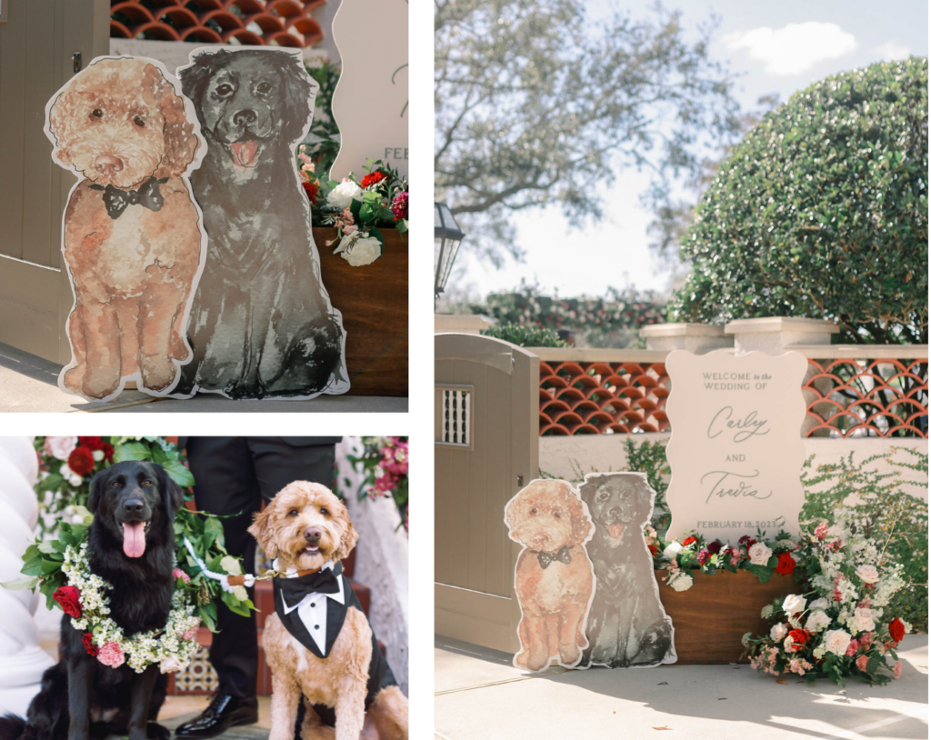
Image of puppies by Nate Puhr
Another sweet way they welcomed their guests was through a branded beverage cart at the entry to the ceremony. We created custom art for the front and side so that guests could grab a refreshment on their way in. 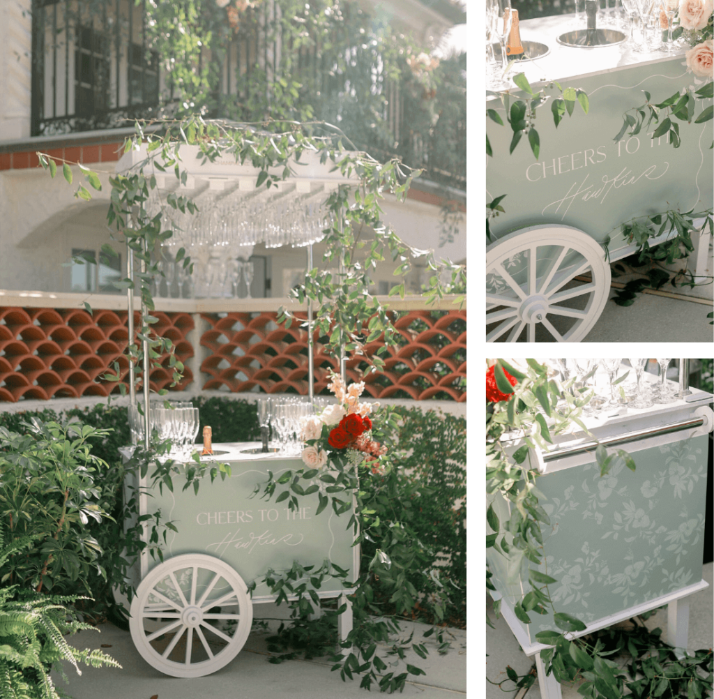
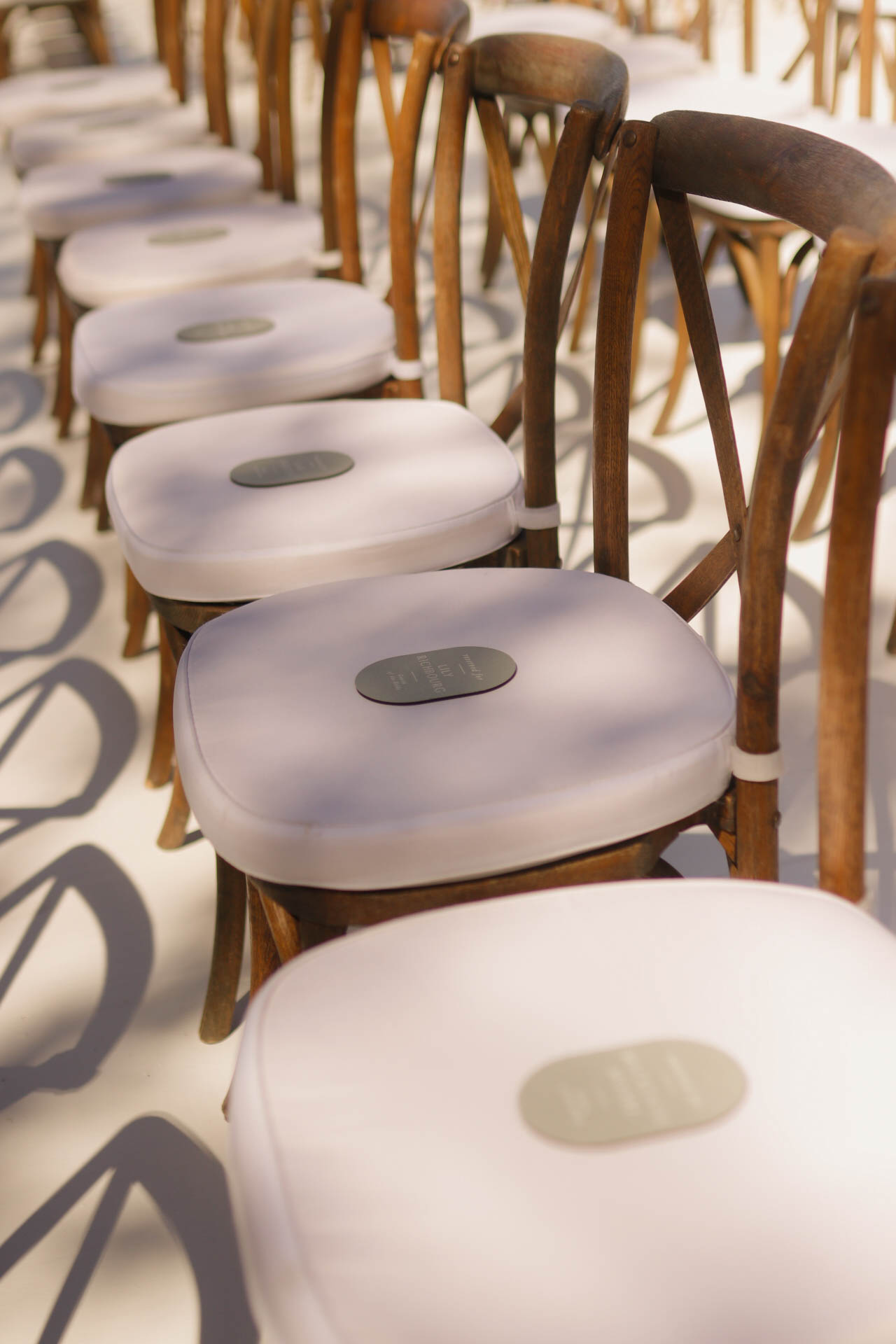
Reserved Seats
They have a large family, and they wanted to be really organized with seating. So we created reserved chair signs for each individual chair in the first couple of rows so that family members had designated seats.
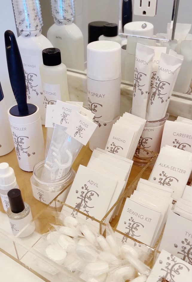
Attention to Detail
Their monogram played a considerable role in the wedding and was practically everywhere! One unexpected way they used it was on custom toiletry wrappers for the restrooms. They branded feminine hygiene products, mouthwash, hairspray, and Q-tips. The attention to detail was mind-blowing!
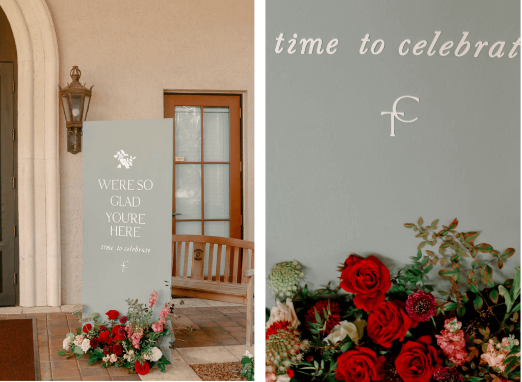
A Second Welcome Sign
The reception was at the Country Club of Orlando, a short drive from the ceremony location. So they transported everyone from the home to the reception venue via trolley. When they arrived, a second welcome sign greeted them: “We’re So Glad You’re Here. Time to Celebrate.” We included the flower design from their monogram and then a simplified version of the monogram at the bottom. Velvet and Twine did all the wild, deep red and pink-toned florals for the day, and they are exceptional at their craft!
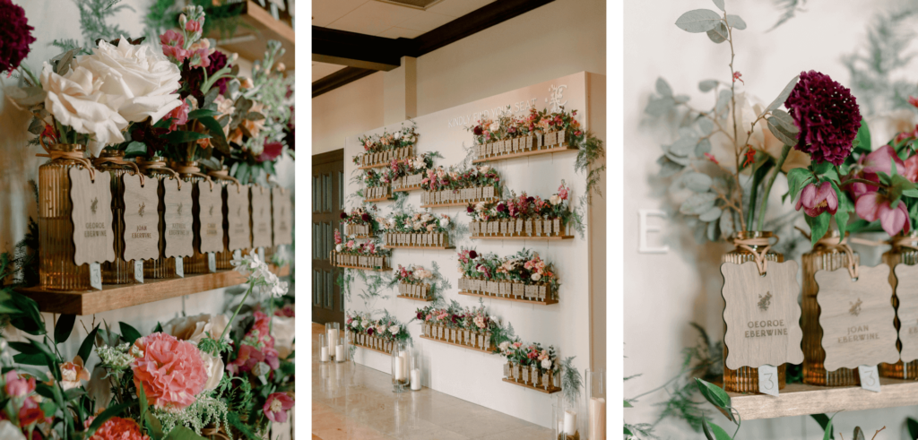
A Rustic and Romantic Seating Chart
Their seating chart held individual bud vases with flowers. We selected the amber-colored bud vases because the color added some dimension and warmth to the design, instead of keeping it all green. Each vase held an engraved personalized wooden luggage tag, which was indeed a labor of laser love. 😅 We had to be very obsessive about the details to align every name, and I’m happy to say they turned out great!
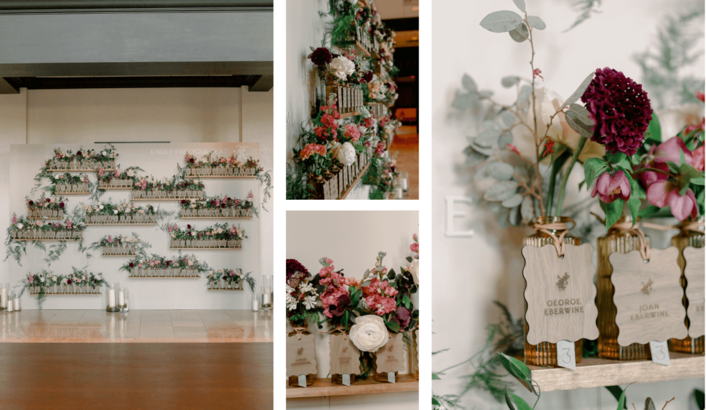
Each vase also needed to indicate the guest’s table number, but I wanted the laser tag to be an evergreen keepsake without a table number. So, we layered the tag with sage green paper to indicate their table number. Then, we wrapped everything with a soft leather cord, which added a rustic touch.
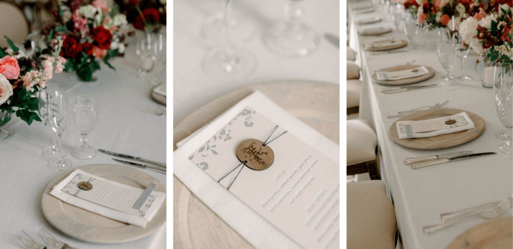
Letterpress Menus
The menus resembled the main invitation, with the same floral pattern. Using letterpress for menus is uncommon, but Kim wanted to incorporate texture, so it was a natural choice. We wrapped the menu with the same thread as the invitations, but instead of a wax seal at the top, we incorporated an engraved monogram at the top. And then we made double-thick, chunky place cards for the head table only. The other guests self-selected a seat at their assigned table, so they did not require place cards.
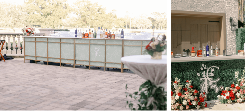
Monogram Mania
We incorporated the monogram in a custom acrylic box for their cards and gifts. They had an enormous bar from Vivant Rentals, so we created a 22-foot-long bar insert with the same floral pattern from their invitations with the monogram in the center.
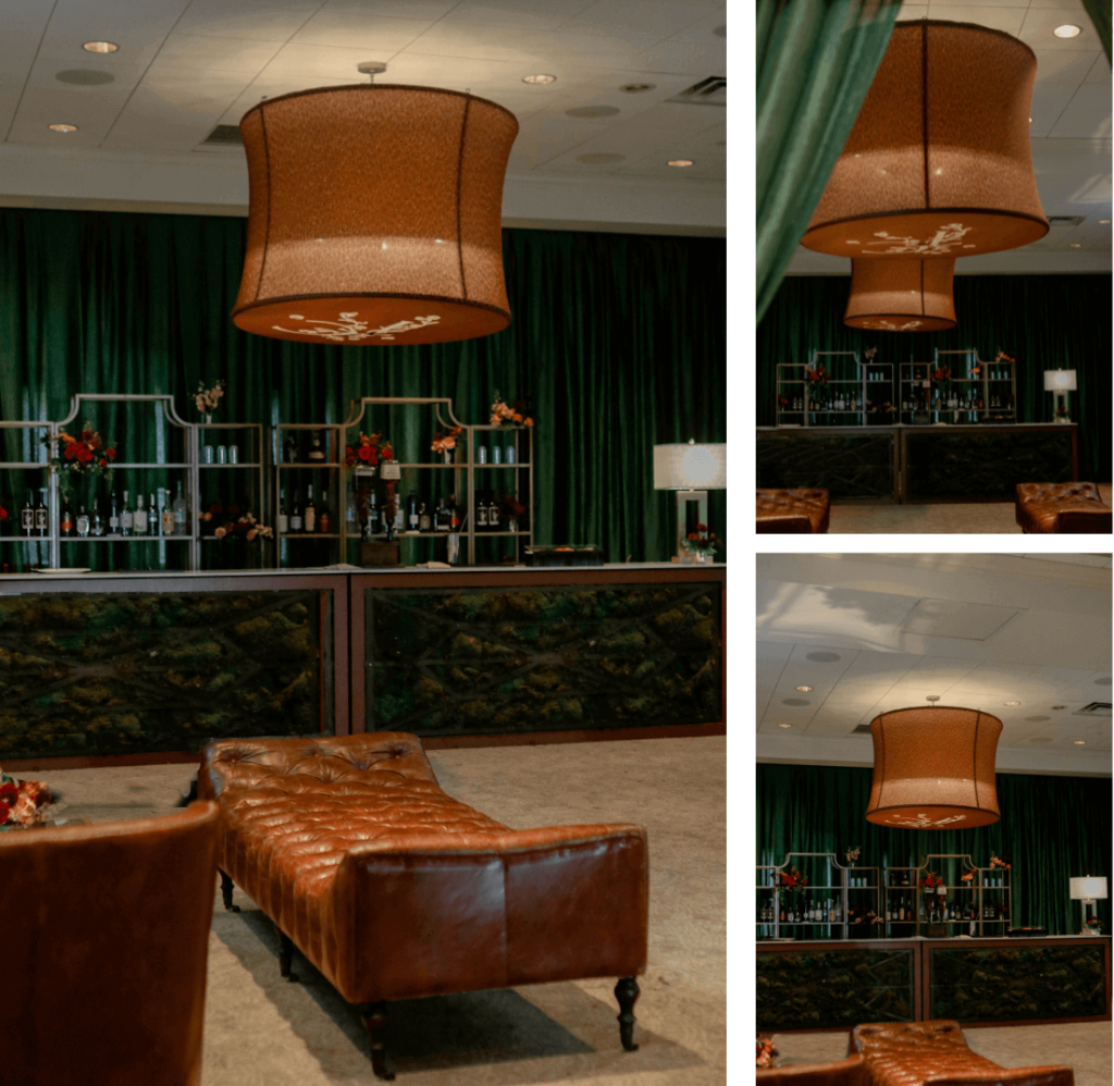
A Moody Bourbon Lounge
The Country Club of Orlando has a side room off the ballroom that transformed into a bourbon lounge just for the wedding. The room was draped in dark green fabric to hide the cream walls and give it a dark, intimate feel. However, the existing chandeliers didn’t give lounge vibes, so they wanted to cover them. To answer this, we created drum shades in collaboration with Swag Decor. We’d never customized drum shades before, but it was a fun and unique item to brand!
Living the Branded Wedding Dream
Carley and Travis’ wedding was a branded dream to work on! We love clients who take chances and care about the details, and this wedding was a perfect picture of that.
We would love to talk with you about your wedding and how we can make it a branded dream, too! Fill out our contact form and we’ll chat!


