April 4, 2023
A Ranch-Themed Corporate Event
As the sun sets behind the rolling hills, you can almost smell the sweet tall grass and leather in the air. This is not just any ordinary corporate event but a luxurious ranch-themed retreat where guests can escape the hustle and bustle of everyday life and immerse themselves in the rustic charm of the Wild West. We had the pleasure of working on this unique annual awards night to honor realtors called “The Ring Club Gathering” in The Villages, and it’s an event I won’t soon forget!
Most of our work centers around weddings, which we live for, but we love the opportunity to venture outside the wedding world into upscale parties and corporate events! This allows us to flex our creative muscles and play with textures, motifs, and colors that aren’t common in our everyday work. So when Woven and Revel brought us on board, we were ready to push the envelope to help make the signage and stationery for The Ring Club Gathering.
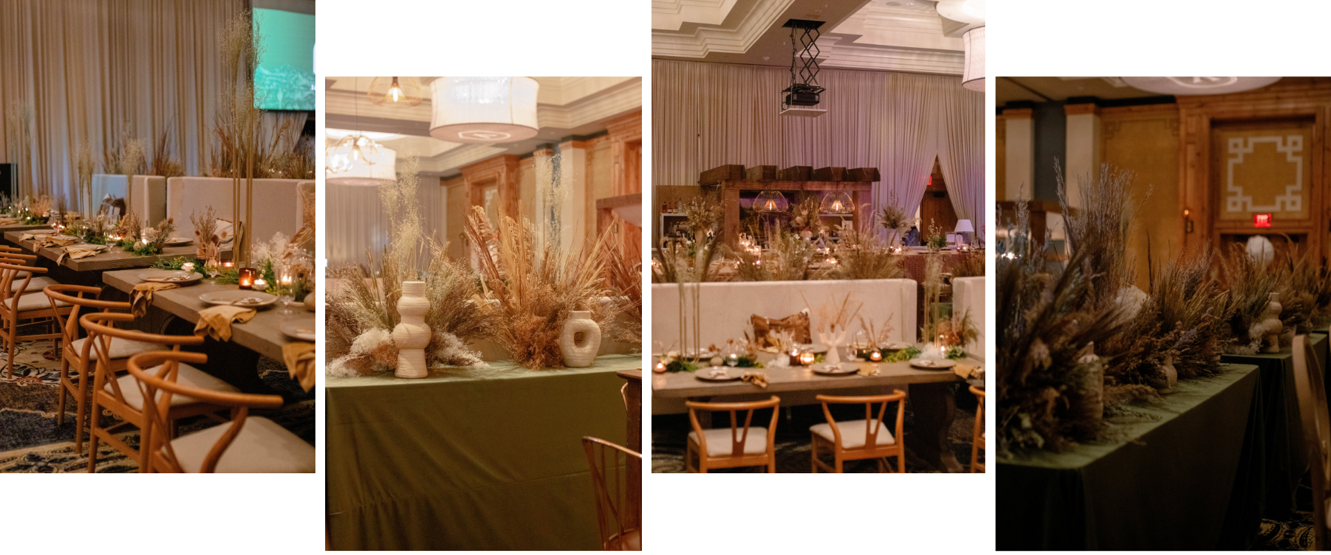
The event had a Yellowstone theme, so we found inspiration from mountains, ranches, and cowboys. The Brownwood Hotel and Spa was the venue, which could not have been a better setting for a party like this, with its classy, old-money ranch decor.
Brand ‘Em, Cowboy!
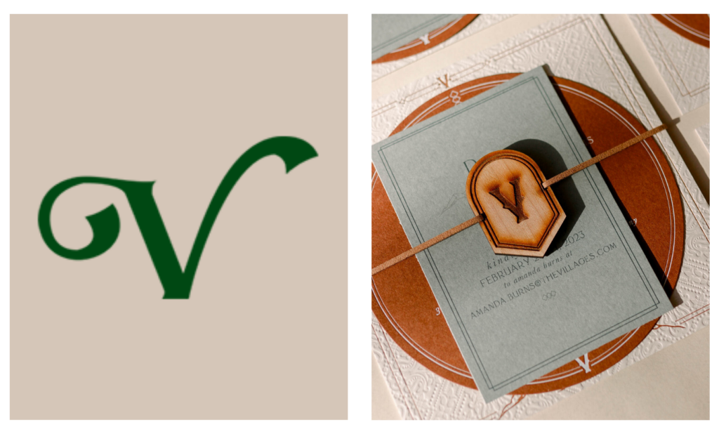
Ranchers brand cattle to show distinction and ownership. A brand on a cow differentiates it from any other ranch’s cattle. At AM+Co, we specialize in branding of a different sort – branded events – that serve the same purpose. Branding an event shows distinction and sets an expectation that this event is different from the others. Since branded events are our wheelhouse, one key element we used for this event, particularly, was a “V” that we adapted from The Villages logo. We basically “ranched it out,” as you can see in the side-by-side comparison. This logo is repeatedly echoed throughout the event, creating cohesion and a sense of intentionality in each element.
Stunning Invitations
We started with their save the dates, which were digital. We don’t usually offer digital design services, but since this was such a comprehensive event, we included it especially for this client.

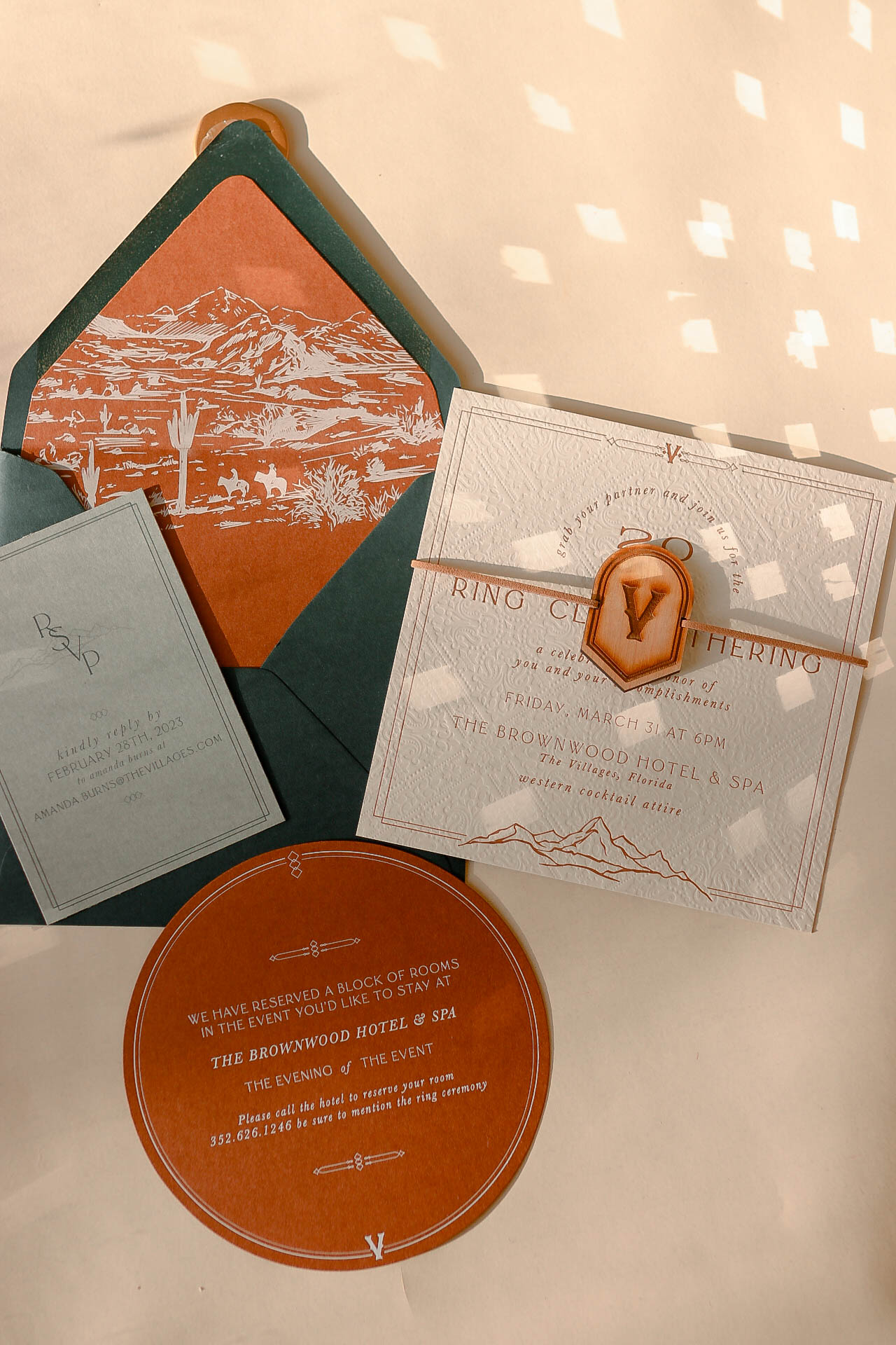
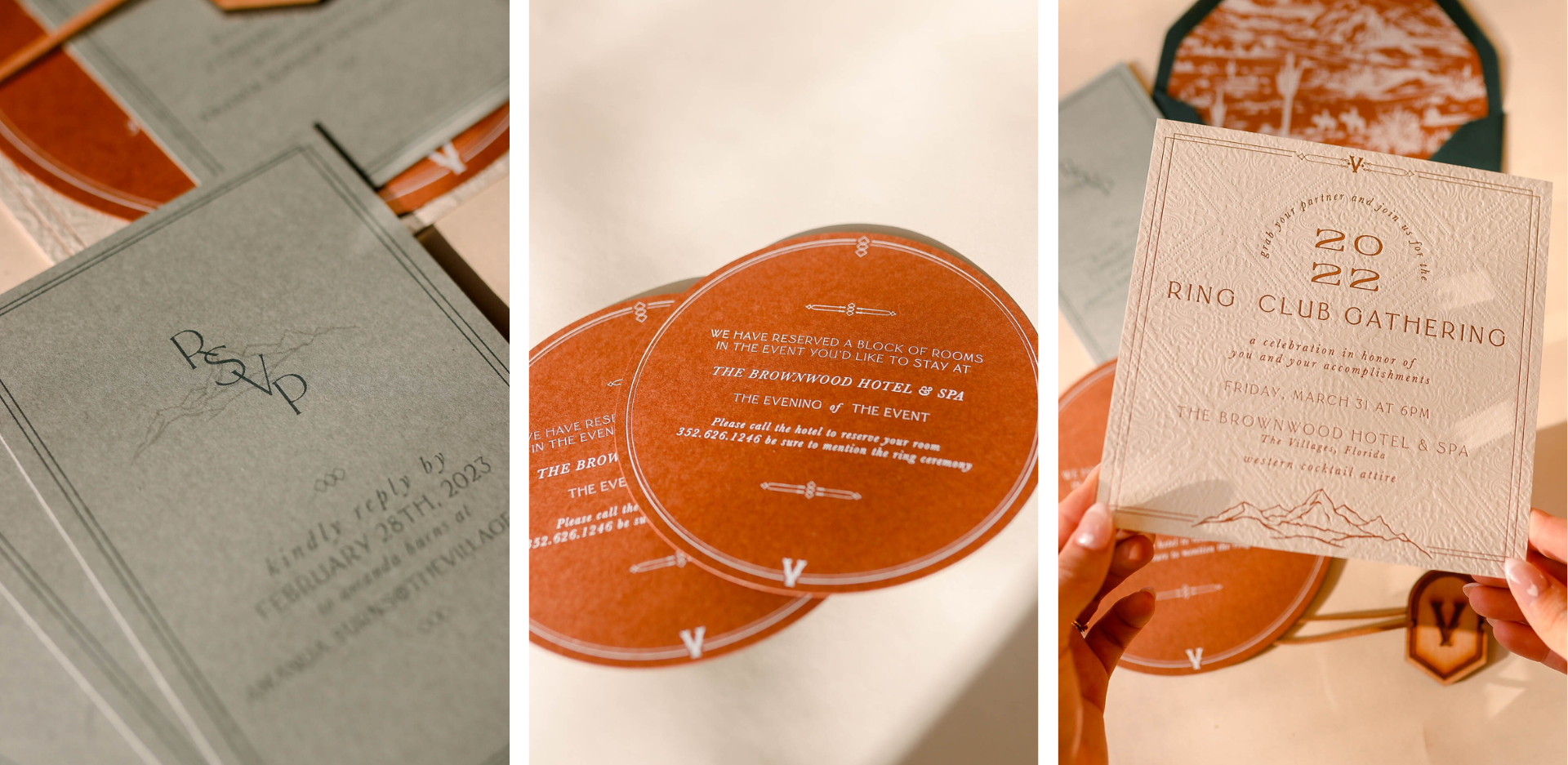
Then, we created gorgeous invitations, which incorporated blind debossing and letterpress. The client wanted to include a mountain look, so we brought that into the hand-drawn envelope liner, with a ranch scene, mountains, cowboys, and an adorable cactus 🙂 And the rich emerald envelope provided the perfect amount of contrast and depth.
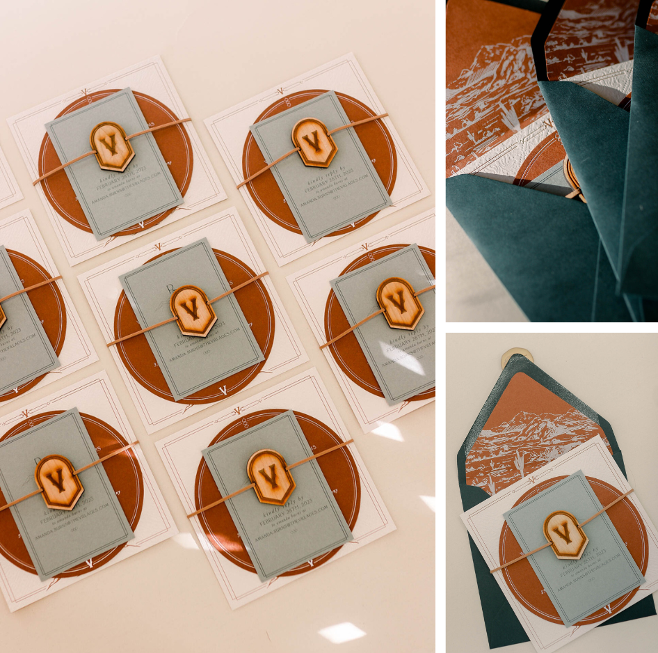
The color palette in this event was to.die.for, and each layered piece of the invitations coordinated perfectly yet unexpectedly – from the cream square invitations to the circular rust-colored accommodations card to the sage RSVP card. We also created a wooden embellishment for the invitation with our laser that incorporated the “V,” which the guests would see throughout the party. Finally, we bound everything together with a cognac-colored leather cord.
Bag Tags
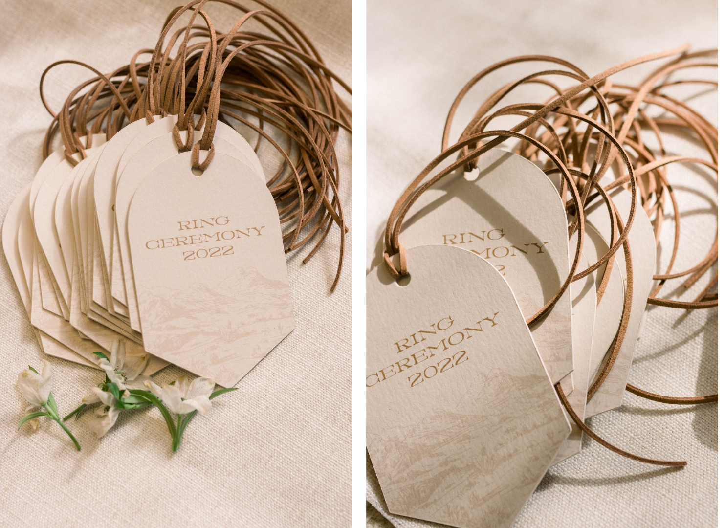
Every guest received a welcome goodie bag, and we created a tag for those bags. The tag was affixed to the bag with the same leather cord as the invitation.
The Welcome Sign
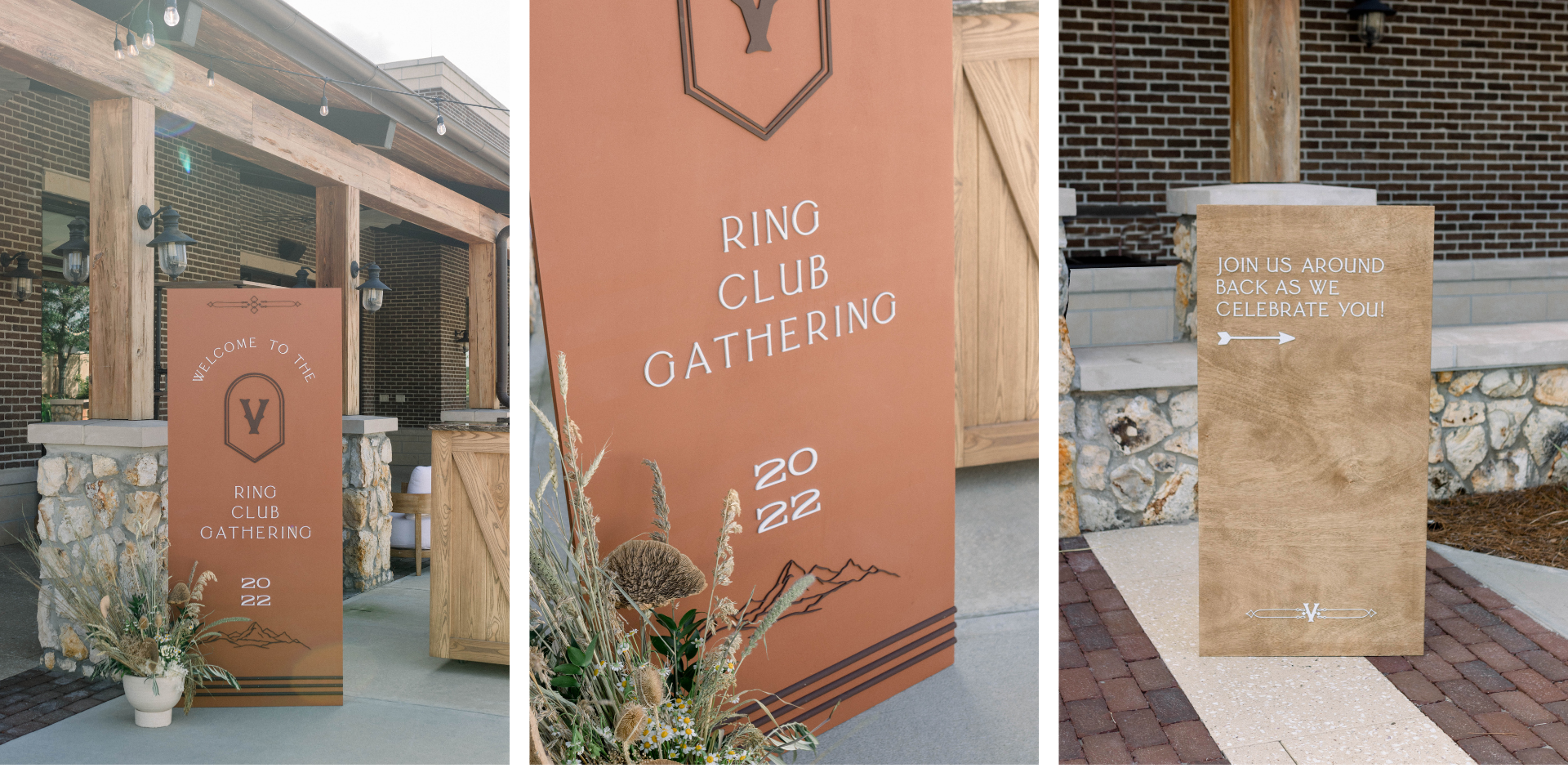
A welcome sign is one of the top five must-haves for an event, and this one was one of my favorites! The sign was a deep terra cotta color and incorporated laser cuts in brown and white to give it a masculine feel. We used the “V” right at the top of the sign, which called back to the invitation the guests received and helped them know they were in the right place. Then we also did a directional sign, a stained wood with white laser cuts to show them which door to go through.
The Bar Signs
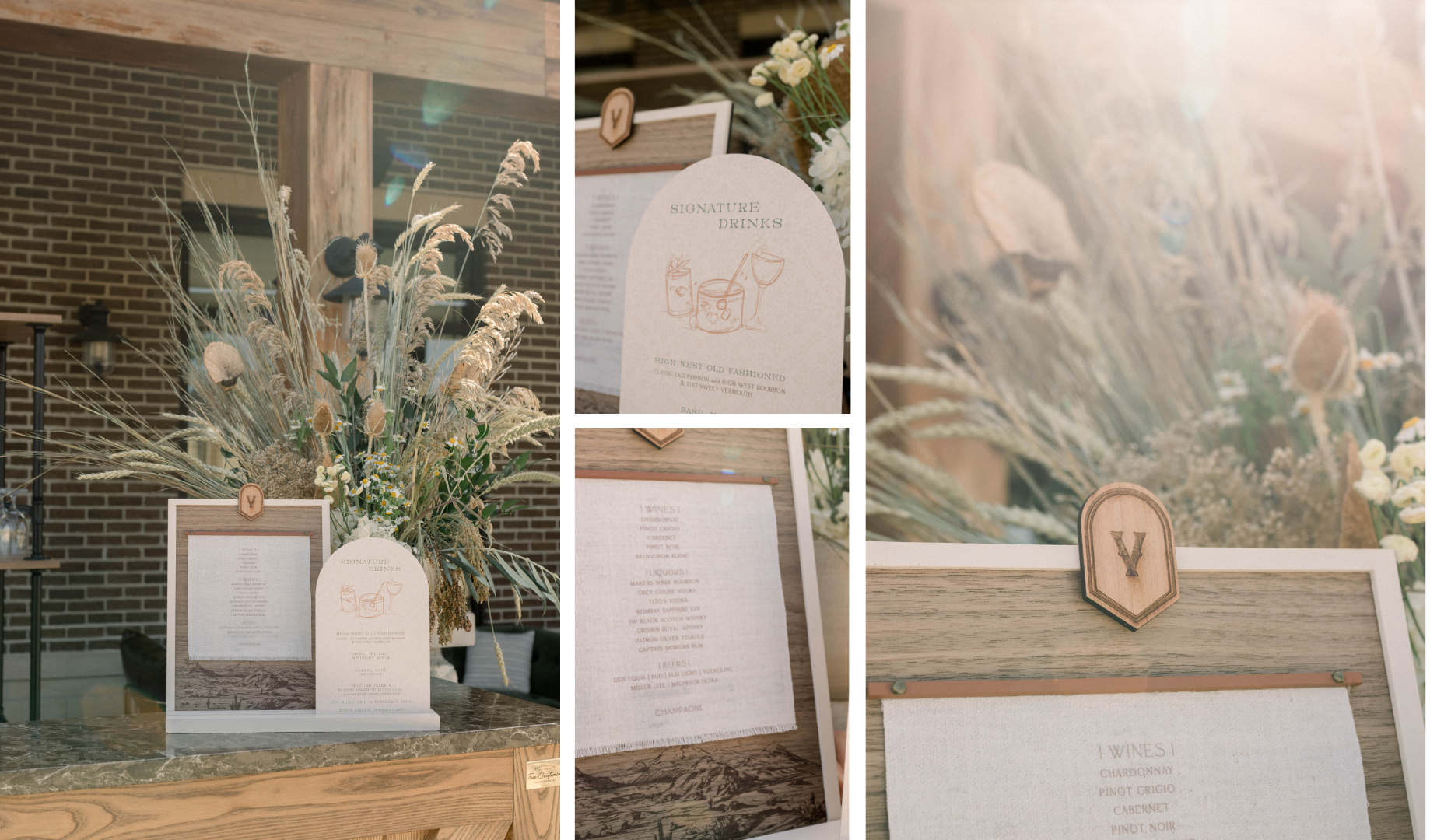
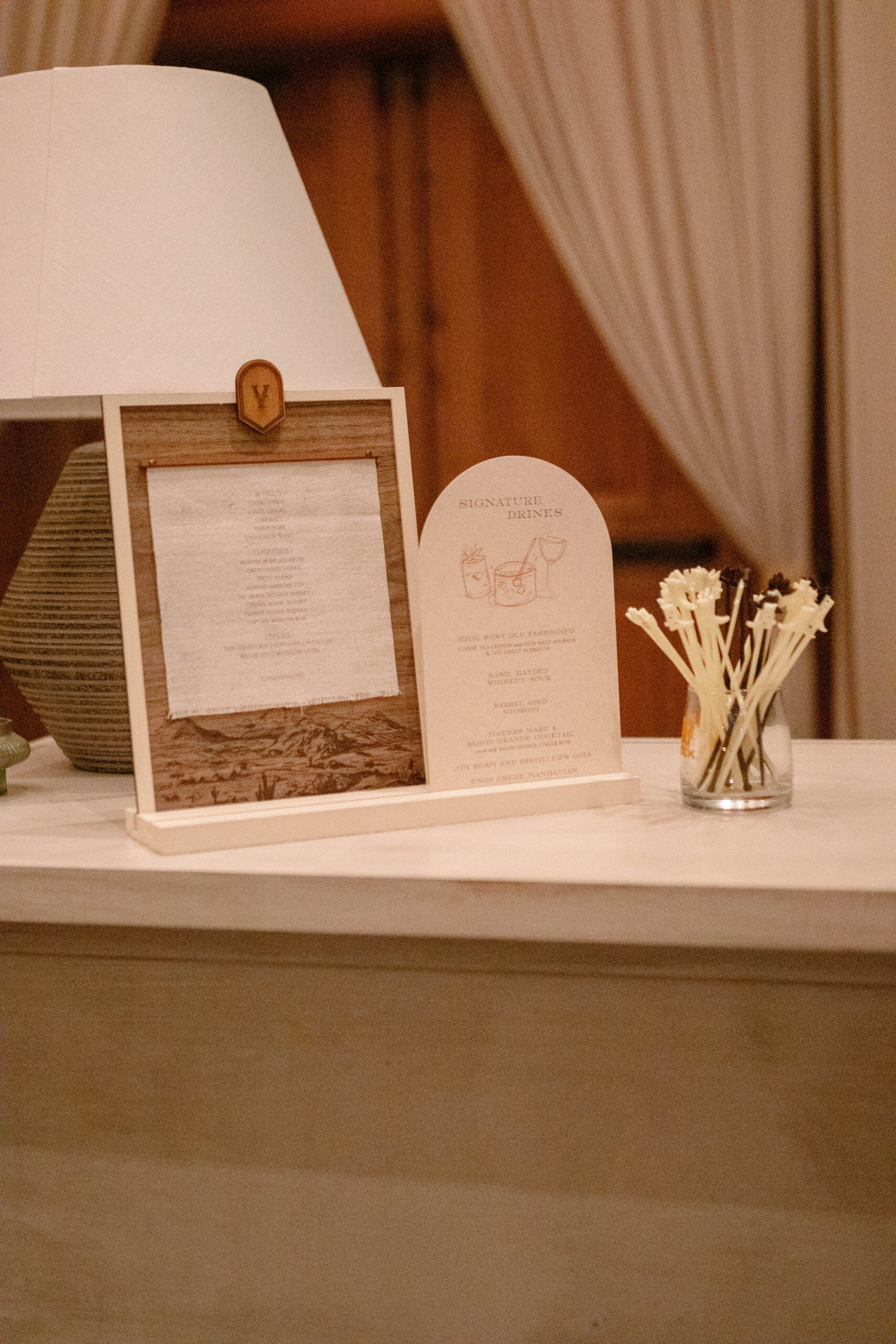
Even though they took forever to create, the bar signs for this event are my absolute favorite. Sometimes the projects that take the most effort are completely worth it! First, we printed the same pattern from the envelope liner onto the wood. Then, on the left side, we printed all the bar selections on linen and added a “V” embellishment. Then, on the right-hand side, we printed their signature drinks in the same blind-debossed pattern on their invitations. Everything for this event was curated, and I put a lot of thought and planning into patterns and combining elements for a complete, branded look.
Branded Cigar Station
Weddings have the edge over other parties since they have a built-in script. You’ll watch the bride and groom dance, witness a cake cutting, and do some dancing. But when planning a corporate event or party, you have to be very intentional with activities for guests. This event was creative and over the top, with many interactive moments for guests.
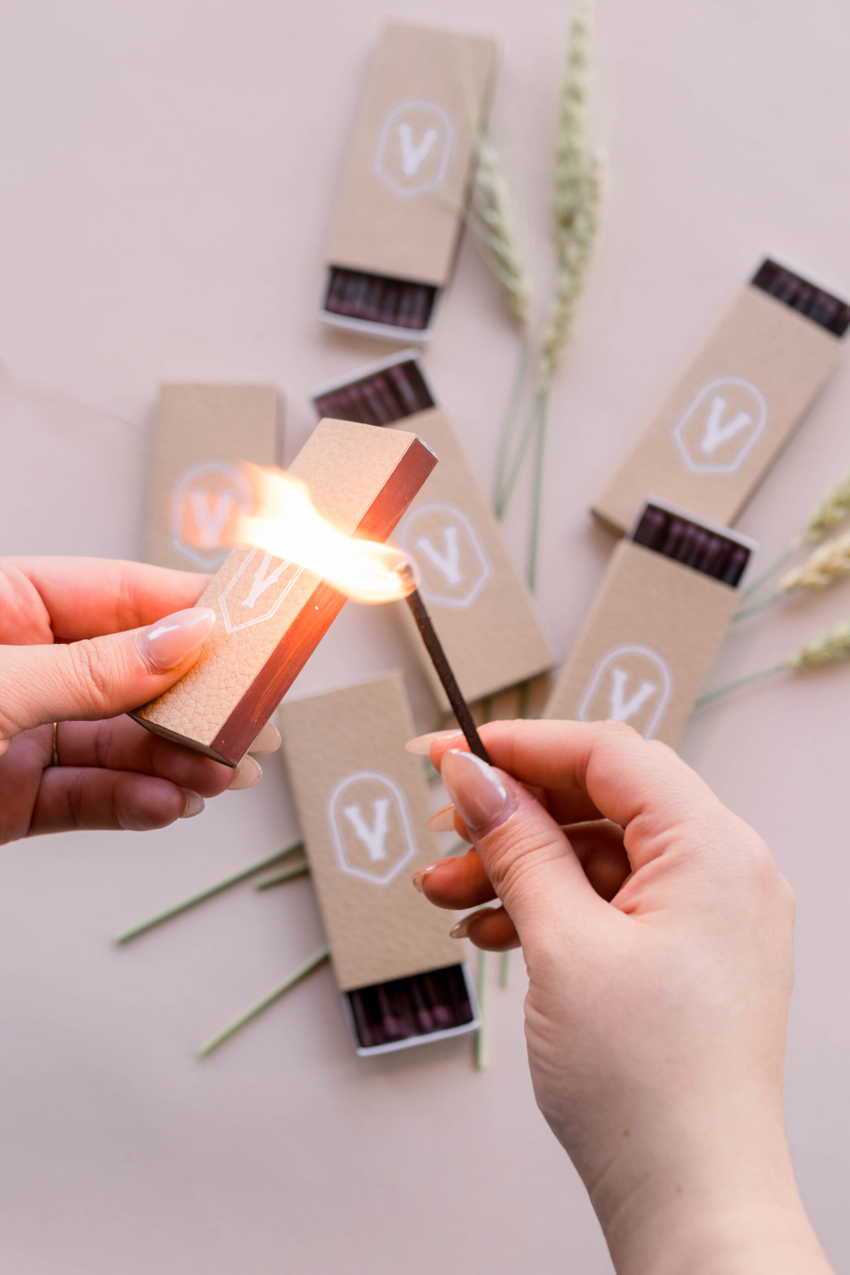
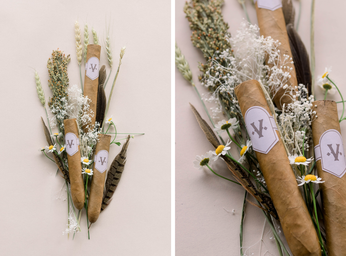
One such interactive area was a cigar roller. We created stickers for the cigars and leather-textured cigar matchboxes, which incorporated the “V” branding.
An Interactive Meal
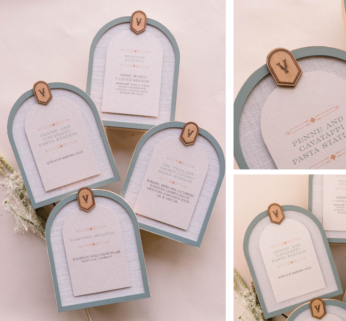
This event did not have assigned seating or a plated meal; instead, there were food stations that guests could visit. We created signage for each station, including a carving station, a seafood station, a taco station, a pasta station, a dessert station, and a coffee station.
Custom Stetsons
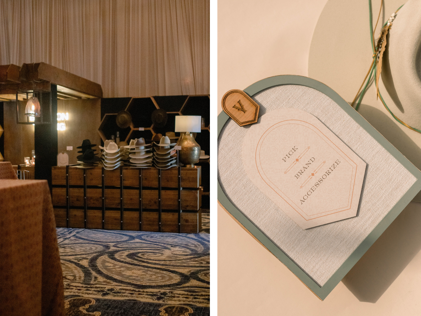
The event organizers flew a hat brander in from out of state as another interactive element. Some of the guests received an award, and they were given a wooden token with the same “V” branding that they could take to the hat brander. The token allowed them to choose a high-end stetson-style hat. The brander would brand it on-site, and they could add feathers and pins to make the hat completely custom.
Throwing Shade
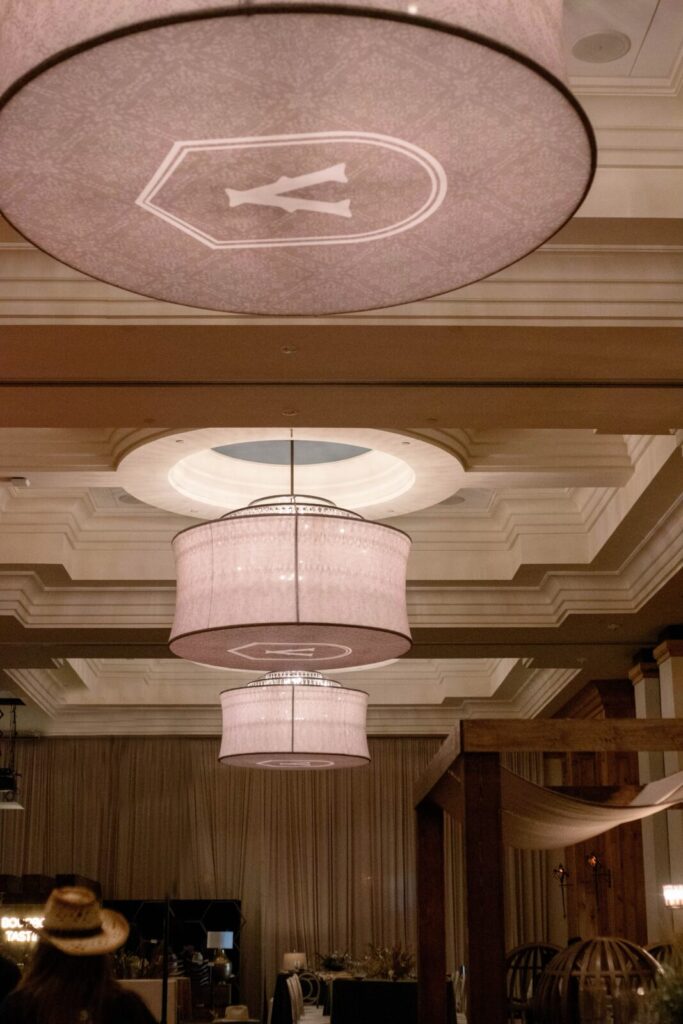
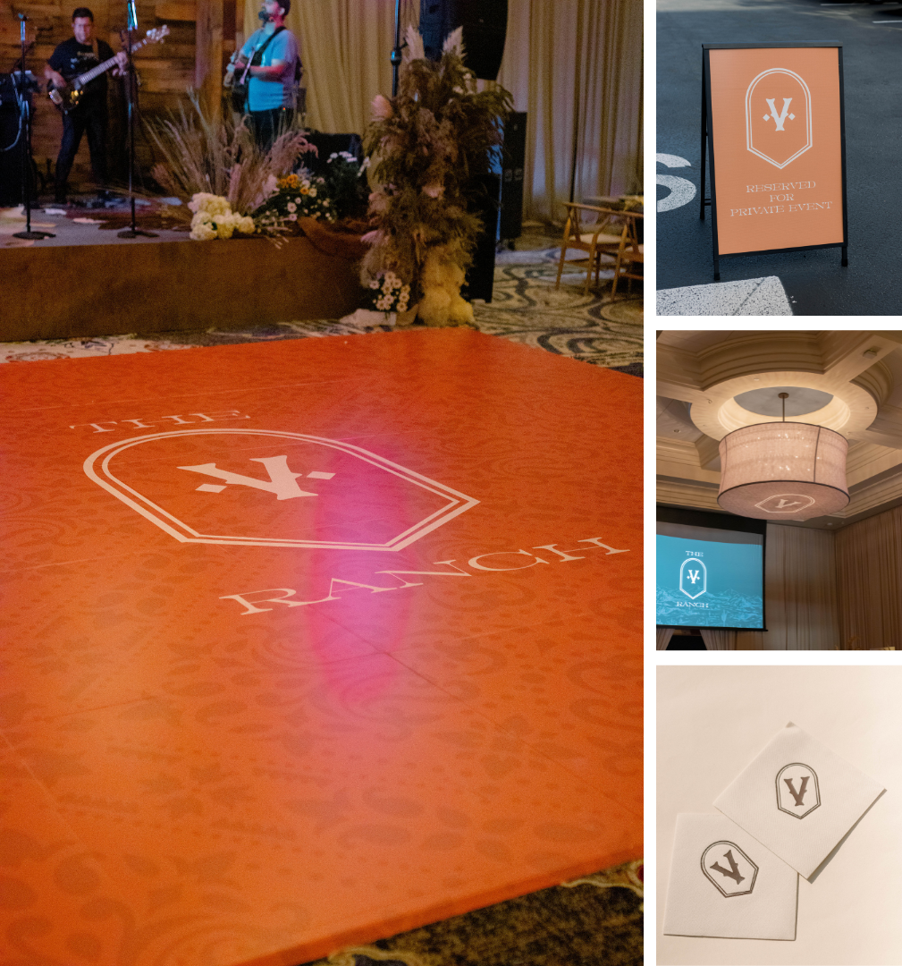
In every venue, certain decorative elements are unchangeable, but light fixtures aren’t one! The ballroom at The Brownwood has beautiful chandeliers, but chandeliers don’t necessarily lend themselves to a ranch vibe. We transformed the lighting in the room by designing custom drum shades to cover the chandeliers. Not only did these give the room a warm ambient light, but they also brought the branded “V” into the design.
The Menus
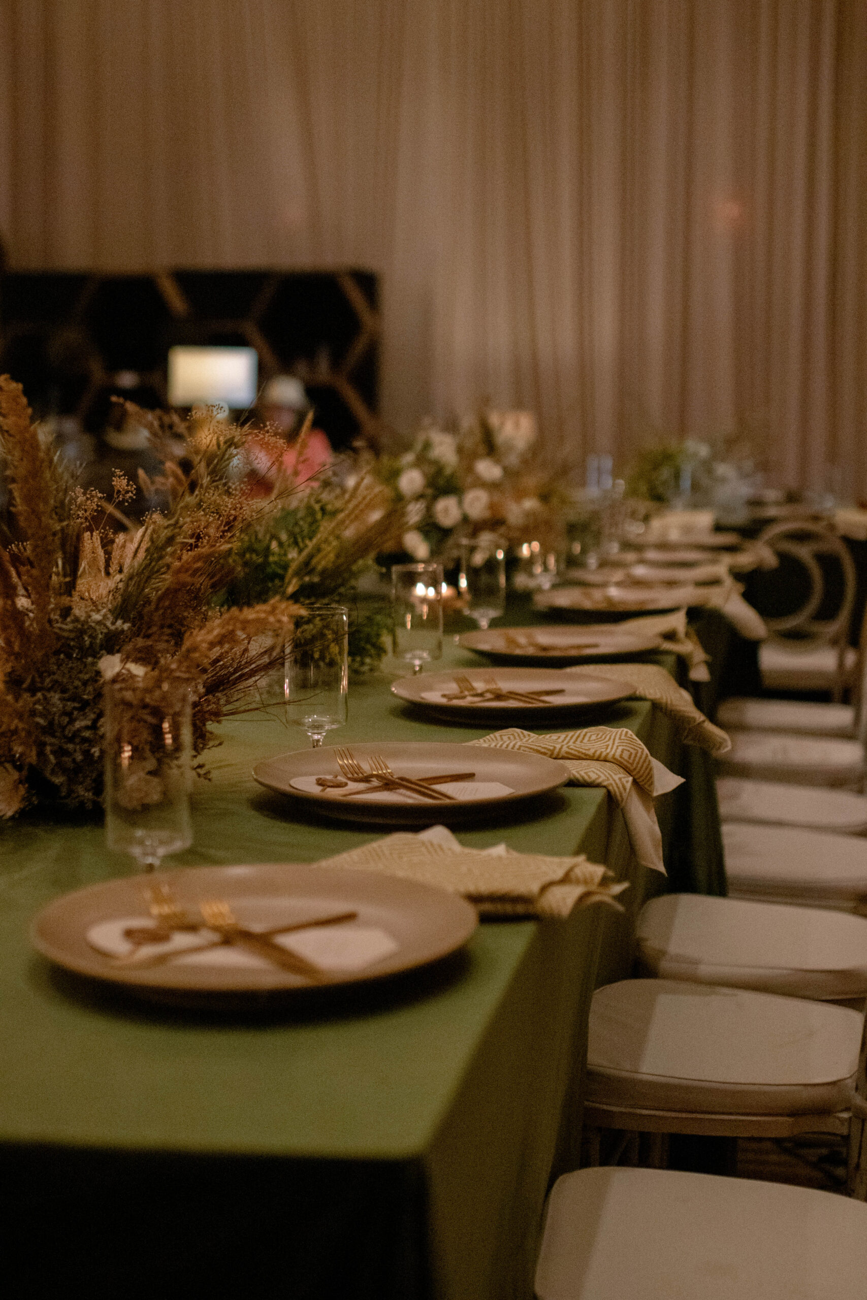
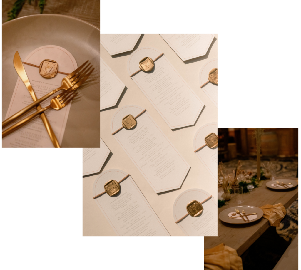
We created the menus that lay at every place setting, on tables full of perfectly chosen tableware by Glasshouse Rentals and rustic, elaborate, and romantic florals by Gather and Grace Designs. These menus held the same wax seal as the invitations, however, it was squared off, and we added a matching leather cord to bring in the look from the invitations and the gift bag tags.
Other Elements
We designed the wrap for the dance floor in warm, deep terra cotta. In addition, we designed the graphic for the projector screen to coordinate with the room’s aesthetic. We also created parking directional signs.
There wasn’t one stone left unturned (or unbranded) for this stunning celebration of The Ring Club Gathering. It was a true pleasure to be a part of this beautiful corporate event. Want to brand your next luxury party or event? Want to add some AM+Co magic to your wedding? Reach out on our contact form! We’d love to talk and bring your dreams to reality!

