December 9, 2022
Alexis + Kieran: A December Wedding to Remember
We’re heading toward the end of the year, and December is such a busy month. Along with the normal workload of weddings, we have added fun celebrations with the AM+Co team to thank them for a record-breaking and memorable year! We’ve been documenting the fun of this month on our Instagram reels in a series called Reelmas, with our December weddings and Christmas activities all mixed in. Alexis and Kieran’s branded wedding, planned by Bella Sposa Events, was a part of that. AM+Co did everything from their invitations to day-of items. I adored how everything turned out for this wedding, top to bottom!
Pretty and Warm Invitations
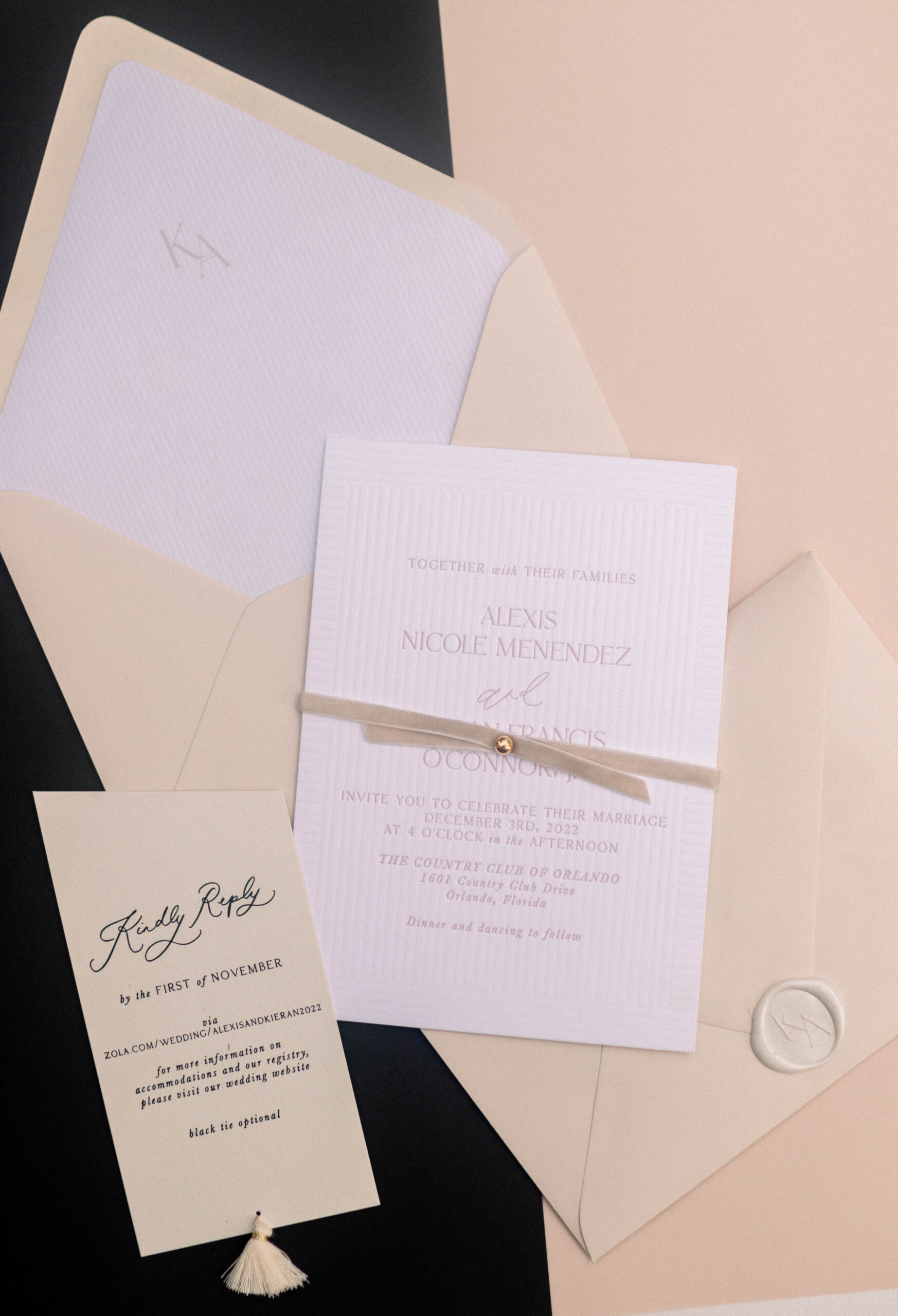
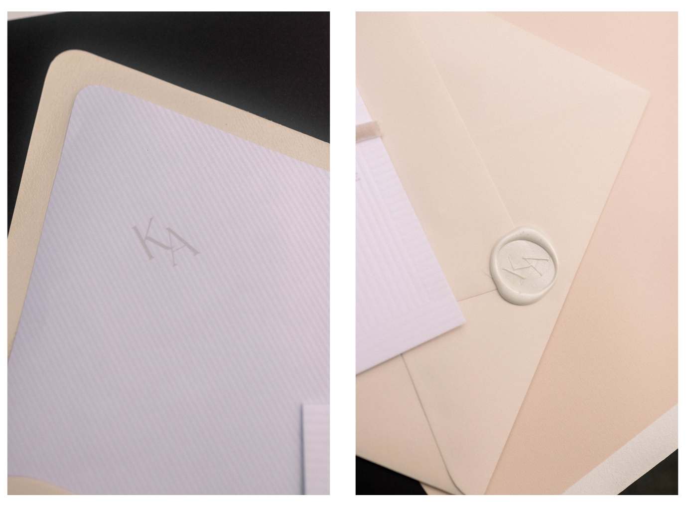
Alexis’ invitations incorporated a blind deboss line pattern similar to Mona’s, but with a twist. Their white invitations with pink letterpress were paired with a kindly reply card. Alexis didn’t use a details card, she went for a simpler and pared-down concept, but the kindly reply card had an angle cut with a tassel, and the print was black foil. The contrast of each of the elements was stunning.
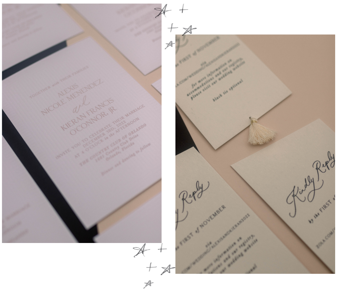
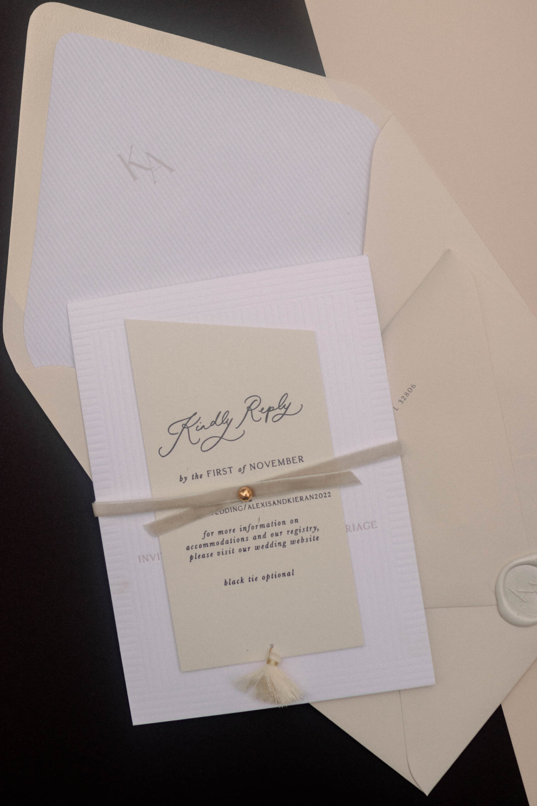
We wrapped the invitation with a taupe velvet ribbon studded with a gold ball, which gave it a very pretty and warm aura. The envelope liner had the same stripe pattern as her invitation, but we used the couple’s monogram, which we also repeated on her wax seal. What I love about the wax seal is that we used pearl wax, which was a first for us! It was a nice change from just plain white.
A Stunner of A Seating Chart
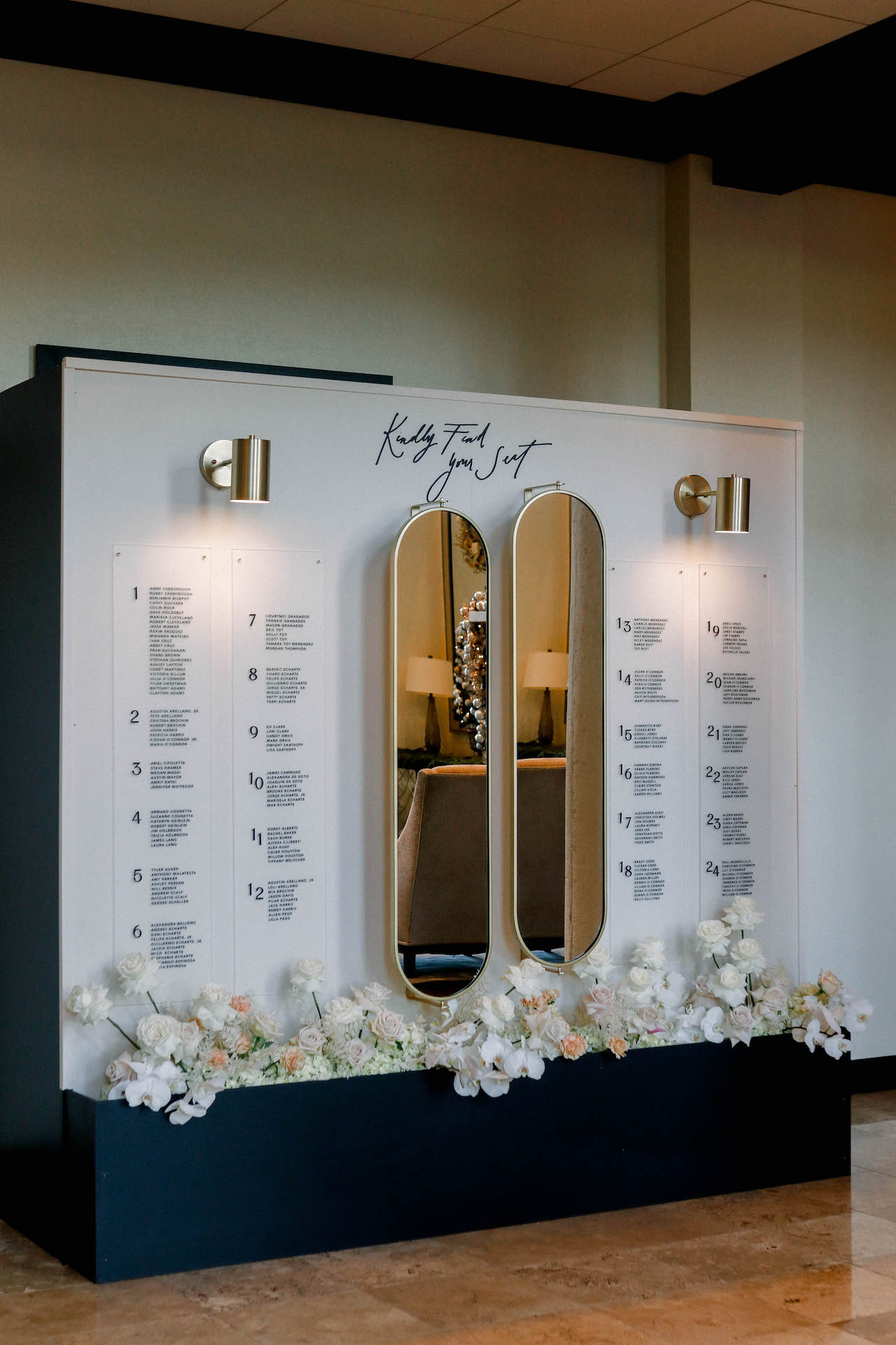
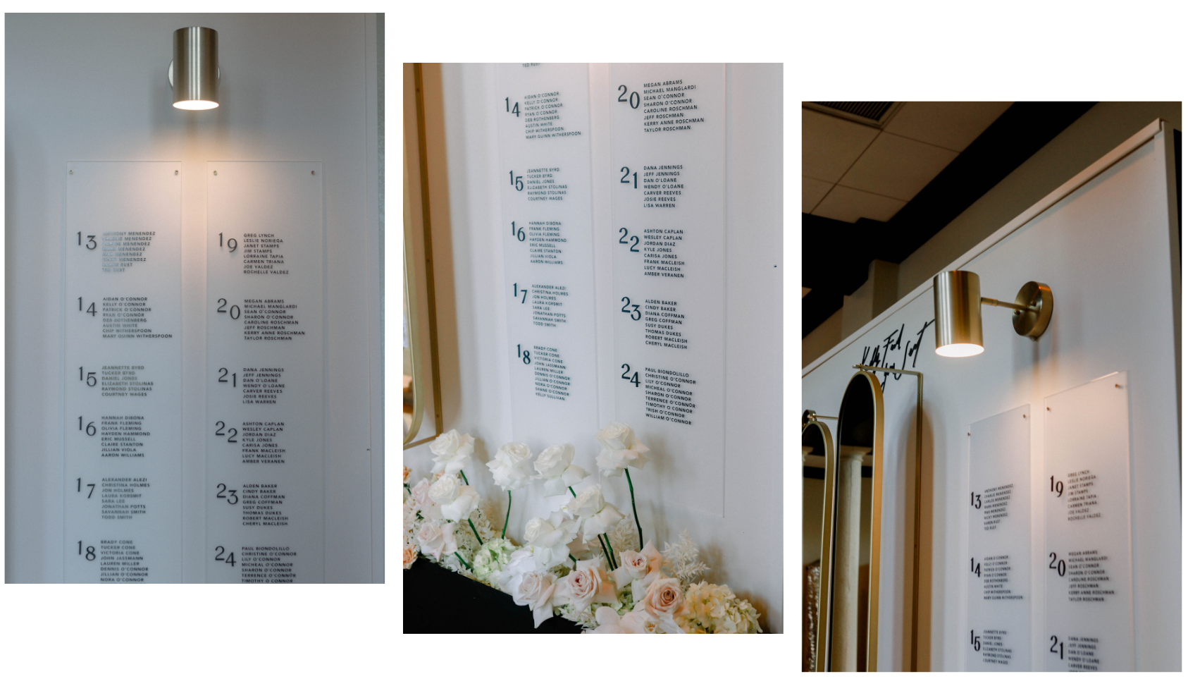
I loved what we did for Alexis’ day-of items. Her seating chart had a long, black eight-foot flower base, which In Bloom Florist filled with florals in creams and pinks. The wall portion was painted taupe with frosted acrylic panels that held the seating assignments. We added gold sconces to light the top of the panels. I love how the side panels of the seating chart carry through the black of the flower box as well.
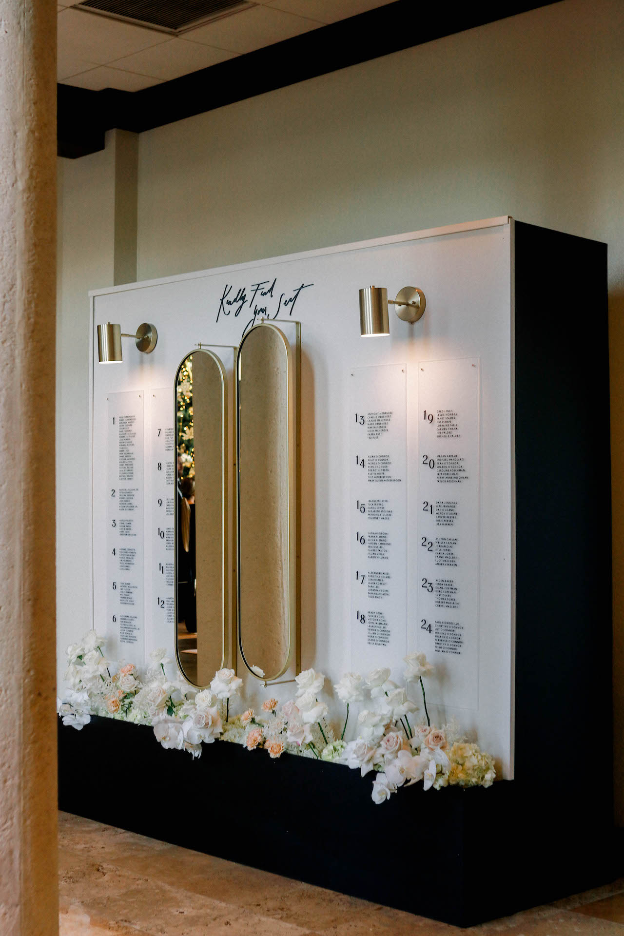
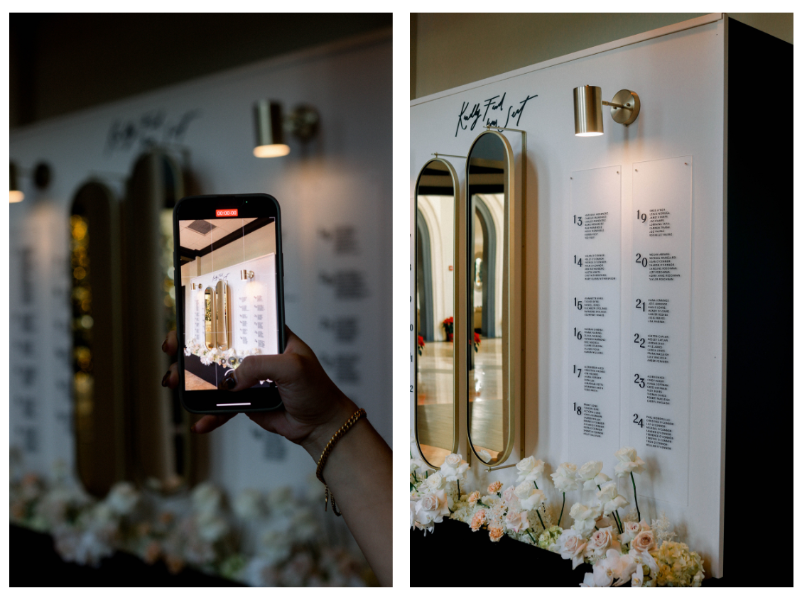
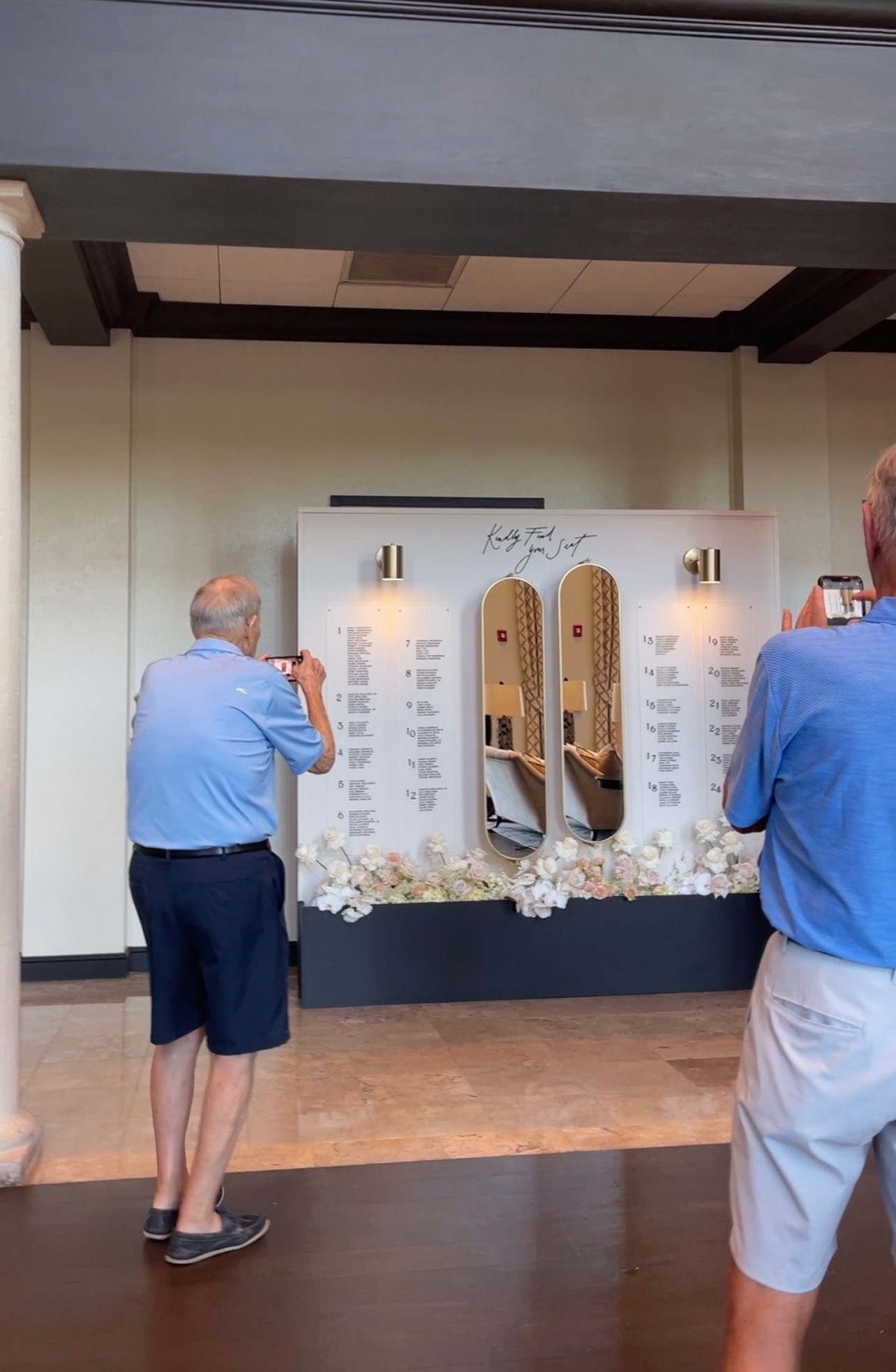
At the center of the seating chart were two beautiful mirrors from West Elm. If they look familiar, it’s might be because you’ve seen them in our office. We bought them specifically to do double duty – to make our office look amazing and to use them in seating charts. One cool feature is that they also serve as a linen corkboard, so you can swivel them to serve a second purpose. This seating chart was a showstopper. I got a kick out of seeing some of the senior golfers at the venue, The Country Club of Orlando, stop by and take photos – they weren’t even guests of the wedding! You can see it in our Instagram reel here, too.
Welcome Sign, Bar Sign, and Table Numbers
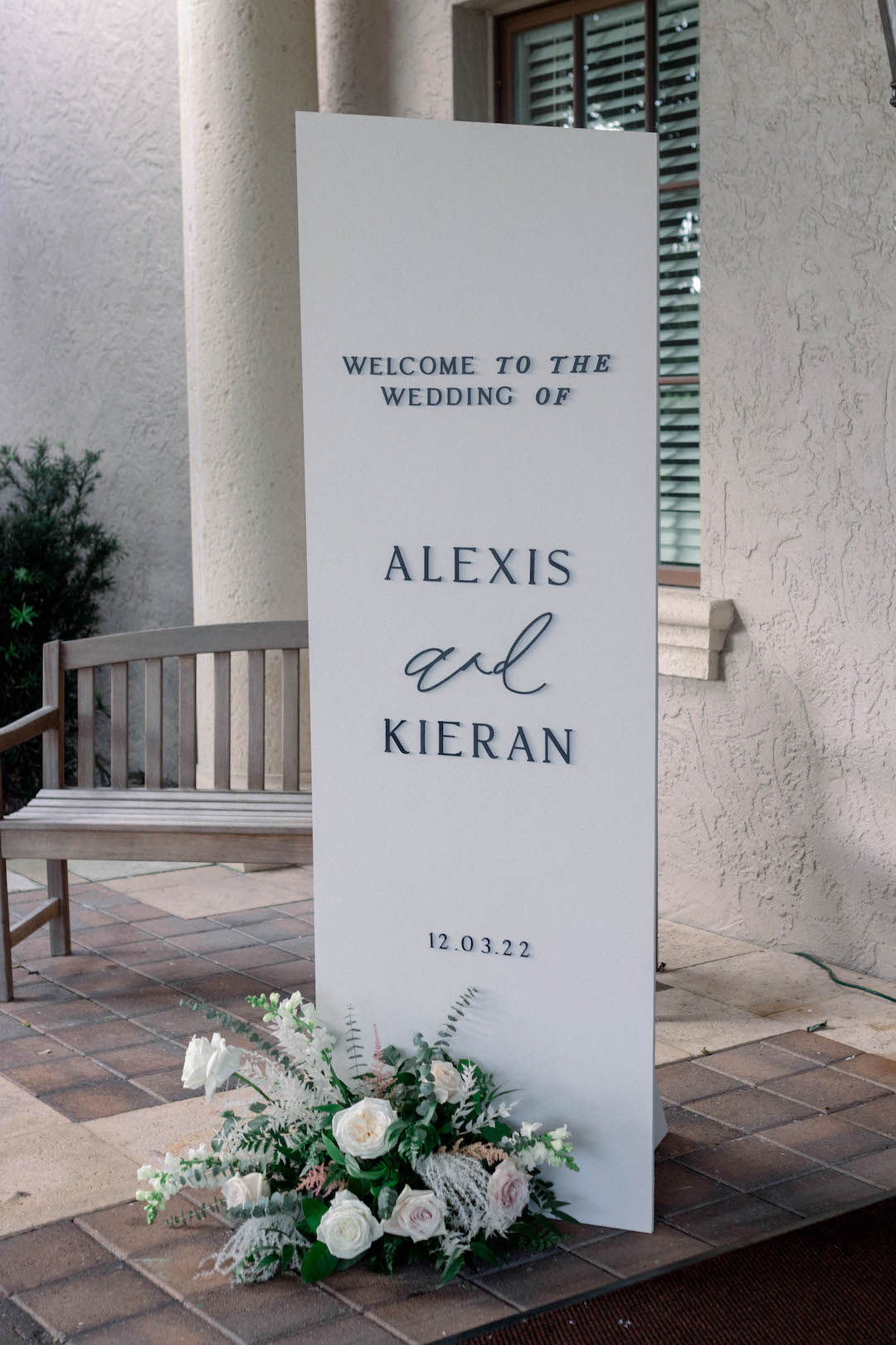
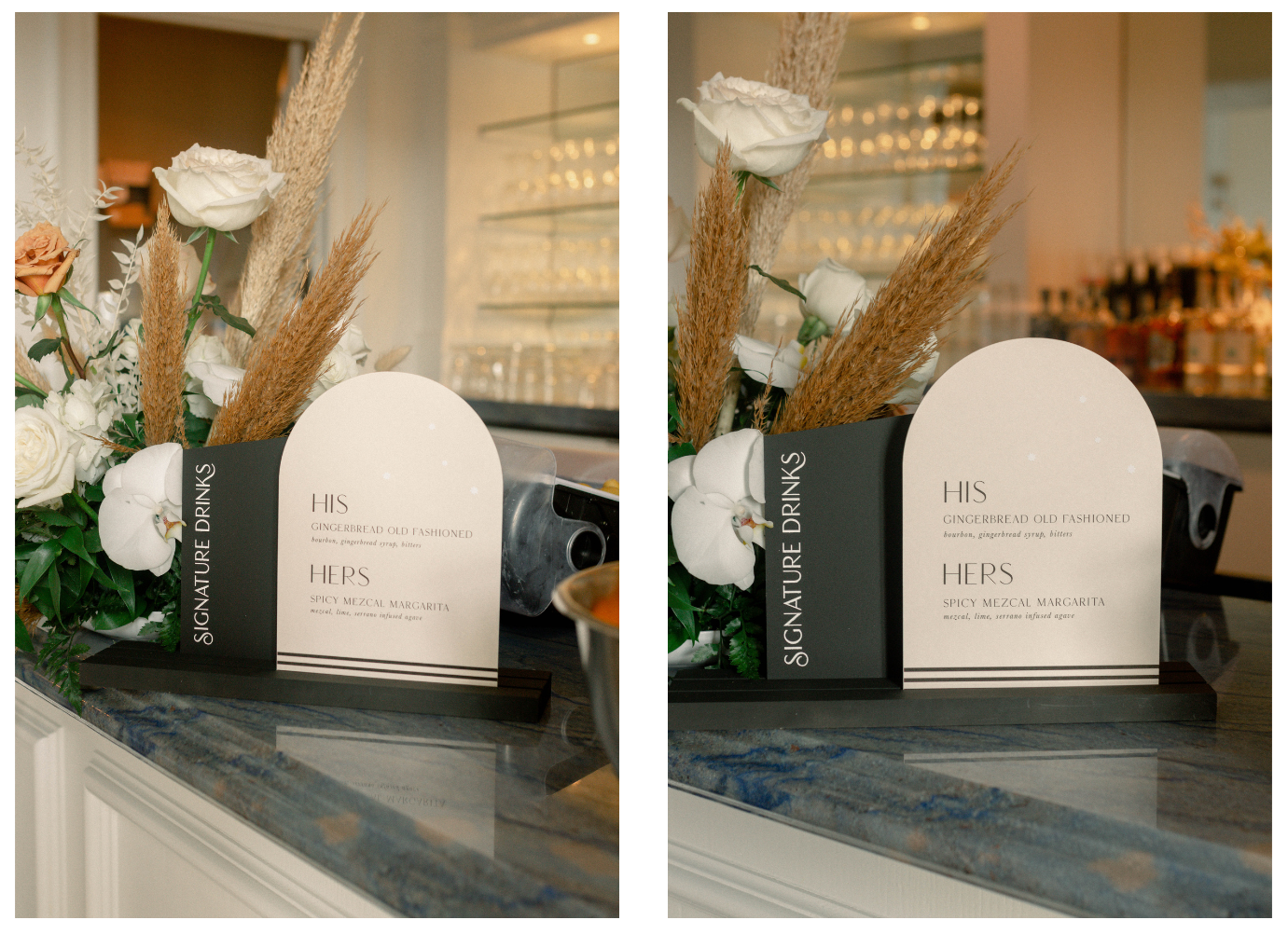
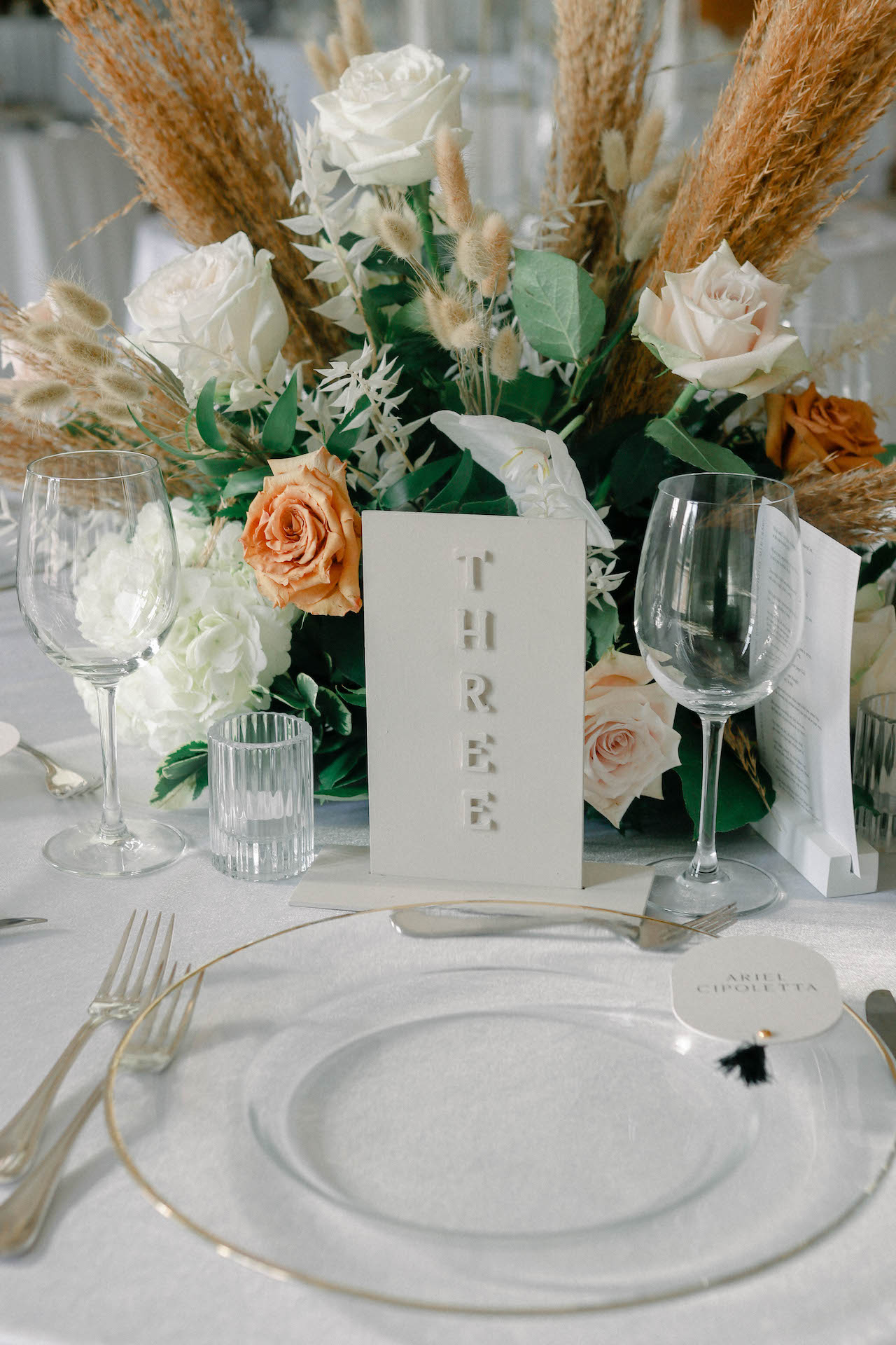
Alexis and Kieran’s welcome sign was simple, clean, and modern. And their bar sign brought through the subtle striped details from the invitation and worked in some white stars (because you know AM+Co is all about the white stars!). We used our stone table numbers, which are available as rentals if we deliver.
An Unexpected Placecard Color
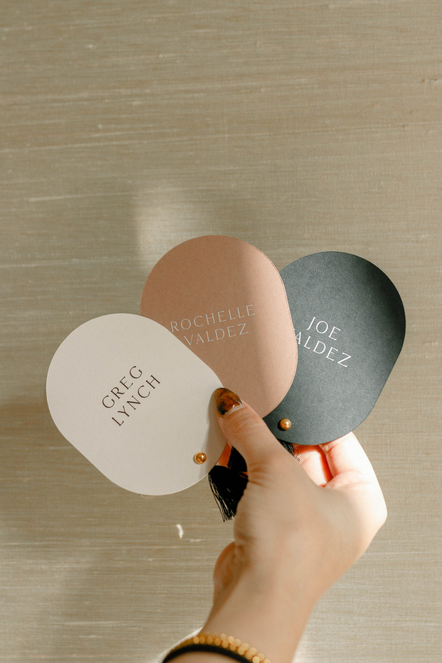
The place cards were one of my favorite things about this wedding. There are some important things to keep in mind when you create place cards. If you’re using them to indicate meal choice for the waitstaff, then it’s important to choose colors that you can differentiate in low lighting since dinner hour is usually dim and romantic at a wedding reception. So, for instance, it isn’t advisable to do white and cream since it would be challenging to tell those two colors apart. For these place cards, each one had a black tassel, calling back to the invitation suite. But along with the taupe and black, we worked in brown, which was an unexpected choice. She didn’t use a lot of brown in her wedding, but it matched nicely, especially with neutrals in the pampas grass in the florals at each table.
Take a Bow(Tie)
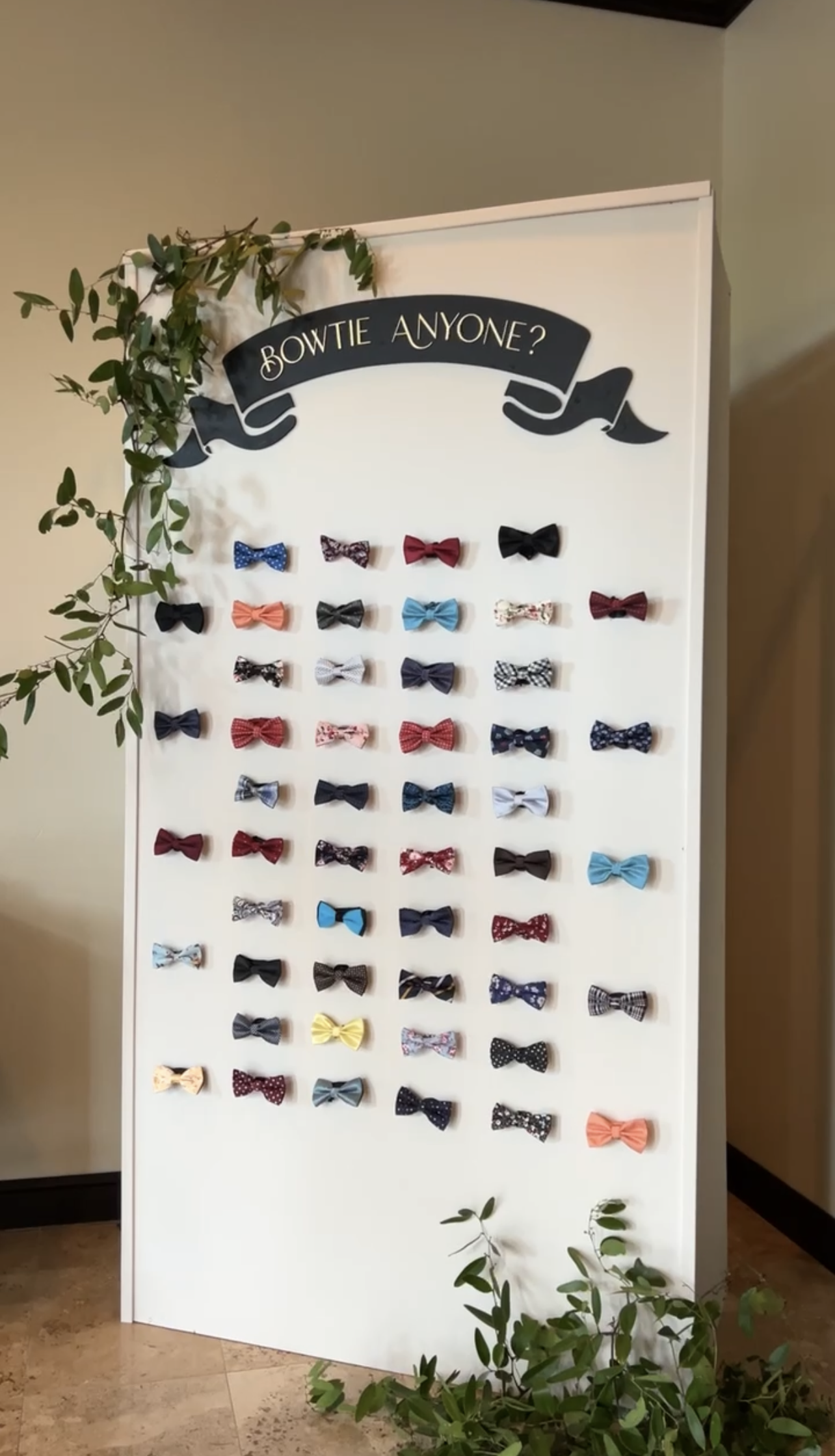
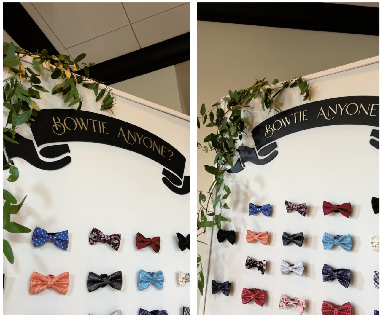
One of the most unexpected and fun pieces we did for the wedding was a bow tie wall. Alexis wanted guests to be able to put on a crazy bowtie for the dance party. So we made a wall to display all of the options.
This was a romantic and modern wedding, and we loved the opportunity to put the AM+Co touch on it! If you’d like to work together on your upcoming wedding, reach out now! Our calendar is filling up for the coming year, and the earlier you can connect with us, the better! Love is in the details, so let’s make every detail of your day speak of the love you have for your significant other and for your friends and family!

Leave a Reply
You must be logged in to post a comment.
[…] couples choose to use color on the place cards to indicate meal selection, like Alexis and Kieran and Nancy and Trevor. This simplifies service for the wait staff, ensuring a seamless experience […]