November 15, 2022
Using Your Wedding Venue for Design Inspo: Alanna and Kyle
Choosing a venue is a massive commitment in your wedding planning process. It’s one big decision upon which many other decisions hinge. The options for venues are seemingly endless. Will you be married locally or have a destination wedding? Will your ceremony and reception take place indoors or outdoors? Will it be in a ballroom or on a beach? At a country club or on a yacht? At a historic site or in a mansion? At a vineyard or in a botanical garden? Or perhaps an art gallery or a resort? Each choice comes with its own implications for how your wedding day will flow, feel, and look.
Working With Your Venue
Some venues are a blank canvas that you can completely transform to suit your vision for the day. But what if the venue you select has very distinct features that you cannot change? Do you work against them, or do you embrace them and work with them? Today I want to talk about capitalizing on the distinctive features of a venue and using them to your benefit by highlighting the wedding of Alanna and Kyle. They held their October wedding at the Don CeSar in St. Pete Beach, Florida.
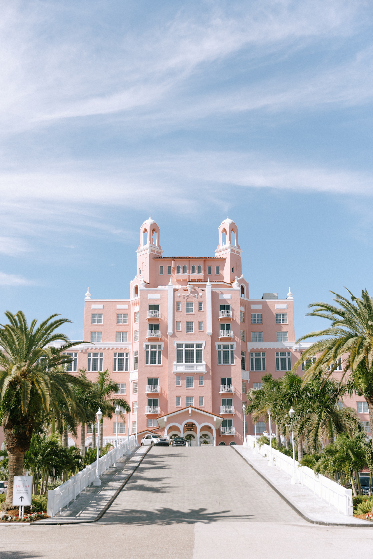
Photo: Faith and Cody Photo
The Don CeSar is a beautiful, Spanish-style hotel that opened in 1928. Located on the sugary sand of St. Pete Beach, it was a huge destination for celebrities at the time and is now on the National Register of Historic Places. However, one of the most distinctive things about the Don CeSar is its color. It’s known by everyone as “The Pink Palace” because its rosy color can be seen from miles away.
Leaning Into the Uniqueness
Now, if pink isn’t your thing (can you even imagine?), the Don CeSar is probably not the venue for you because you will spend a lot of time, energy, and budget disguising and hiding one of its most signature elements – the color. But Alana and Kyle leaned into the pink and incorporated the style of the hotel in many elements of their day, while adding black accents that modernized and elevated the look. I probably wouldn’t have thought to combine these colors, but I grew to love this color palette and thought the pink hotel with pink tones in the invitations combined with the black accents was really pretty!
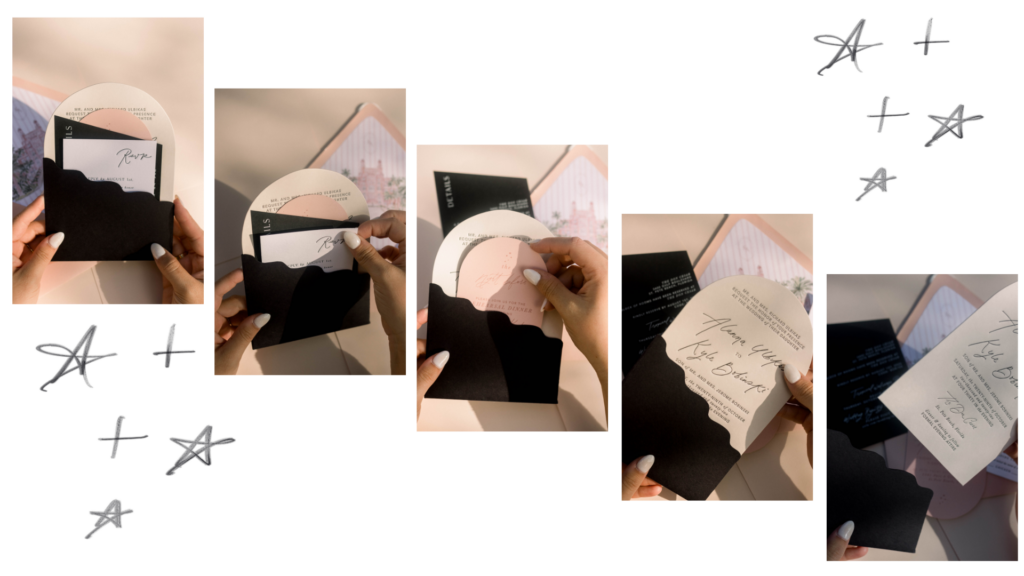
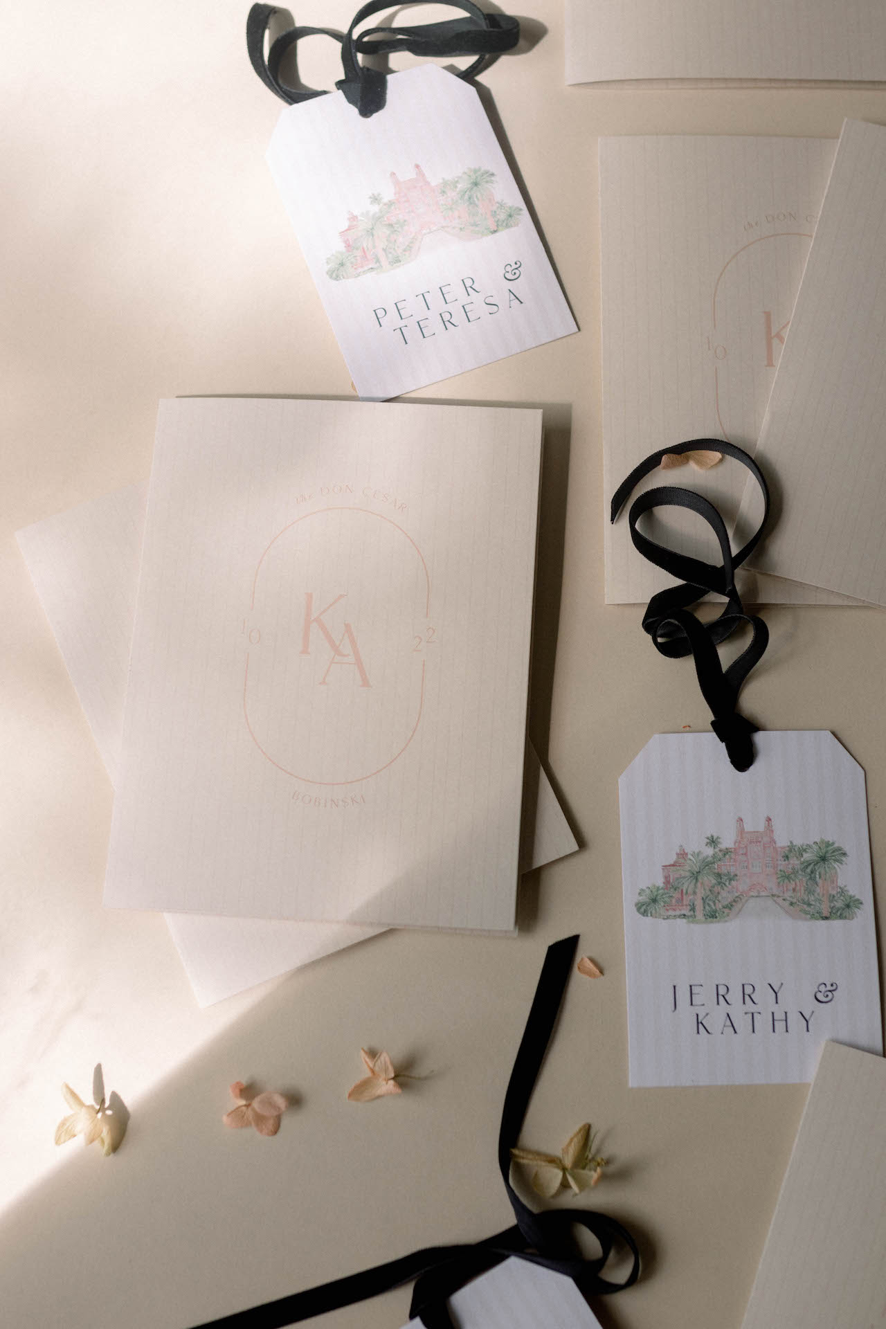
The Invitations
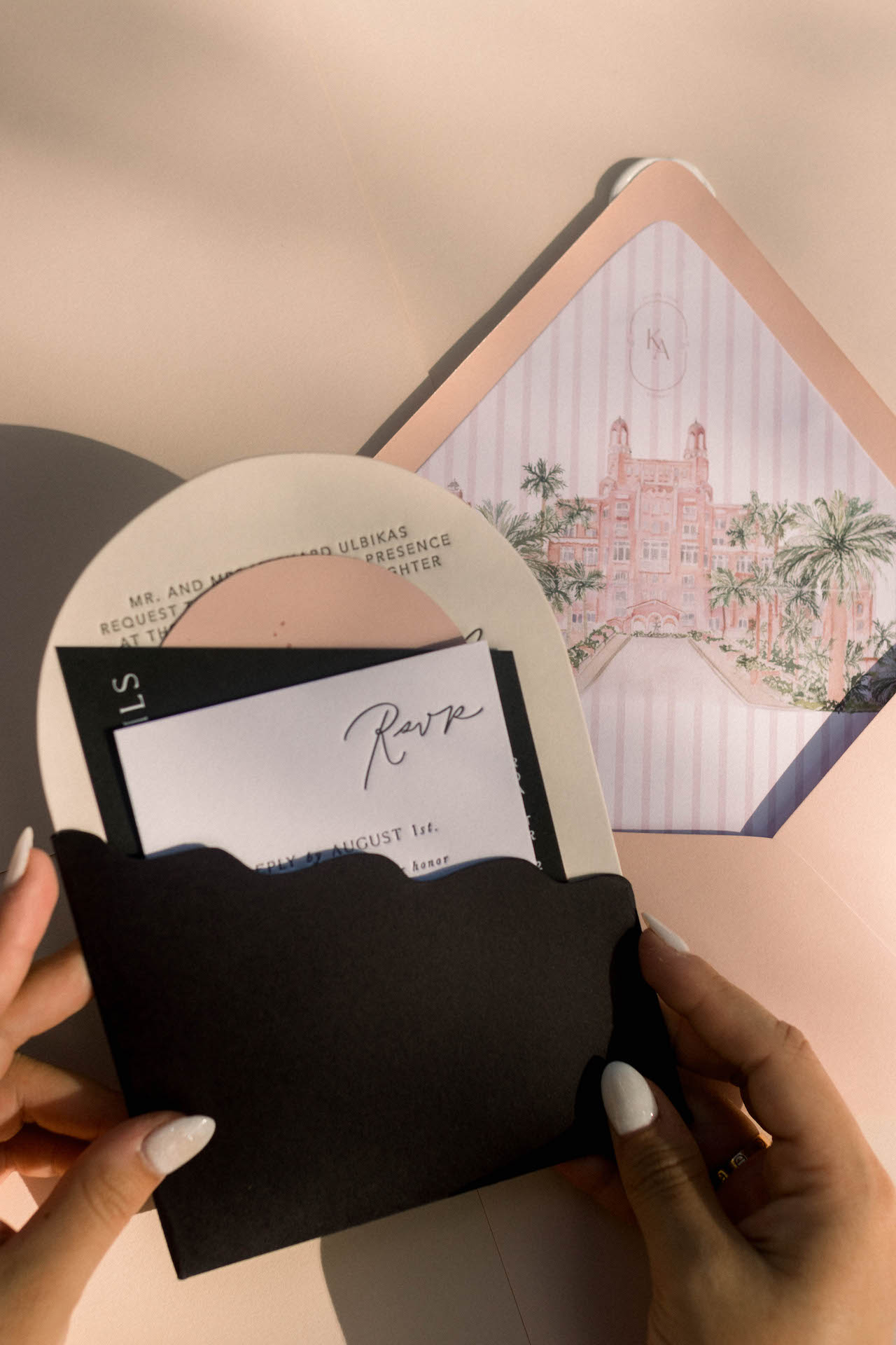
With Alanna’s invitation, we played on a pocket idea we originated with these invitations. This time we created a black pocket, and her interior cards were a variety of shapes. Her main card was an arch-shaped letterpress on chardonnay-colored paper. Some guests received a card with details for the rehearsal dinner, which was pink and pill-shaped. Her details card was a diagonal-cut black piece. And her RSVP was a regular rectangle in white. I love how all the colors reflected the hotel’s look, and the arch of the paper called to the arched windows of the hotel.
Welcome Bag Tags
I love when couples go all out to welcome their guests with unique touches. Alana and Kyle prepared welcome bags for each of their guests. We customized tags with each couple’s name, the venue illustration, and the stripes. It was attached to the welcome bag with a black velvet cord for a completely branded look.
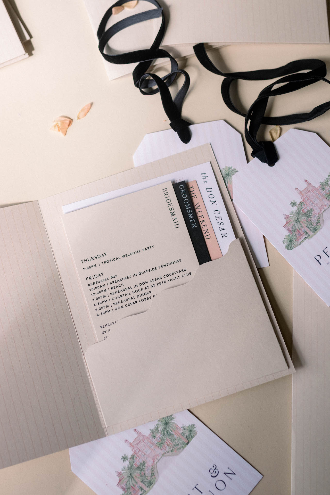
The Welcome Booklet
A welcome booklet reinforced the invitations with the same pocket on the inside. Again, we did a soft pinstripe, not as chunky as the liner, but very thin to give it a little bit of visual texture. The pocket held cards in pink, black, taupe, and white.
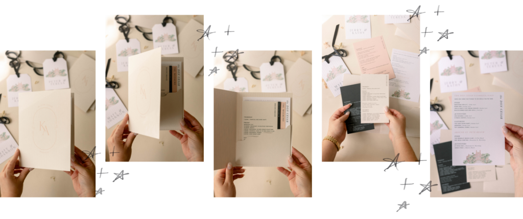
Each card was different, and depending on which events the guests were a part of, the booklet was customized to their weekend. The Don CeSar card had a list of things to do at the hotel. The weekend card held the weekend event itinerary, including the Welcome Party and Day-After Brunch. There was also a Bridesmaid card and a Groomsman card that detailed where the bridal party needed to be at all times. Each guest received the cards that were relevant to them for the weekend. Some couples only received the Don CeSar card and the Weekend card, while others received everything if they were in the bridal party. This bride was very organized (✨love to see it✨).
Signs
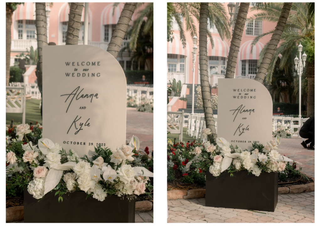
The welcome sign was a sail shape in the same color as her invitation, with our flower box base, which we also did for Jackie’s wedding. Gather and Grace Designs did a beautiful job with the flowers.
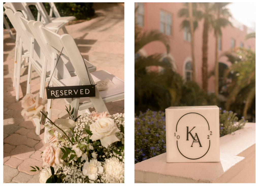
We made reserved chair signs, similar to the ones we did for Taylor’s wedding. They were black with white lettering for the aisles. We also made a custom card box with their monogram, a K and A with a 10 and a 22.
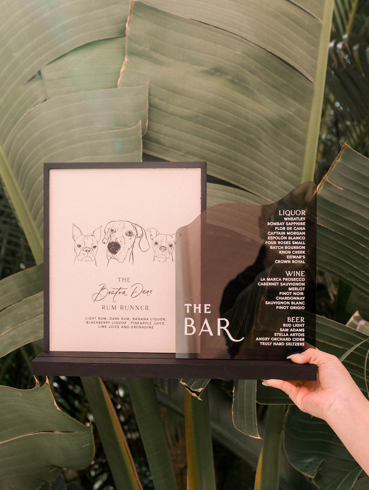
Alanna has three adorable dogs- two Boston Terriers and a Great Dane. We worked them into the bar signage with three puppy illustrations on the left side, and then a smoke acrylic engraving on the right side where it lists liquor, wine, and beer.
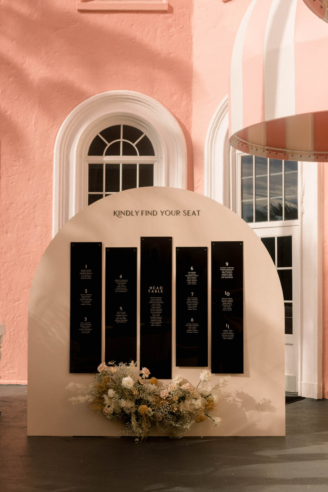
The Seating Chart
The seating chart was an arch, like the invitation, with black acrylic panels. Florida wedding problems – it was SO HOT setting that up! I love that this seating chart was a whopping 8 feet tall! We’ve done an arch seating chart before, but never this tall. The size was breathtaking and very clean-looking. After Gather and Grace added florals, it was elegant and simple, but the shape of the seating chart called to the arches in the windows gave this wedding an overall cohesive look.

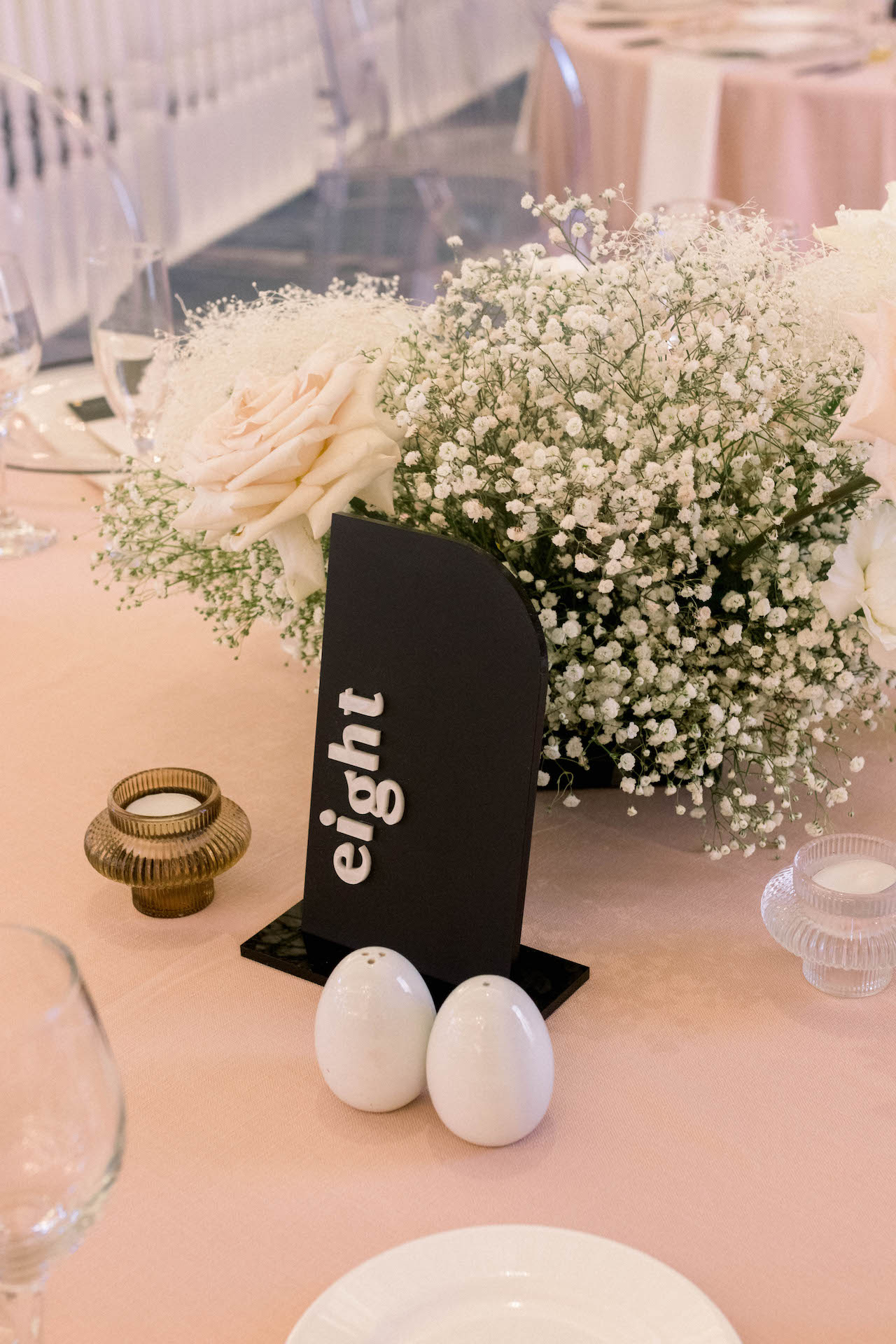
On the Tables
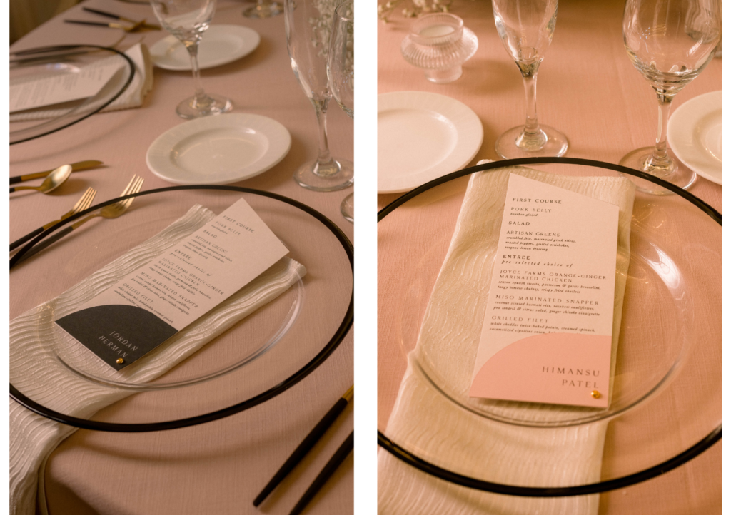
Alanna and Kyle used our black and pearl table numbers from our rental collection (available if we deliver). We also designed their menus, which held a diagonal cutline, similar to the invitation details card. The place card was attached in pink, black, and white. The card’s color indicated the meal to assist the waitstaff in serving.
When You Can’t Lean In
At the last minute, about four days before the wedding, Alanna and Kyle decided to add an alcove-type sweetheart table. The best table placement was in front of a set of draperies, which could have been better aesthetically, so their planner, Woven and Revel, reached out about creating a background for the table. This would create a focal point to draw the eye away from the draperies and place the focus instead on the couple. Thankfully, we were able to add it to our production schedule (we can produce with a fast turnaround if we have time in our schedule – just ask!). They repurposed the ceremony florals around their table, and it brought this table to life!
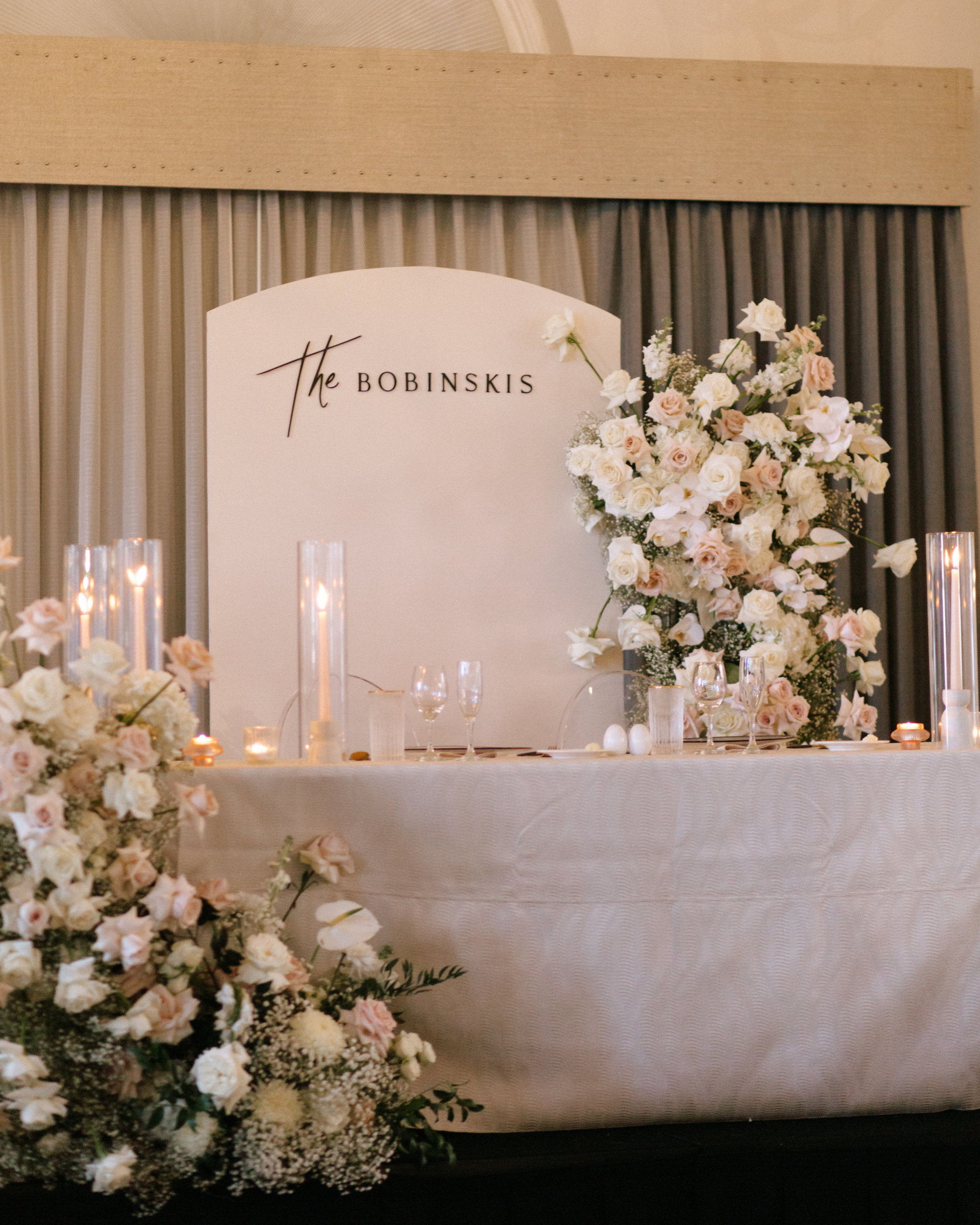
Photo: Faith and Cody Photo
This is a great example of what to do when you can’t work with the environment in your venue. When you can’t work something into your aesthetic, make the best of it and create focal points that draw the eye toward specific places you want people to look.
If you have your venue selected, we’d love to work with you on your branded wedding experience! Contact us today, and let’s start dreaming!


