October 4, 2021
A Branded Wedding Experience: Natalie + Alkibiades
We had an exciting weekend kicking off the most packed-out wedding season we have ever had! Natalie came to us over a year ago because like so many 2020 brides, her wedding was postponed due to COVID. She initially hired us to do her “change the dates,” and then she brought us on to do her entire wedding. In many ways, she was our dream client because she entrusted us with the look of her entire wedding. We handled the stationery, day-of paper, and the signage at her Miami venue. Natalie’s wedding is a great example of how seamless every detail can look when you work with us to create a branded wedding experience. Each piece is intentional and custom, not pieced together from different retail sources. So how do we make a branded wedding experience?
It All Starts with the Invitation
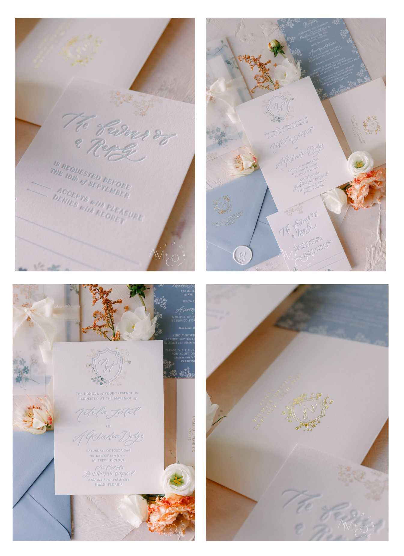
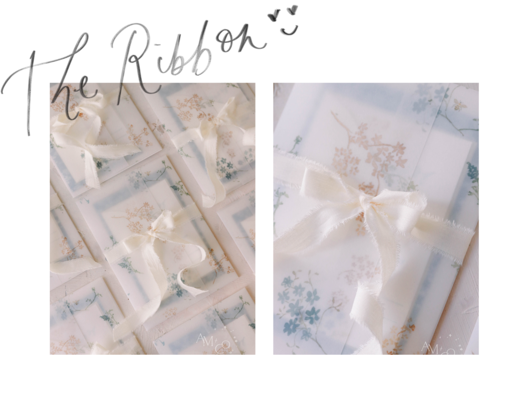
The invitation is hugely important. It gives your guests the first impression and sets the expectation for what they can look forward to at your wedding. Once we get the invitation perfect, we try to run back every detail for the event to that invitation. The day-of stationery and wedding signage carry the initial vision. For Natalie’s invitations, we incorporated a beautiful vellum jacket and silk ribbon along with the pale dusty blue. You can see elements of this vision echoed in her wedding from start to finish, and when it was all put together it was simply magical (**chef’s kiss**).
Natalie’s invitations had three pieces, like many of our suites. The first piece is the main invitation, which has the location where you want people to first meet you. The second piece is the details card, which has reception information, accommodations, and anything else you’d like your guests to know. Finally, we have the RSVP card where guests (you guessed it!) RSVP for the wedding. Natalie chose letterpress invitations, which give a debossed look, and digital printing for the watercolor aspects. And her custom monogram was an element that was carried throughout the day. 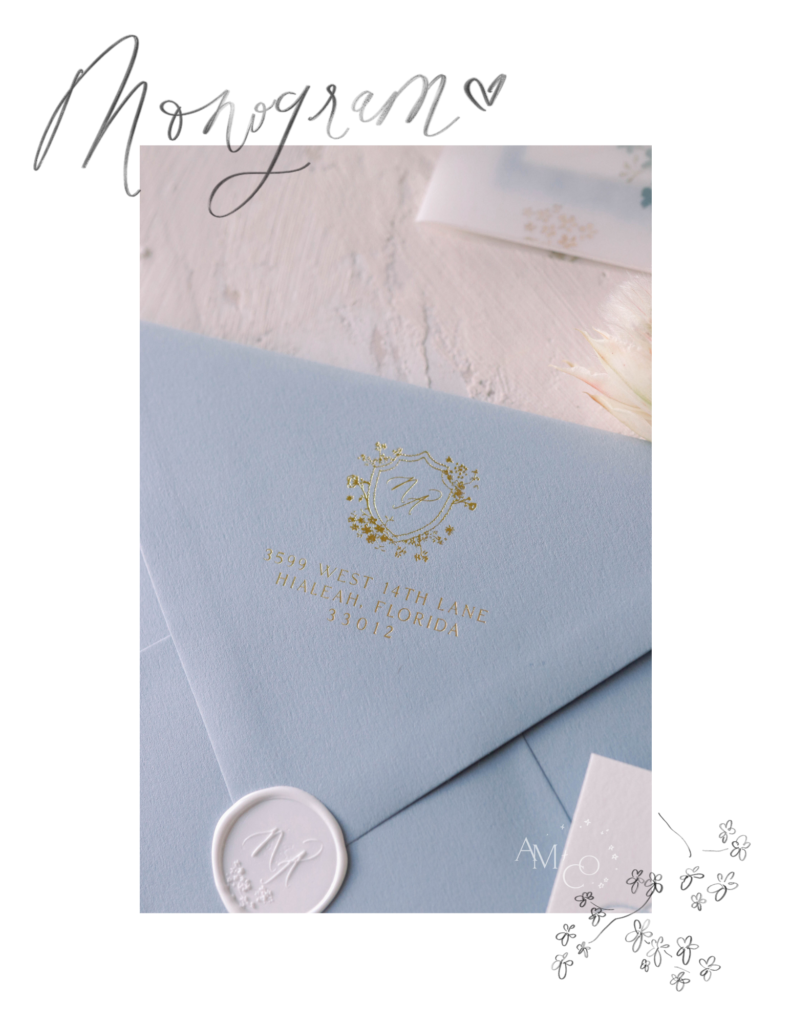
Next Stop: Programs & Ceremony Signs!
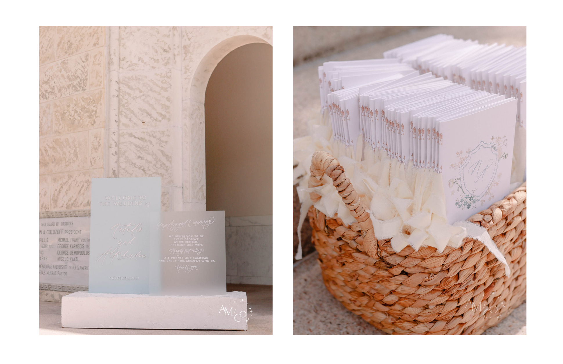
After arriving in Miami, our first stop was the ceremony venue, a stunning Greek Orthodox church. We dropped off the programs as well as the Welcome & Unplugged sign. These two signs used our concrete base double stand, which is one of our rentals. The frosted acrylic welcome sign calls back to the vellum in her invitations.
Natalie provided a basket for her programs and one of her best friends distributed them to guests upon arrival. Tying in natural elements like this wicker basket was important to her. And we used the same silk ribbon from the invitation on the edges of the program.
The Final Piece: Reception
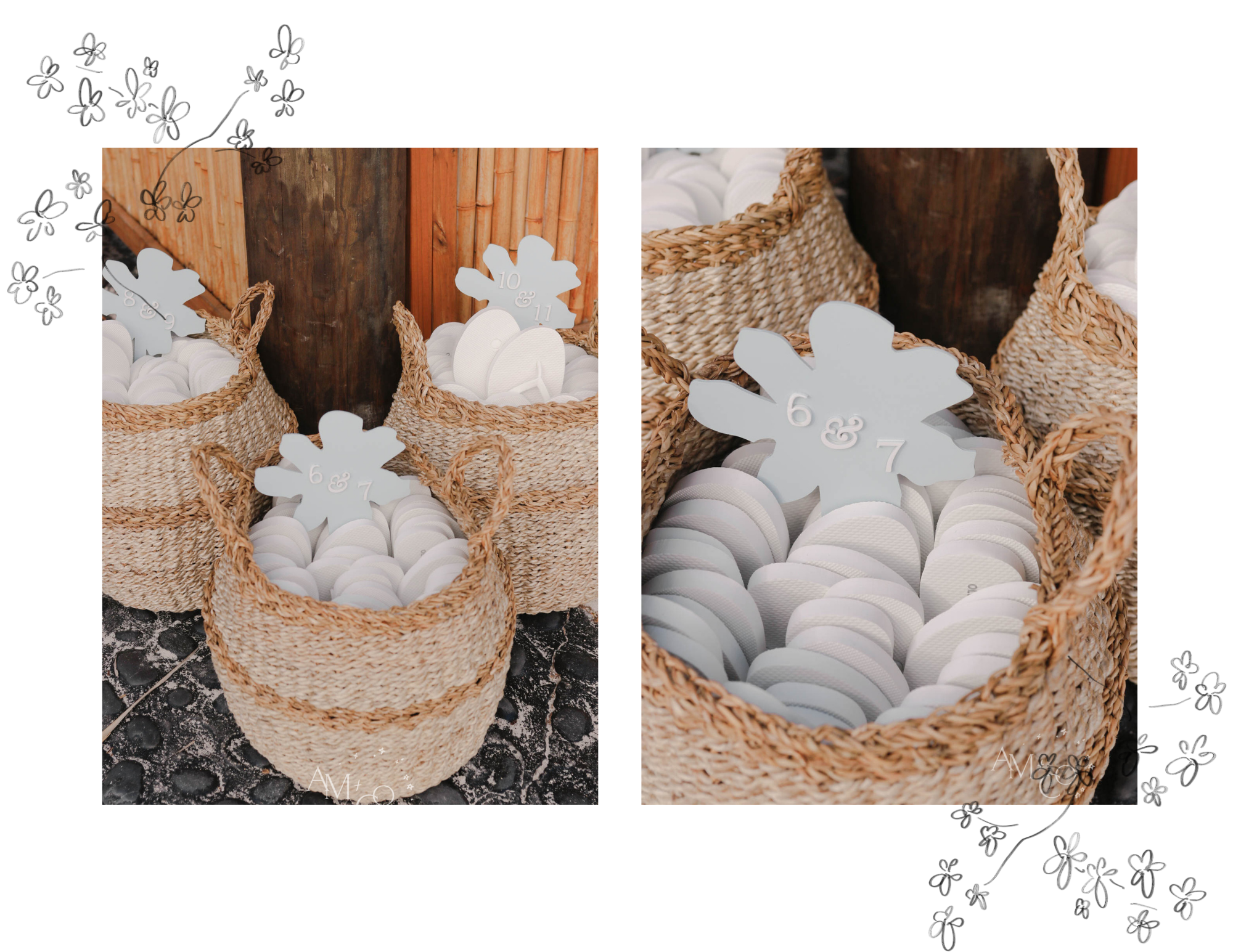
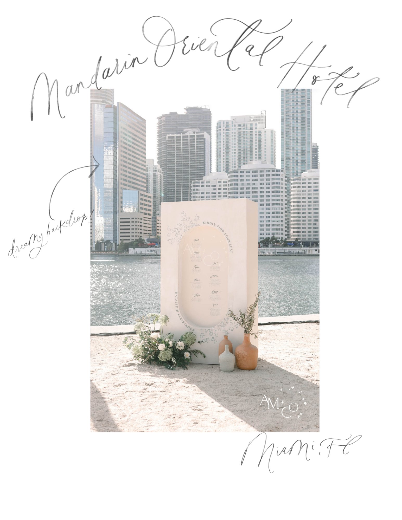
The reception took place at the Mandarin Oriental Hotel on Brickell Key. It was very sandy and the bride anticipated how uncomfortable that could be for guests wearing heels, so she had white flip flops for everyone, organized in baskets by size. We made the size signs for the baskets by pulling a flower shape from her invitations and laser-cutting the numbers. It’s all in the details!
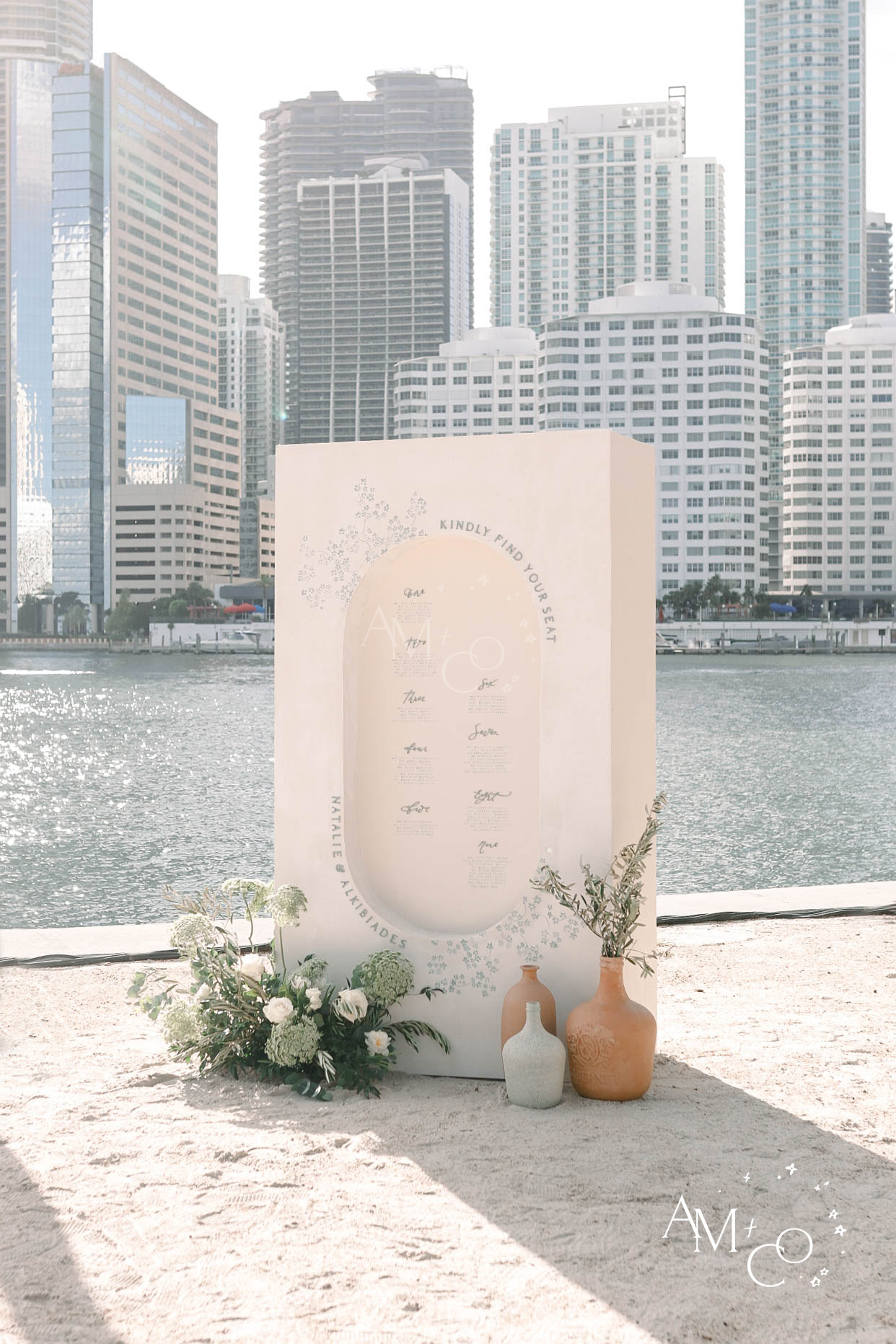
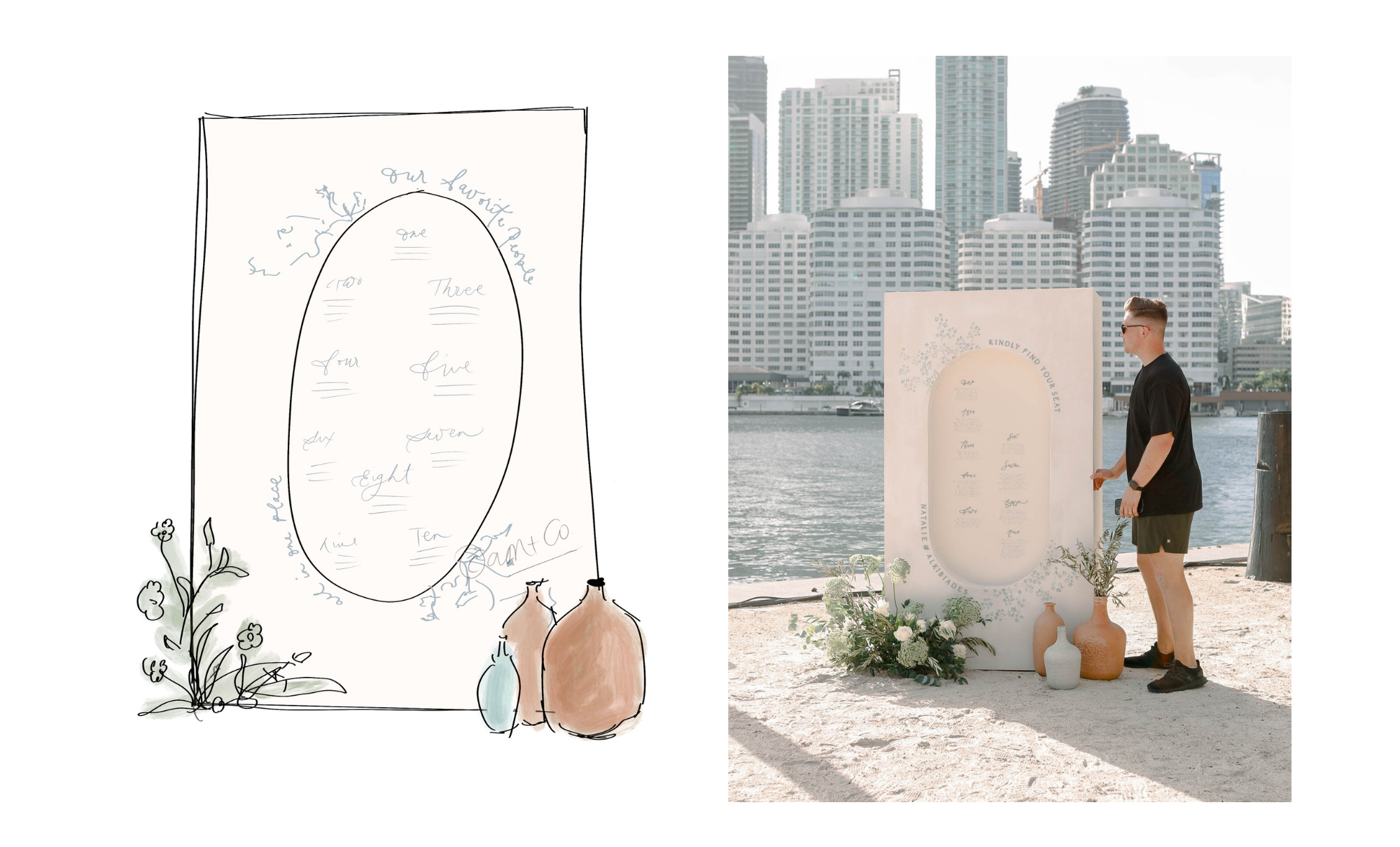
The piece de resistance of this wedding was the seating chart. It always cracks us up when we work with a wedding planner for the first time – when we arrive and ask them where they’d like us to put the seating chart, they’re usually like, “Oh, the easel can go over there.” Then, when we roll up with a huge structure (see Tyler for scale in the photo below), it makes sense to them why we asked for 3 hours of setup time. What we do is not your run-of-the-mill seating chart and it definitely makes a statement!
This seating chart was Tyler’s baby. We wanted to create a pill-shaped inset in the structure, but this was our first time bending wood so we knew it was going to be a challenge. Tyler usually works without me during the building process. One day I called him and asked how it was going. I could hear the frustration in his voice as he explained to me that they had broken all of the wood when trying to bend it and had made five trips to Home Depot! I jokingly said, “No pressure, no diamonds,” and his eye roll was almost audible over the phone! Easy for me to say as I sat in my air-conditioned office while he was sweating and breaking wood!
When I finally saw the finished structure I was awestruck – this job isn’t always glamorous but the payoff is amazing!
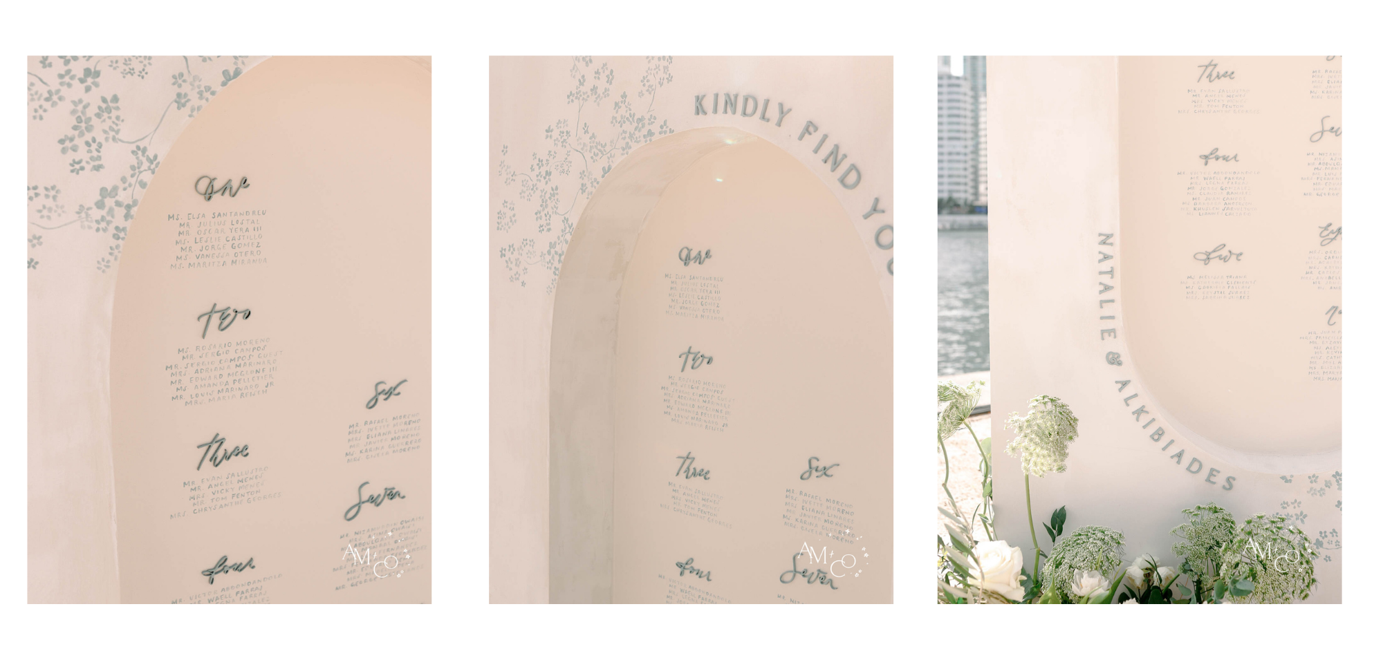
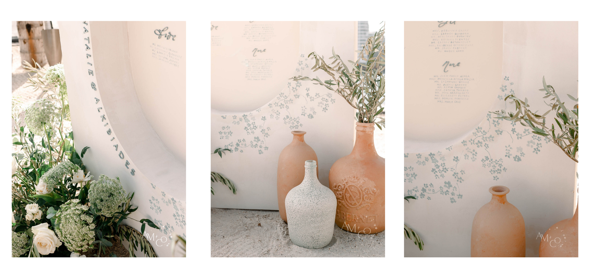
I used the same pale dusty blue from the invitations to handpaint flowers on the seating chart. We added laser cuts from the invitation to give it dimension. We usually shy away from flat surfaces so that everything we create has texture and life. Another thing that sets us apart is that we handwrite all seating charts. We could easily use vinyl, but we want our work to look more like a work of art than something mass-produced. The lettering on our charts is unique and not every letter is uniform. It looks natural and organic.
We always recommend that our brides order flowers for placement around our structures. Flowers add intentionality and create a moment. We paired our chart with glass jars that Heather, our studio assistant, painted for us to look clay-like. You can see here that the finished product combined with the Miami skyline was so dreamy!
Working with professionals to bring the vision you have for your wedding to fruition is a decision you will NEVER regret. We believe love is in the details, and so we take care to not only craft each piece with intention, but to display them properly as well. Even though the wind was crazy on Saturday, we worked to secure each of our pieces safely (safety is always a priority) and troubleshoot isses the wind caused. That way, that Natalie was able to get full use out of every item she commissioned from us. Hiring us to deliver and install on the day-of is definitely worth it!
@andimejiaco Greek wedding signage and this location! ??? #SoFiMoneyMoves #miamiwedding #123PandoraME #ThatCloseMessenger #TakeTheDayOffChallenge
We’d love to work with you to create a branded experience for your wedding, where each part and piece fits perfectly together to tell a seamless story! Fill out our contact form so we can find out more about your big day and let’s bring your dreams to life!
Leave a Reply
You must be logged in to post a comment.

[…] « A Branded Wedding Experience: Natalie + Alkibiades […]
[…] our expectations. Expertly planned by Cali Curated, every detail was perfectly executed in this branded wedding. The Miami weather was fantastic, and Villa Woodbine provided a stunning Mediterranean-style […]
[…] color and the gorgeous wood-tone stars, which we carried into every structure we created to create a branded wedding experience (our […]
[…] wedding was the picture of simplicity in an AM+Co branded wedding experience. We leaned into their muted color scheme for their invitations, which were letterpress and blind […]
[…] and grandpa chipped in and helped us get it done in four hours! I can’t help but think back to the first inset-style seating chart structure Tyler made, which was a multi-day effort of much frustration as he learned how to bend wood. I’m so proud […]
[…] had three weeks to design and build everything, and this was a completely branded event. That means we could carry some of the same motifs throughout the day, from signage to […]