May 31, 2023
Chelsea + Patrick, Part 2: A Modern Wedding On St. Simons Island
We shared the leadup to Chelsea and Patrick’s wedding day in a blog on their bright and fun rehearsal party here, so be sure to check that out. From reading it, you can tell how much love and thought went into the rehearsal party and that this bride cares about the details. Let me tell you, her wedding did not disappoint!
Chelsea and Patrick brought us to St. Simon’s Island in Georgia, a serene and gorgeous backdrop for a wedding weekend. They say opposites attract, and while their rehearsal party was vivid and bold, their wedding was understated and modern. It was really fun to create signage and day-of items for two events that were so different yet celebrated the same beautiful love story.
Branding, Inspired By
With branded weddings, we usually start by designing the invitation and then develop the branding from that initial piece. However, this wedding shows that if you find us after you’ve hired someone to do your invitations, we can still develop a branded wedding for you with signage and day-of items. Truthfully, I was a little sad that we didn’t get to do Chelsea’s invitations, but we still used her invitations as inspiration for our work without copying them. I always want our work to stand on its own, and I respect the work of other artists, so we don’t use monograms or artwork created by other artists in our work.
The Welcome Sign: A Moment
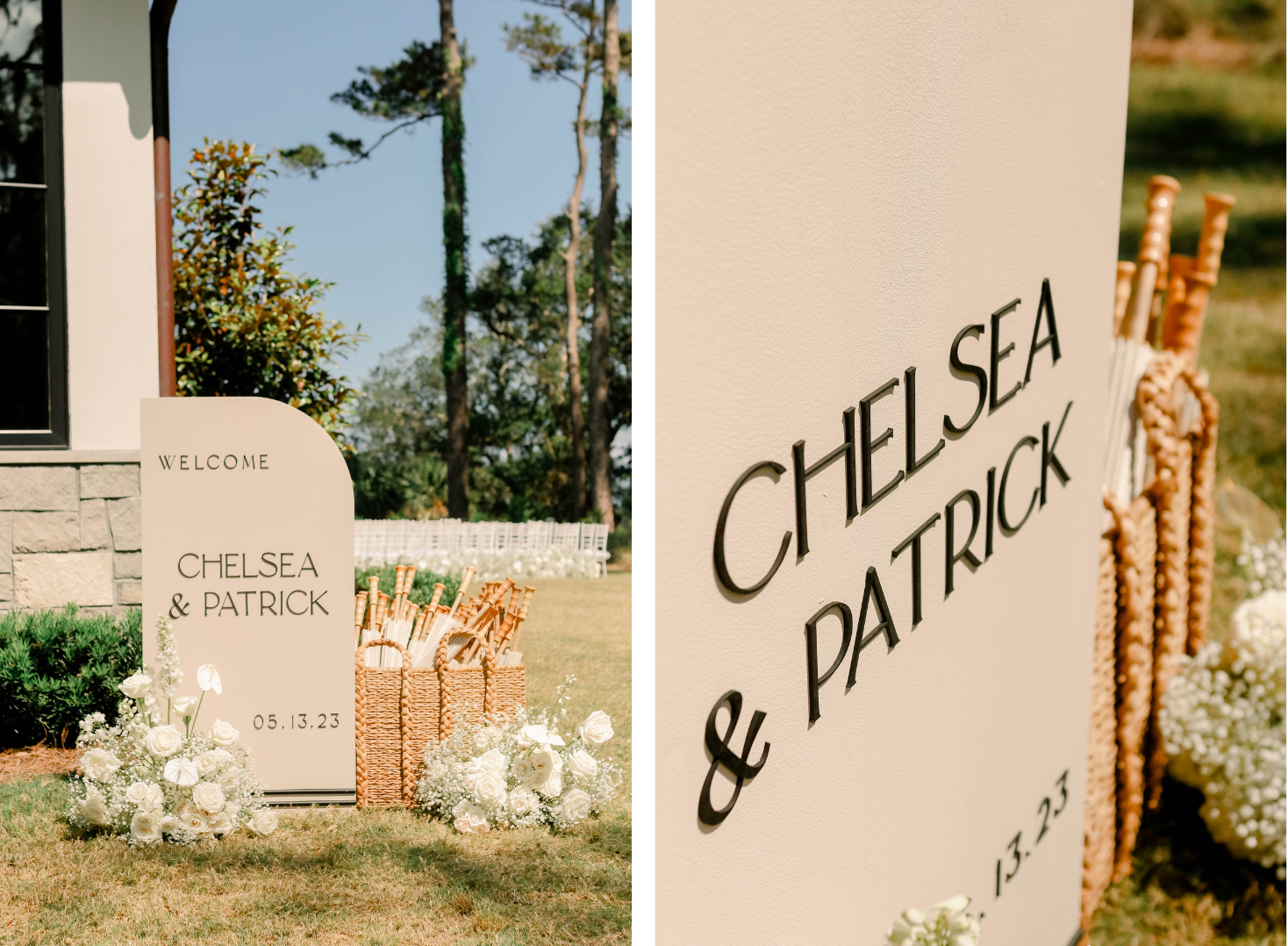
Chelsea and Patrick’s wedding was held at Forbes Farm, with the reception building dividing the front lawn (where people arrived) from the back of the property, where the ceremony was held. A well-placed wedding sign can help guests with wayfinding without ever explicitly telling them where to go, and this sign is proof of that. The placement of this sign on the side of the building served as a guide to direct people toward the ceremony instead of inside the building, as they may be naturally inclined to go.
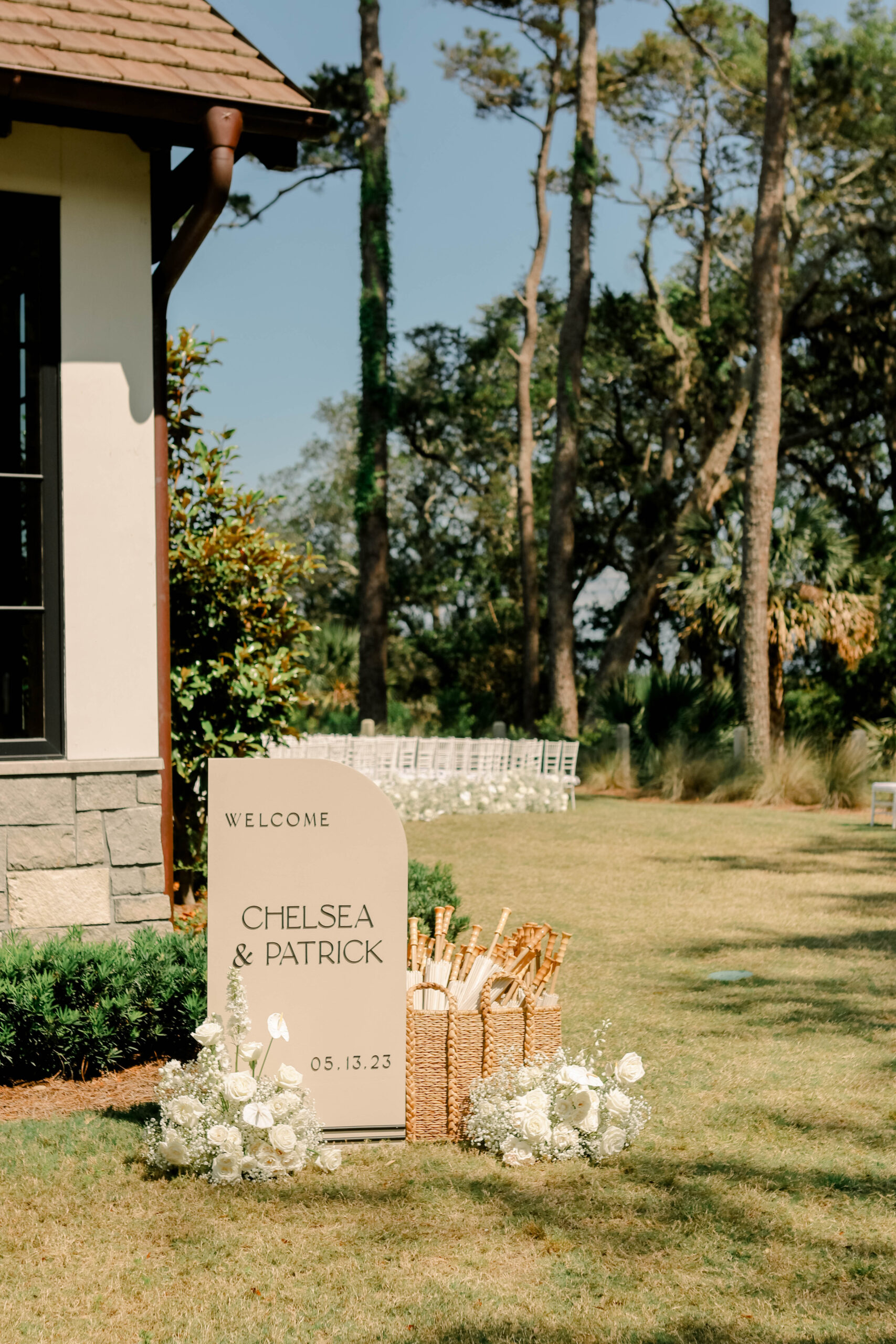
Our welcome signs usually measure two feet wide by six feet tall. We created a smaller one sized two feet by four feet with a sail shape for Chelsea’s welcome sign. We added a black stripe accent at the bottom that matched the seating chart, and I thought it was *chef’s kiss.* Flowers are required for our signs, and Chelsea’s florals were gorgeous, but she also paired a basket of parasols (which you’ll see elsewhere too). The extra thought of this addition made this a moment instead of a random sign in a corner.
How To Get Guests To Your Wedding On Time
Looking for a guaranteed way to get your guests to the wedding on time? Have a welcome cocktail reception! This was the first one I’ve witnessed at a wedding, and I think it’s genius! The time planned for the pre-ceremony cocktail reception provides a buffer so that arriving guests won’t walk down the aisle at the same time as the bride.
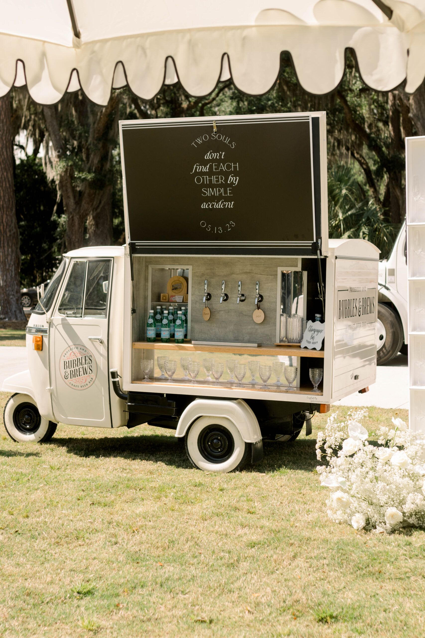
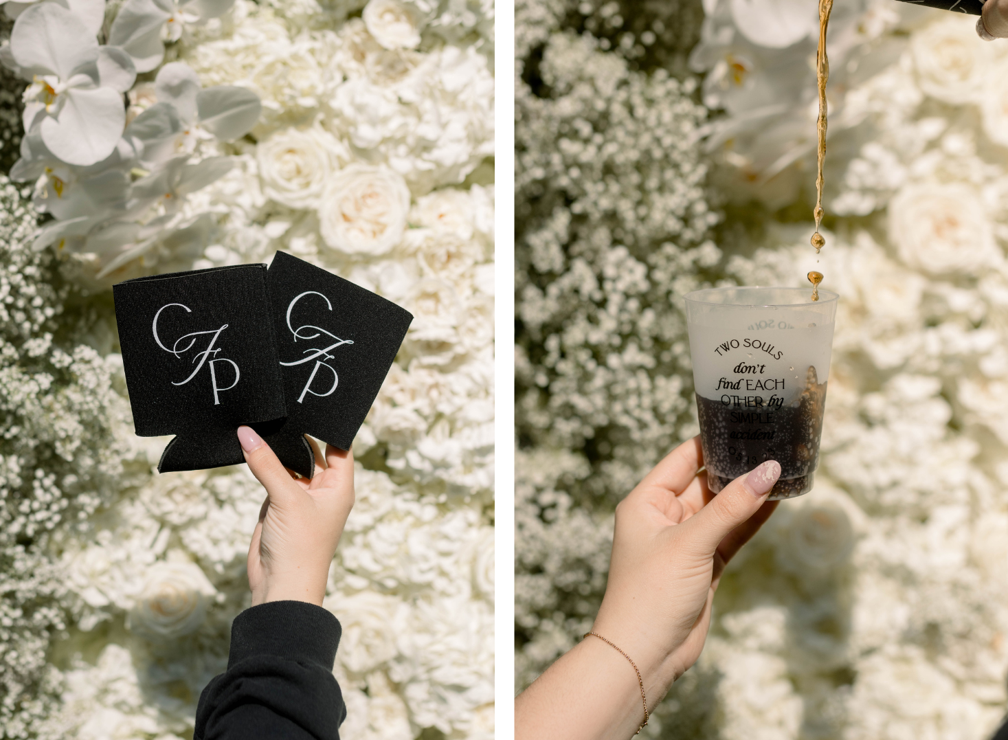
The pre-ceremony cocktail reception was held on the front lawn of the venue. The lawn was dotted with cocktail tables and black and white umbrellas for shade. A champagne cart was parked there to serve guests, and we designed a simple sign that says “Two souls don’t find each other by simple accident,” a quote by poet Jorge Luis Borges. Again, Chelsea went all out with the details and carefully considered how everything would look. Truly, her thoughtfulness paid off.
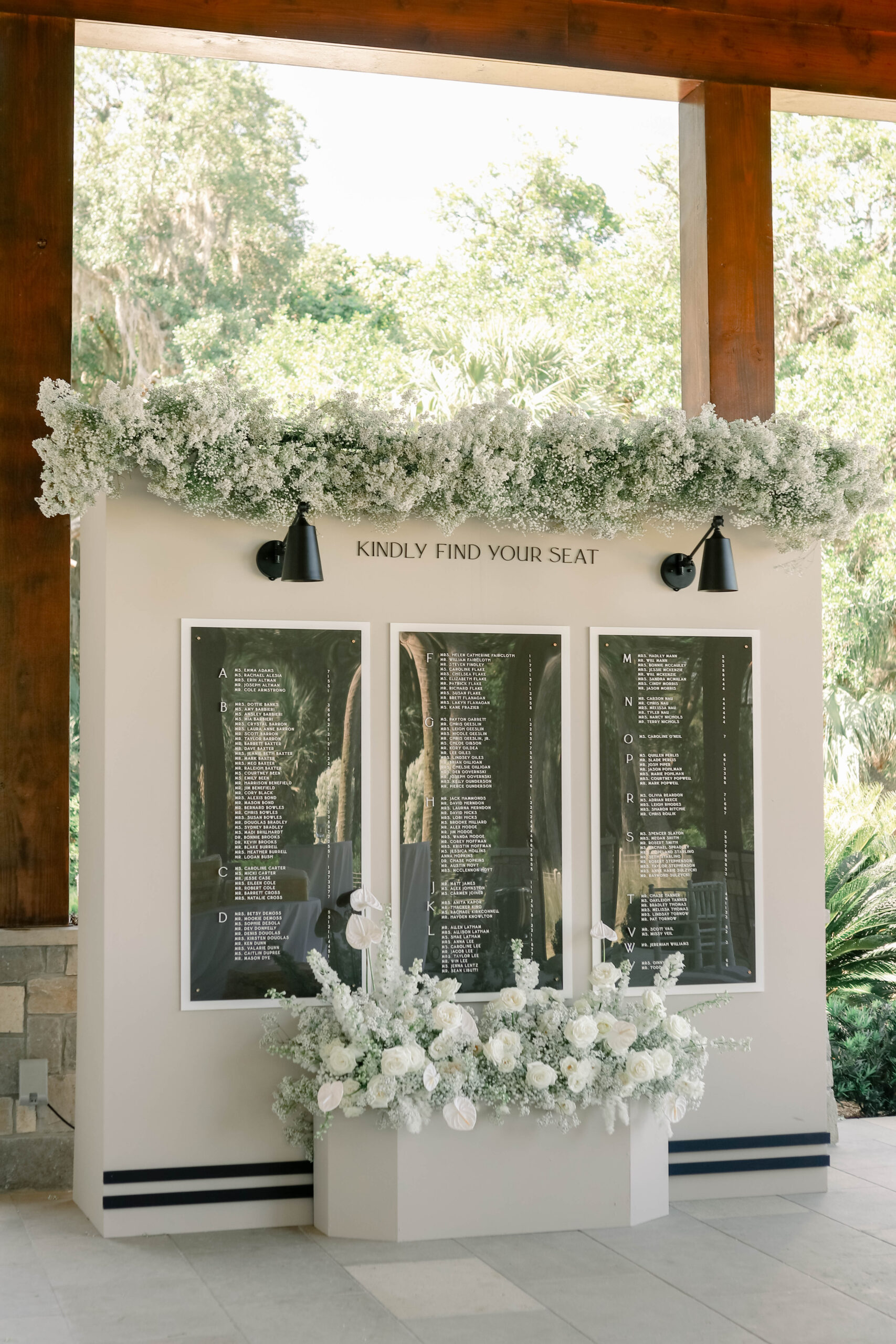
The Seating Chart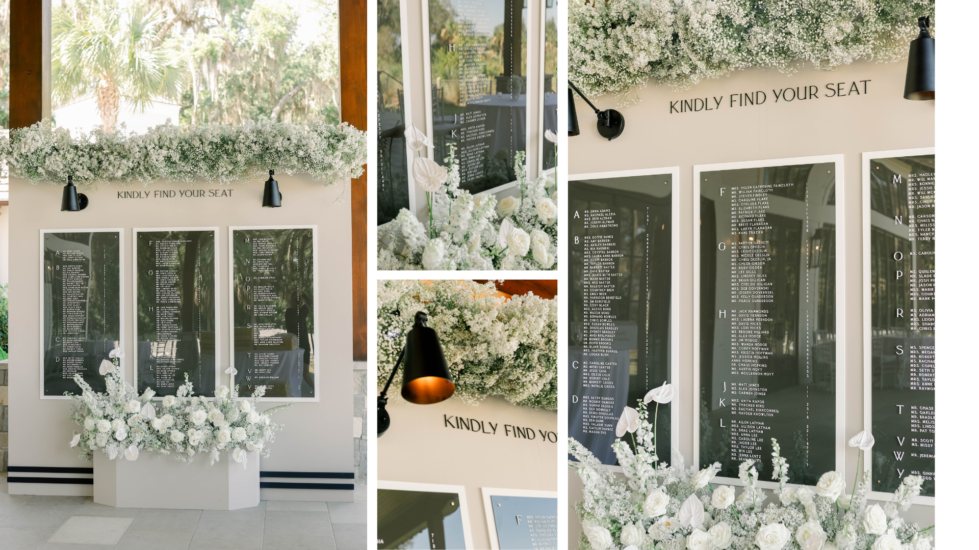
The seating chart was a taupe, almost mushroom color, and we added black pinstripes at the bottom to match the welcome sign. We engraved smoke-colored acrylic panels and layered them with white panels, adding dimensionality and coordinating perfectly with her white, over-the-top florals by Shea Hopely Flowers.
Neon Signage
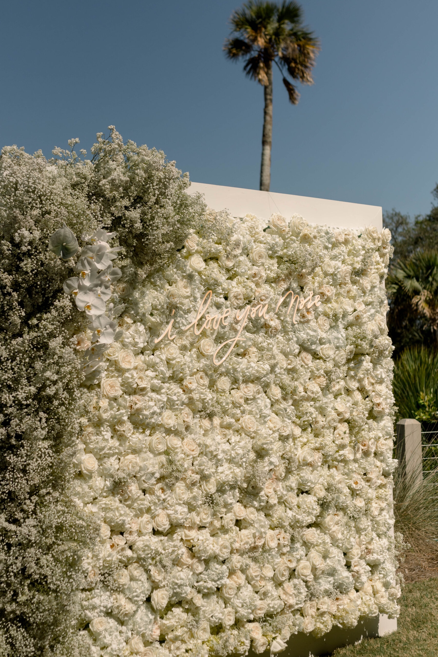
Neon signs are a fun trend that last way beyond the wedding and can become a timeless reminder of your day by becoming a fixture in your home. I calligraphed a neon sign design for Chelsea and Patrick that says, “I love you more.” The florist made a live floral wall where the neon was mounted, which created a perfect backdrop for guests to take photos. It was really cute!
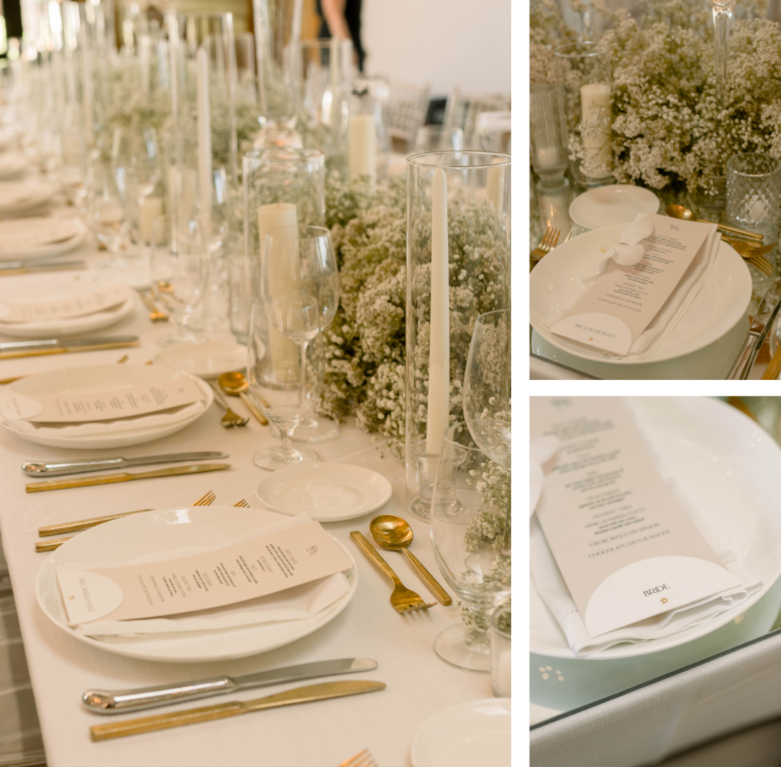
For The Table
For the tables, we created chardonnay menus and white place cards.
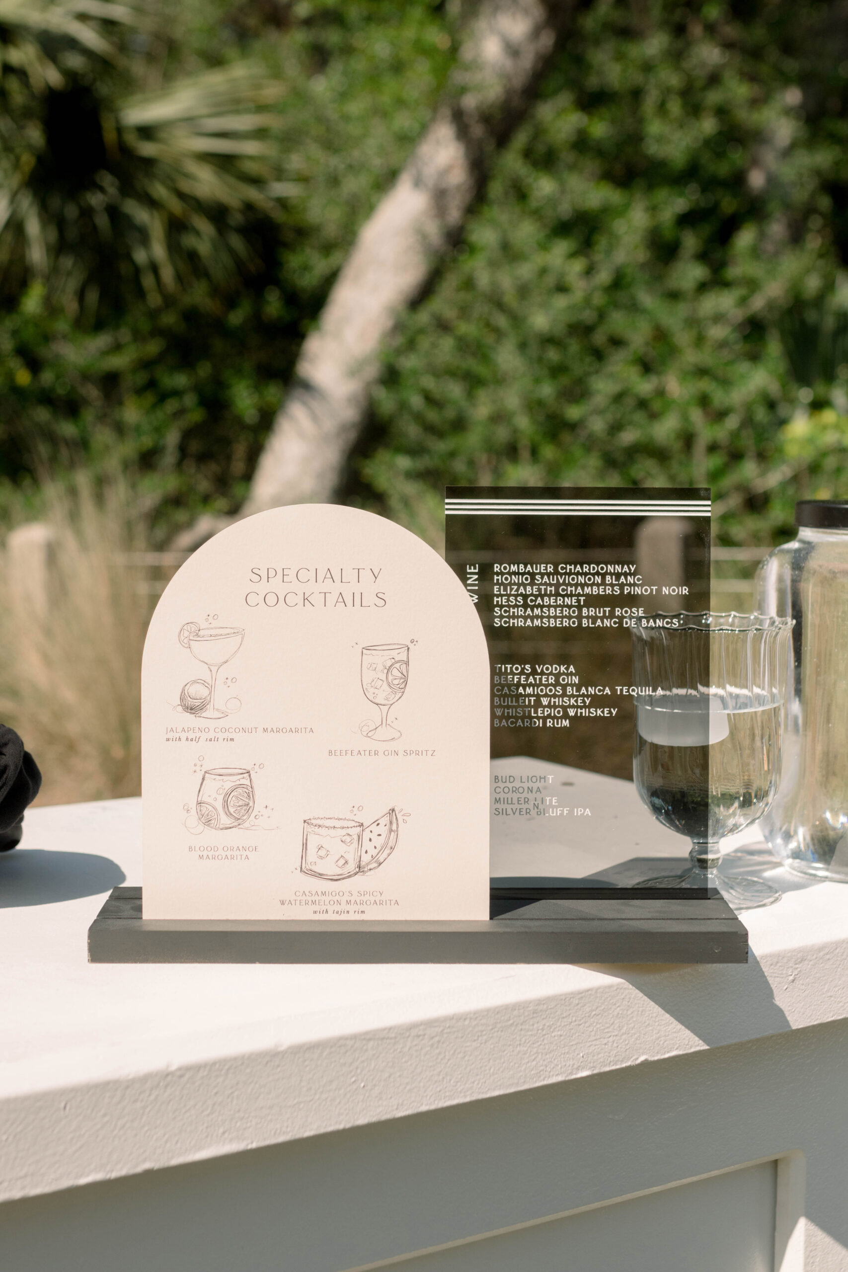
Their bar sign had two panels. One was the mushroom color of the other signs, with hand-drawn illustrations of the specialty cocktails. The other panel was the same engraved smoked acrylic from their seating chart.
We also created koozies with their monogram and plastic cups (similar to the rehearsal party) that carried the same quote from the bar cart.
Chelsea and Patrick’s wedding weekend was a true testament to the power of meticulous planning and thoughtful design. From the rehearsal party to the wedding day, guests encountered personalized touches at every corner. Truly every detail was noticed, and we loved being a part of this amazing weekend!
As a creative studio, AM+Co thrives on bringing visions to life and creating unforgettable experiences for people like you. If you’re planning your own dream wedding and would like to collaborate with us, we would be honored to chat! Reach out to us today, and create an extraordinary celebration that reflects your individuality and takes your breath away!


