May 25, 2023
Chelsea + Patrick, Part 1: A Bright & Whimsical Rehearsal Dinner
What’s more fun than working with a couple to make their most special day extraordinary and memorable? Doing it twice in two days! Chelsea and Patrick brought AM+Co on to do not only their wedding but their rehearsal dinner! This bride took us to Saint Simon’s Island in Georgia. It was my first time there, and I was taken away by how peaceful and beautiful it was. Picture dreamy moss-draped oaks, marshes, and laid-back, low-key coastal vibes. We want to show you all the details, so this is part one of a two-part series. Let’s start with the rehearsal!
The rehearsal was held at a separate venue from the wedding, which was cool because it made it feel like a second wedding and not “just” a rehearsal for the big event. Chelsea went all out for her rehearsal and wedding with her planner, Beth Williams & Company. The rehearsal was held at Village Creek Landing.
Chelsea made her rehearsal look completely different than the wedding. The rehearsal was bright, colorful, and fun, with shades of pink and orange providing pops of color against the outdoor landscape. But, you’ll see in part two of this blog, her wedding was entirely different, with muted colors like black, white, and taupe to give it a modern and classy feel.
You’ll see a lot of squiggly, wavy lines in designing for this wedding. To differentiate it from the next day’s wedding, we created branding for this specific event that was separate from the wedding. It featured hand-drawn hearts and the phrase “Chelsea loves Patrick.” So much thought and love was put into every detail!
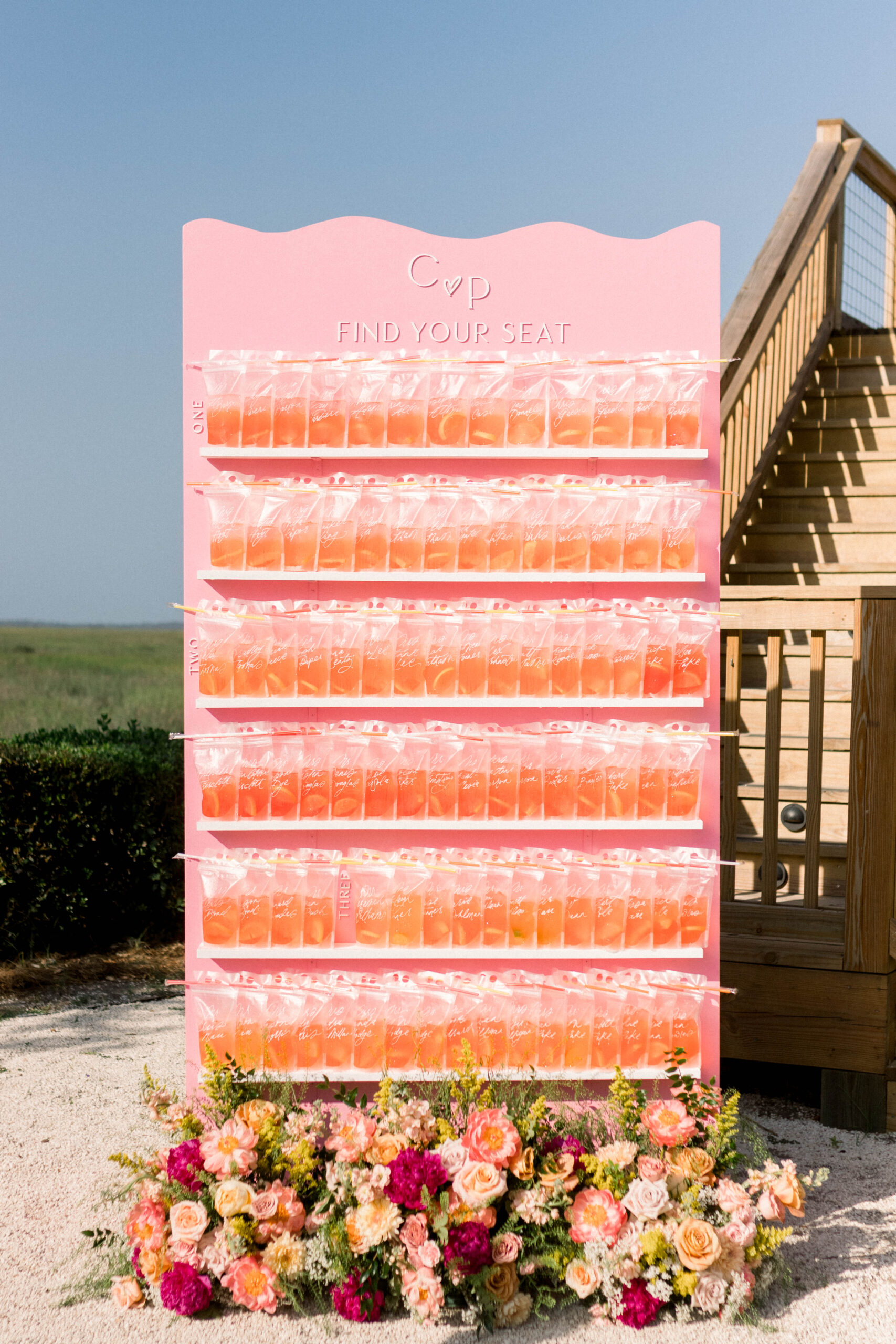
The Welcome Drink Wall
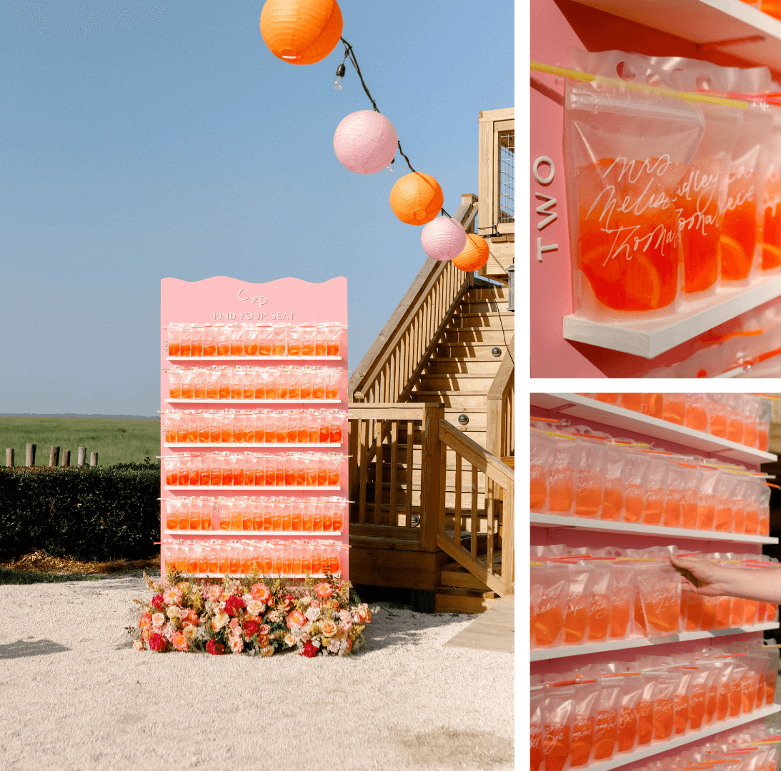
When you want to get the party started right away, I recommend a welcome drink wall! We hand-calligraphed these Capri Sun-type pouches with each guest’s name for a personal touch. Two drinks were on the wall, an Aperol Spritz and a lime-flavored option sans alcohol.
These colors played really well with the drink display. I think it’s wise for brides and their planners to think about what the beverage they choose will look like in the clear pouch on the drink wall because, if it’s not well-planned, sometimes the color can be off-putting or even look sort of… medical. This one, however, nailed it!
Between the intentionality of the drink color choice, the festive fruit inside, and the fact that it was so hot outside, the pouches really worked for this location and brought a fun, refreshing vibe. In addition, the wavy line at the top of the wall against the backdrop of the grass created a relaxed, flowy feel. And the flowers by Shea Hopely of Shea Hopely Flowers of Jacksonville, FL, made the signage look complete, welcoming, and finished.
The Welcome Sign
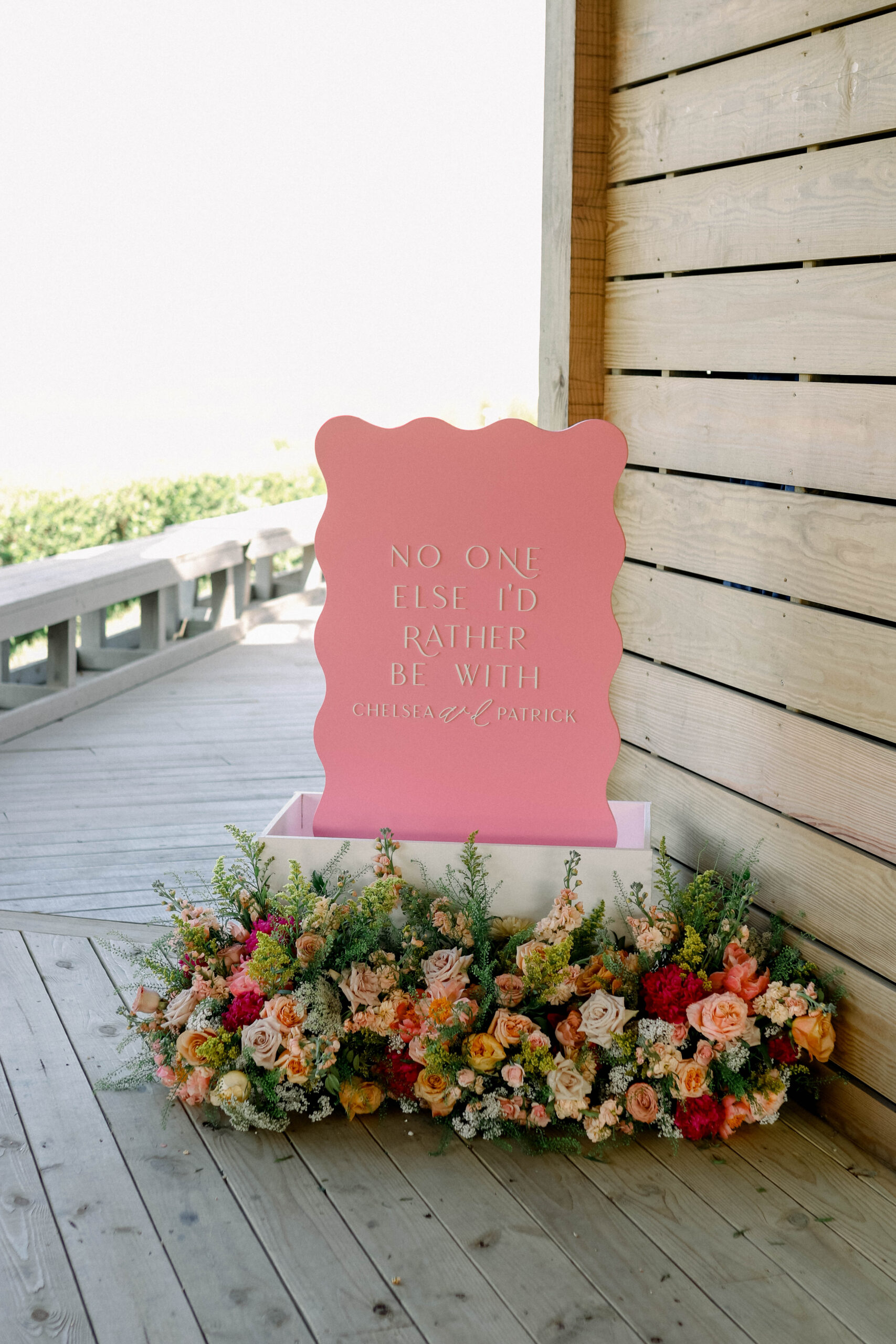
For her welcome sign, we used the squiggle shape and laser cuts for the wording “No One Else I’d Rather Be With.” Many times our photos don’t show the detail, but the laser-cut letters we use in our signage create a 3-D raised look.
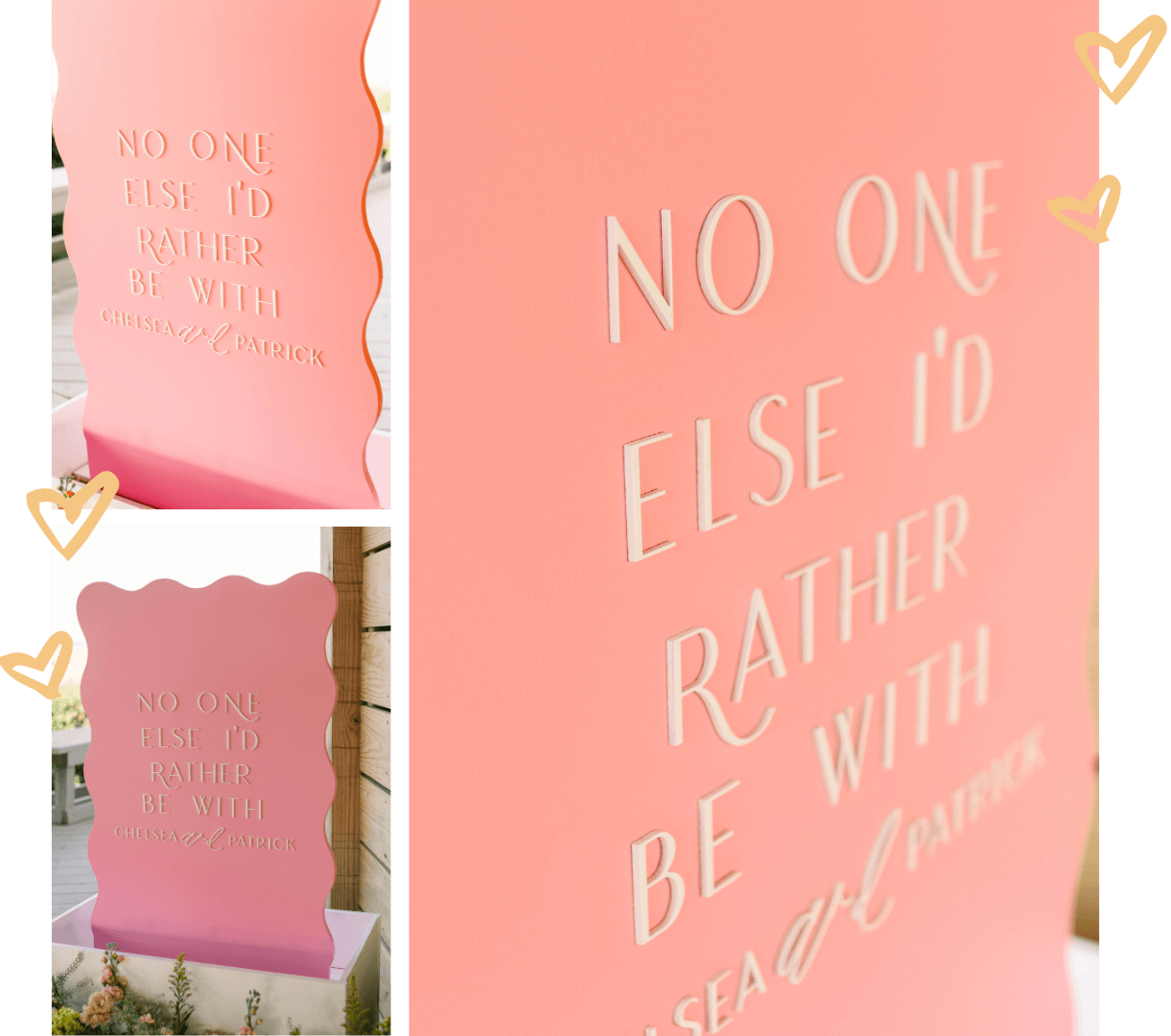
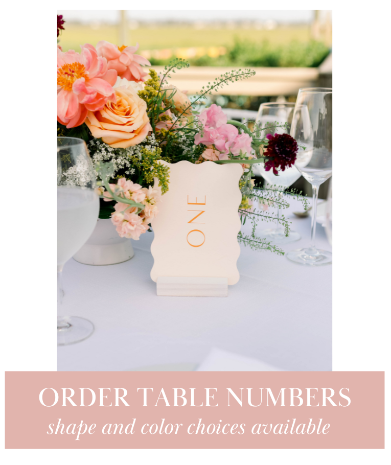
Table Numbers That Travel (+ Exciting News!)
This was a smaller event, so it only had three tables. The table numbers were a light coral-pink with a bright orange table number. They had a wavy border, and we used laser cutouts to point to where each table started.
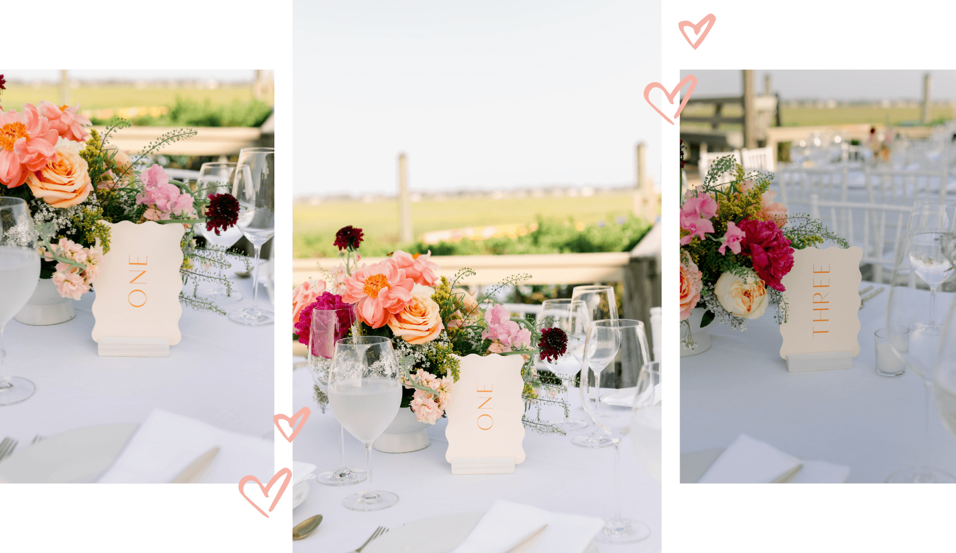
We get so many inquiries on our table numbers from the weddings we show on our Instagram and blog. Yet, they are only available for rental for local delivery, so it’s always disappointing to tell a bride from out of state that they’re unavailable. To solve this, we decided to make these available in our shop for purchase! They’re made of card stock, which travels well if we ship to you. We offer many color and shape options, and the bases are included. Now you can have AM+Co on your tabletops, whether your wedding is in Alaska, Alabama, or anywhere between! 🙂
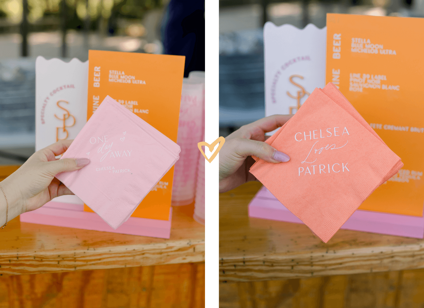
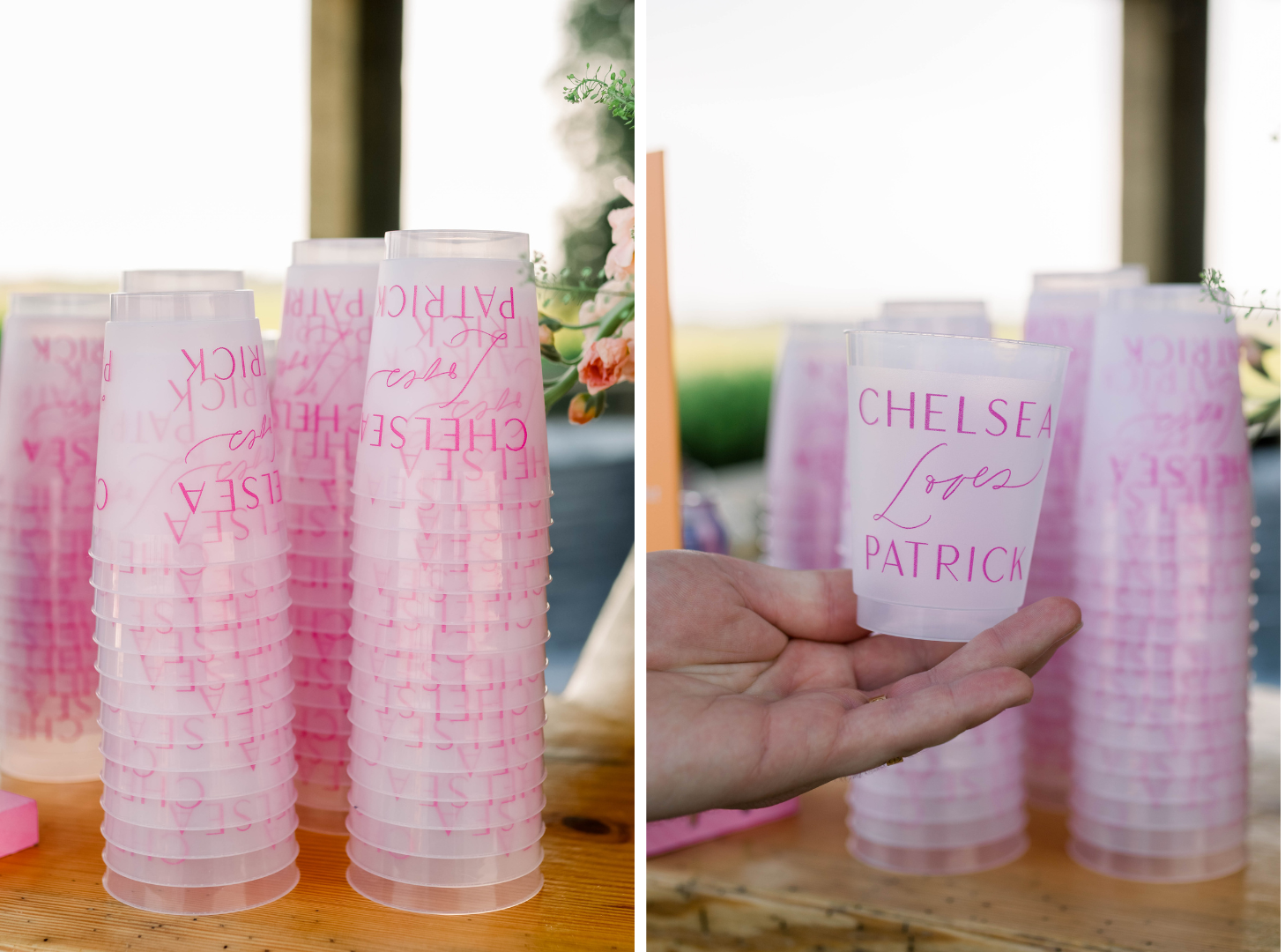
Napkins, Cups, and Drink Stirrers
We created two napkin designs. One set was pink and said “One day away.” and the other ones were orange that said “Chelsea Loves Patrick,” which was super cute!
We also echoed this design in hot pink on the frosted cups.
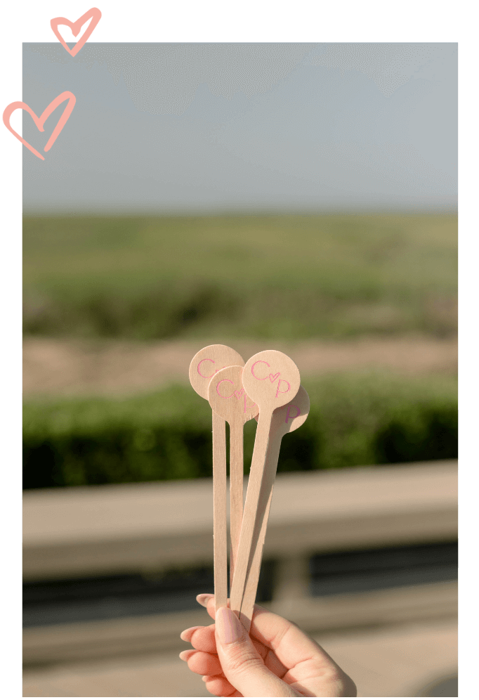
The wooden drink stirrers used the C heart P logo that we also used on the welcome drink wall. Wood for these stirrers worked well as opposed to acrylic since it matched the outdoor surroundings.
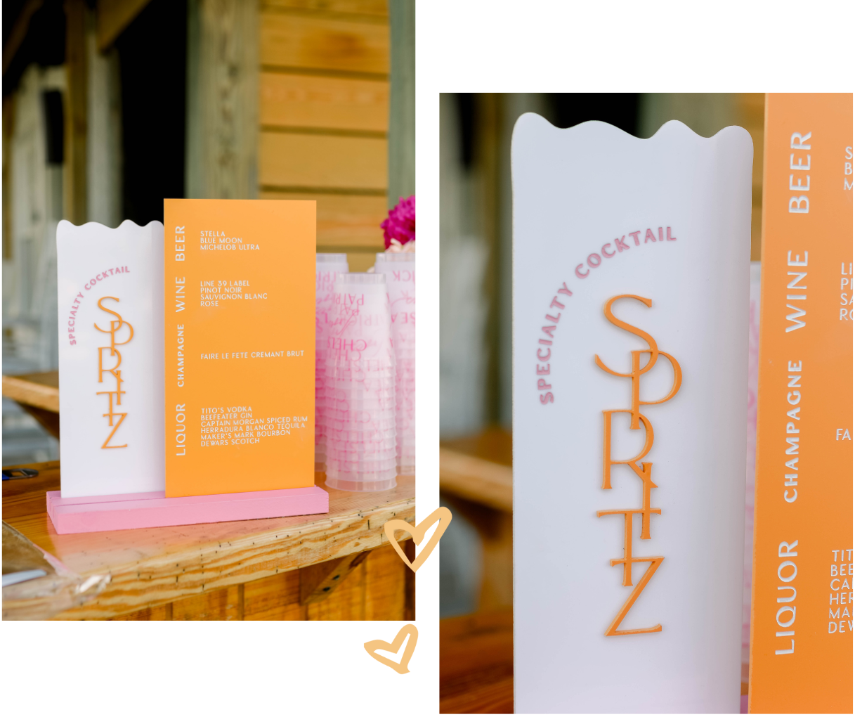
A Colorful Bar Sign
We are in a real “black, white, and taupe” moment when it comes to weddings, so when I get the opportunity to incorporate color into our work, it’s a fun departure! This bar sign used two colors and featured their specialty cocktail (the Aperol spritz) and their lists of available drinks.
1 Day Away…
We were so privileged to be a part of Chelsea and Patrick’s pre-wedding celebration that truly embodied their love. From the whimsical signage to the playful branding that we brought into each detail, the evening was an explosion of creativity and joy. And if you thought Chelsea and Patrick’s rehearsal was pretty, I can’t wait for you to see their wedding, coming up next on the blog!
If you’re seeking a touch of whimsy and a burst of creativity for your own special event, don’t hesitate to reach out. We are thrilled to bring your vision to life! Get in touch with us today and let the magic begin!


Leave a Reply
You must be logged in to post a comment.


[…] « Chelsea + Patrick, Part 1: A Bright & Whimsical Rehearsal Dinner […]
[…] Stirrers are available in lots of mediums and shapes. I adore wood stirrers like those from Chelsea and Patrick’s […]