November 2, 2022
Wedding Color Palette: Black, White, and Taupe
We have recently done SEVERAL weddings with a black, white, and taupe color palette, and we are here for it 💅 We are located in Florida and do weddings all across the state, and all year long, the foliage and flora are exceptionally lush. I find that black, white, and taupe provide a striking contrast to the backdrop of the Florida landscape. Here are a few other weddings we’ve blogged about where you’ll find a similar palette: Mona + Jordan’s, Nancy + Trevor’s, and Sanschy + Jehu’s.
Taylor and Robert’s wedding was full of favorites – one of my favorite color palettes, one of my favorite planners to work with, Bella Sposa Events, and one of my favorite venues, Bella Collina!
Our Semi-Custom Suite
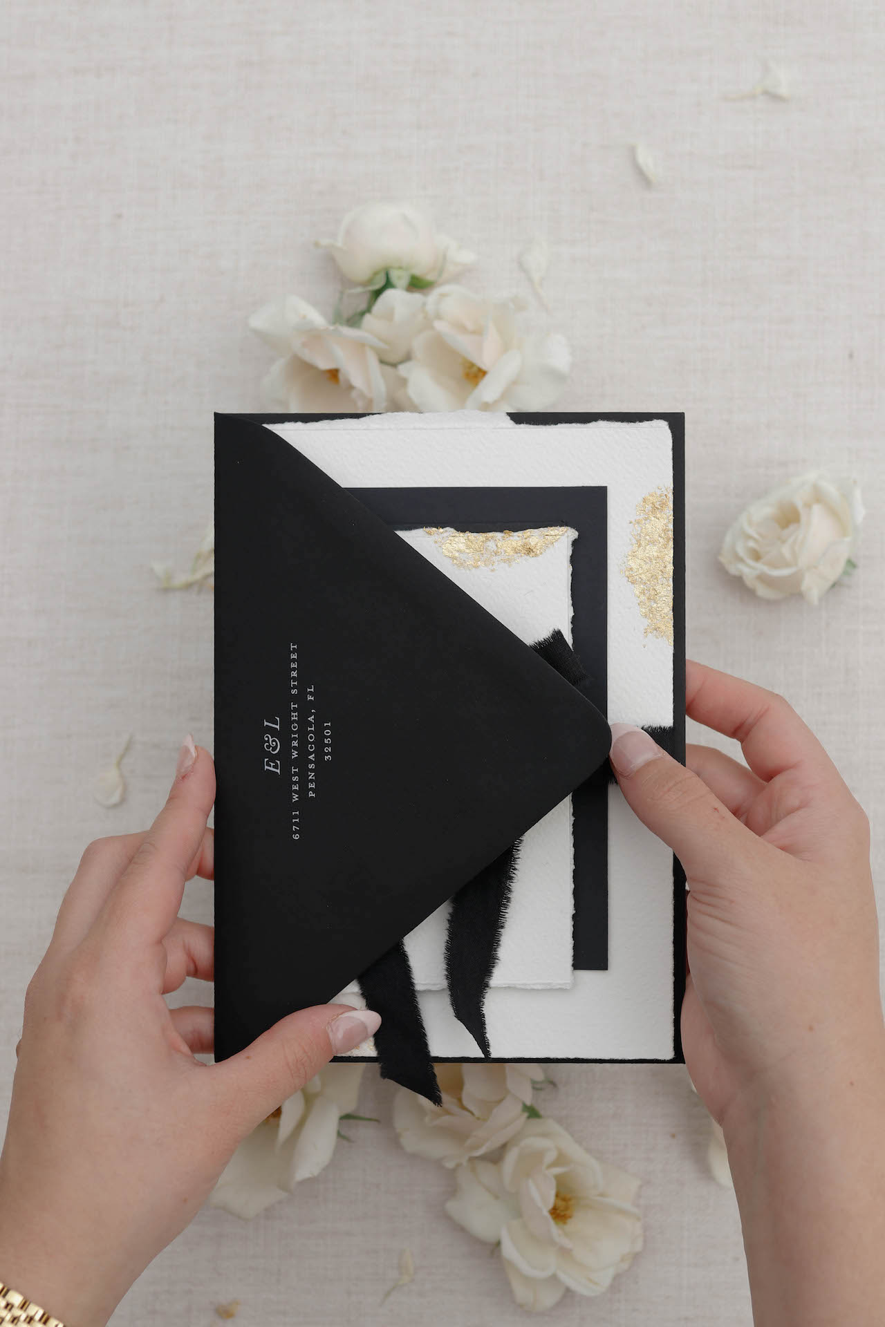
We started with Taylor’s invitations. One exciting thing to note is that Taylor used one of our semi-custom invitation suites. She selected the romantic and timeless Lucia suite, with a deckled edge and hand-applied gold foil accents. Our semi-customs can work with any wedding color palette, and these truly came to life. I love how she blended the semi-customs with a branded wedding experience.
Saved You A Seat!
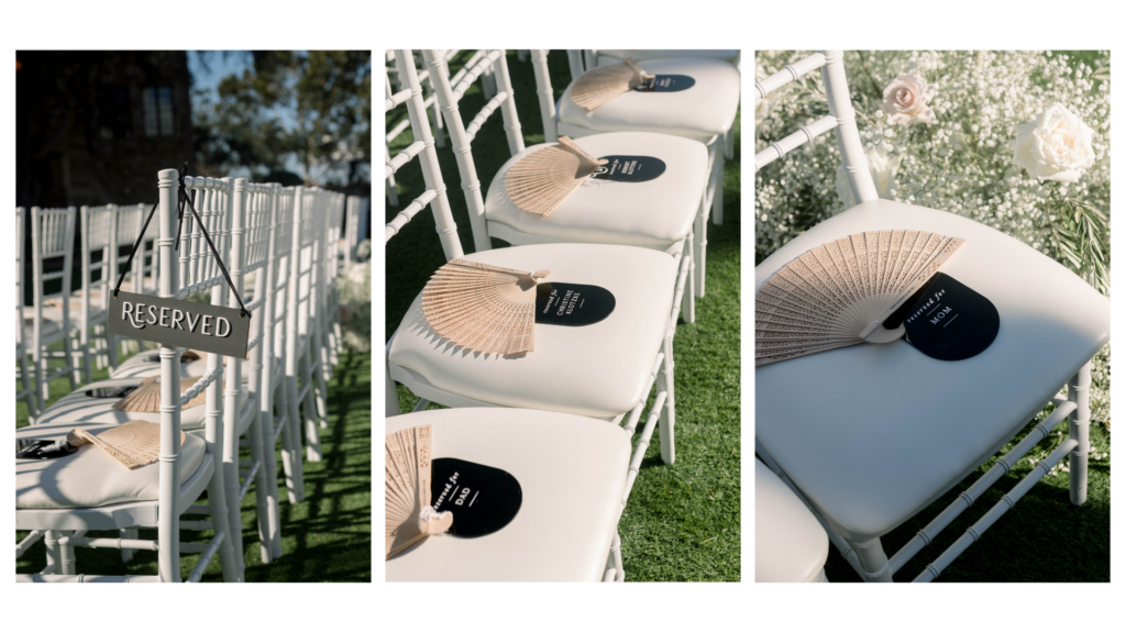
Taylor and Robert did something a bit unusual for the ceremony that I really loved. When reserving seats, weddings usually have a sign at the end of a row at the aisle, indicating that the row is reserved for family or special guests. However, this bride not only wanted a sign to hang at the row’s end, but she wanted signs on seats to indicate that they were reserved for specific people, almost as if she had a seating chart for the ceremony. So, in addition to reserved signs for the aisles, we made about thirty of the individual pill-shaped seat signs in total, fifteen for each side. I think this is a fantastic way to ensure that the special people in your family are honored with reserved seating. It can also be helpful for blended families.
A Grand Entrance
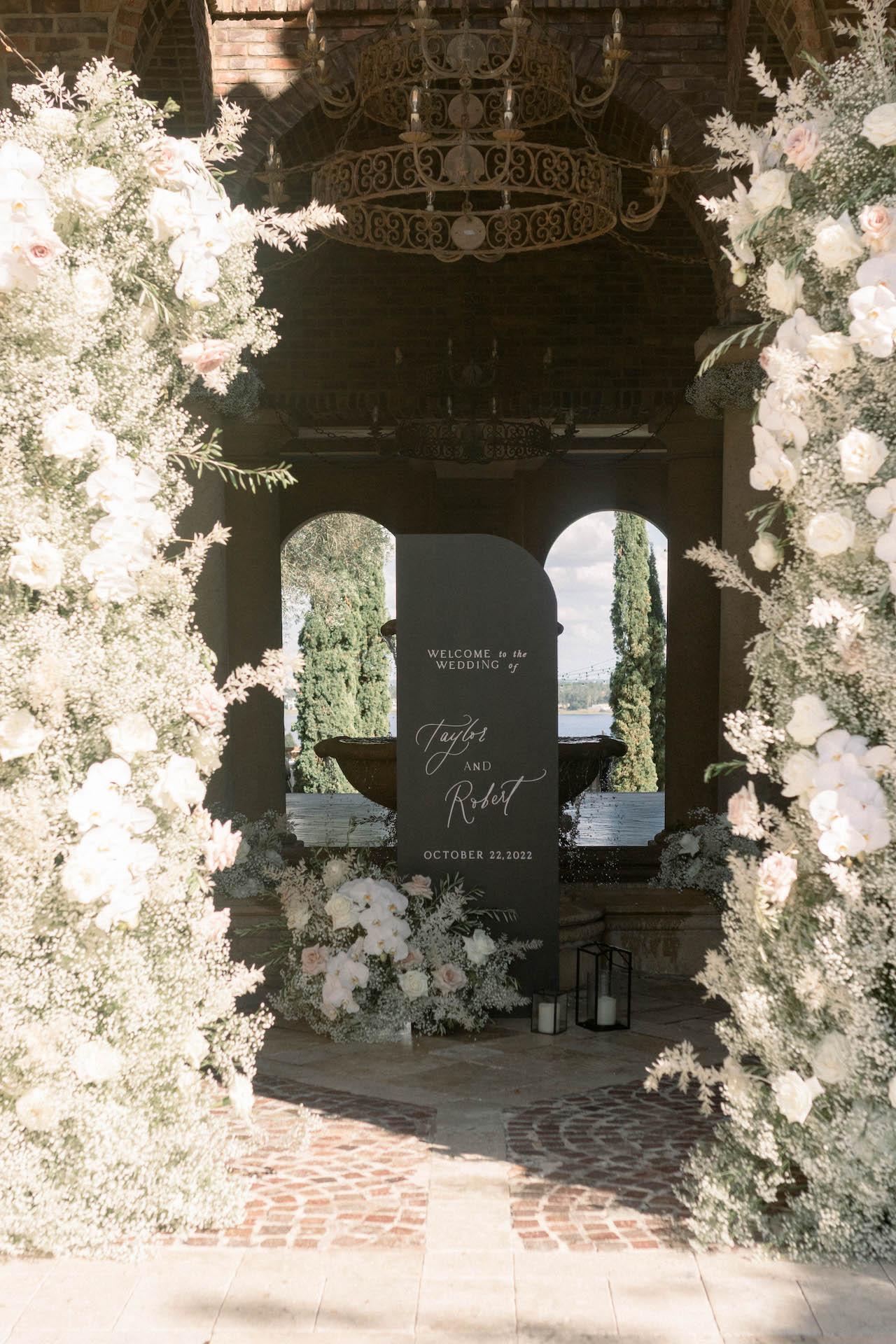
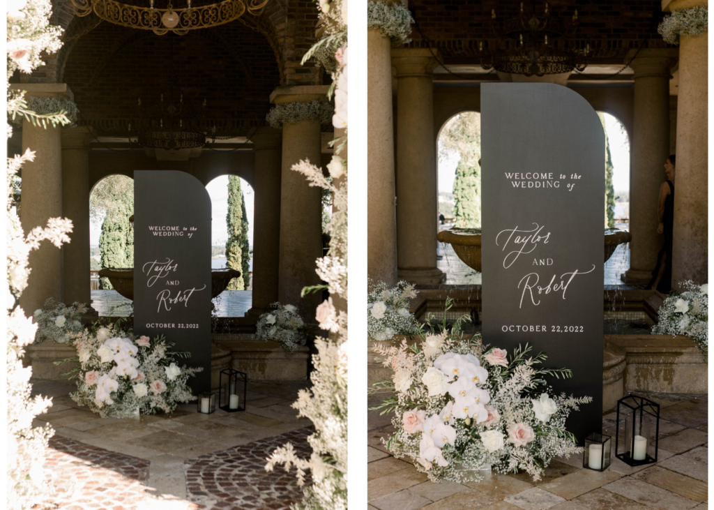
The entrance to Bella Collina is very tall, and I always consider that when designing a welcome sign for this space. I tend to avoid creating anything too close to the ground because the signage can appear underwhelming, and we want to help give guests a breathtaking first impression. So, with that in mind, we created a sail-shaped welcome sign that was six feet tall to make it stand out against the arches of the entrance of Bella Collina. The photos don’t do the height justice, but the welcome sign stood up to the size of the entrance. Taylor and Robert went all out with their florals, provided by Fairbanks Florist. The huge baby’s breath arrangements with orchids and roses, paired with hurricane lanterns and candles, added the perfect touch.
Seating Chart Reflections
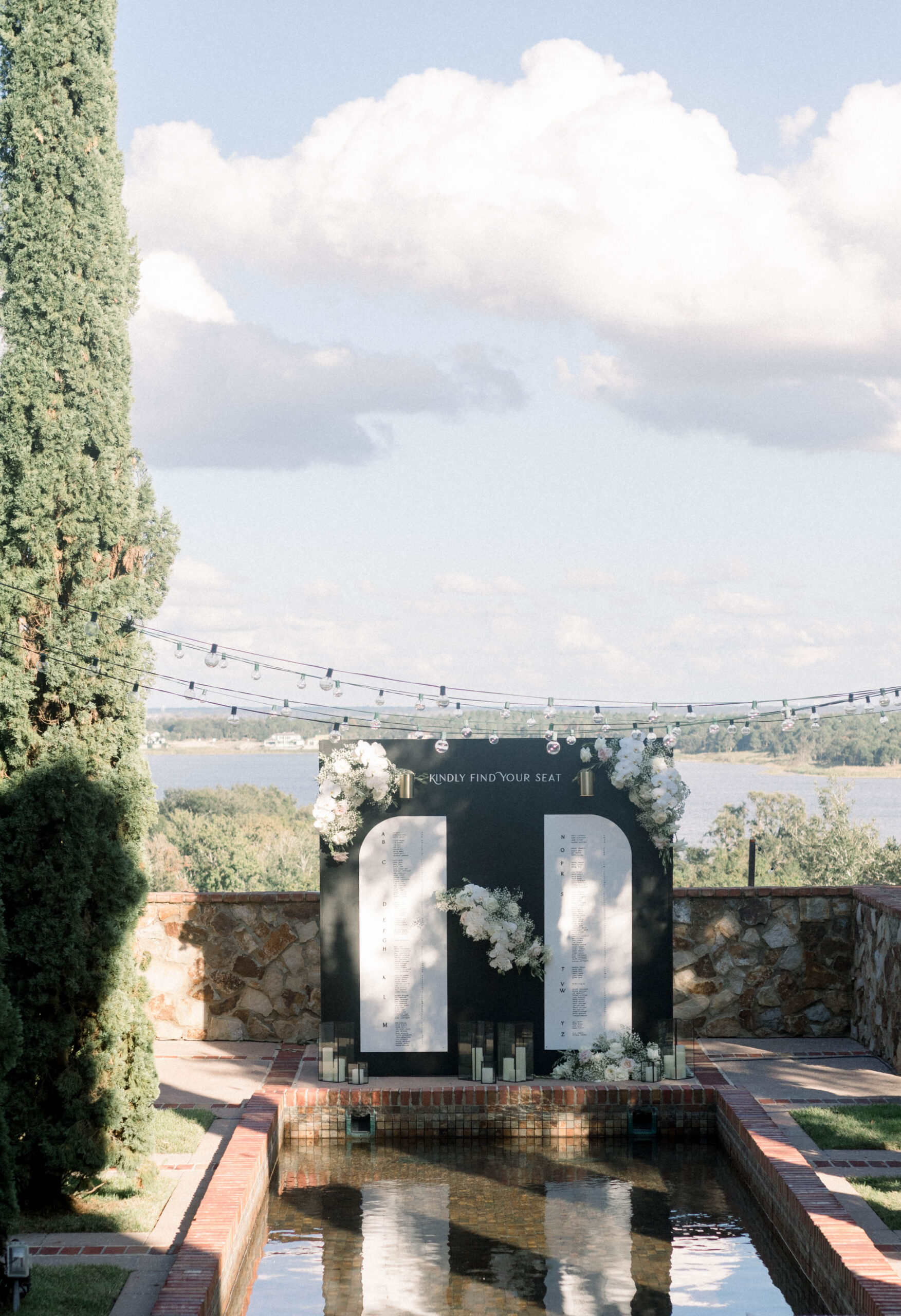
Preparing a seating chart on the wedding day takes about four to five hours. We build them onsite because they’re so intricate. And then we also have to retouch and repaint, especially charts in specific colors (like black), because they tend to take a beating in transport. These seating charts require so much love.
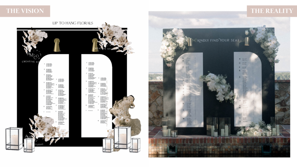
When I sketch a seating chart, I usually include some ideas for flower placement to show the florist, so they have an idea of what to provide. Often, florists don’t understand the scale of the seating charts we create, so when the planner says, “We need flowers for the seating chart,” the florist sends something scaled inappropriately. But something of this size requires a lot of flowers, especially our infinity walls! I’ve learned that providing a sketch with ideas for flower placement goes a long way in helping the florist understand what will help the wall look best on the day-of. Taylor had so many guests that I didn’t think all of the names would fit, but we made it work! [As a note to those planning seating charts, it is better to list your seat assignments alphabetically rather than by table. It allows the spacing to work better and saves the traffic jams in front of the charts 🚗🚗.]
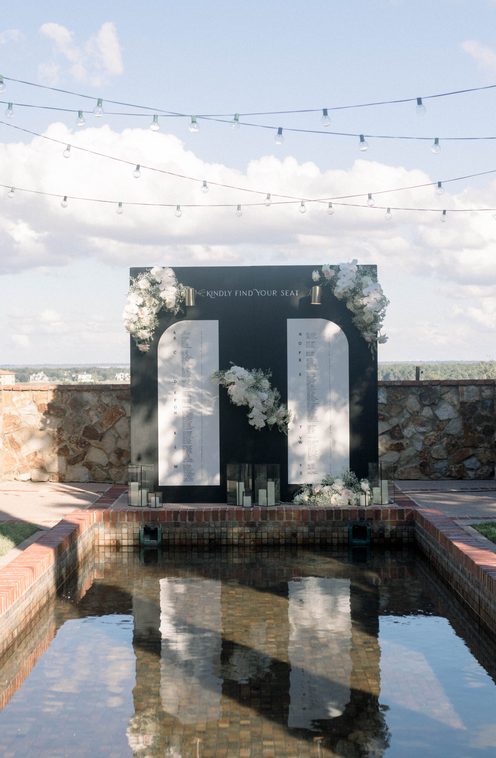
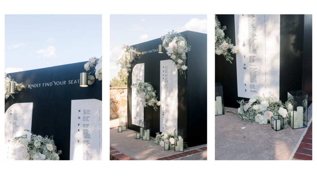
I wasn’t 100% sure about this one at the beginning of the design process. But this is a perfect example of how location and florals can elevate it from great to gorgeous. As people walk down the steps at Bella Collina, the chart is the first thing they see, reflected on the calm water. The simple heading in a modern font, cafe lights, and the over-the-top florals and hurricane lanterns sent this into the stratosphere!
Floating Bar Sign
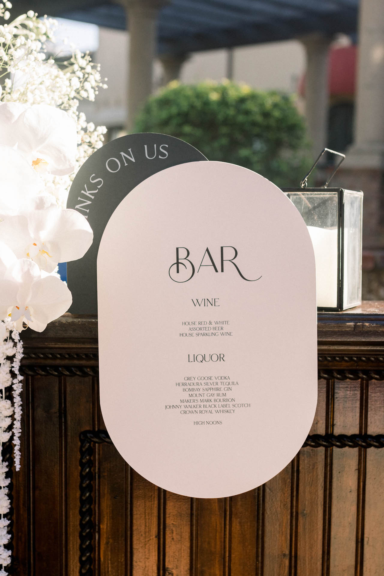
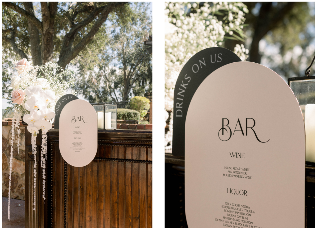
We used a floating bar sign concept for this wedding, where it hangs off the edge of the bar giving an appearance of floating instead of sitting on top of the bar. It had two layers, with the back layer that said “Drinks on us” and the front floating layer holding the drink menu.
“I’ll Take Two”
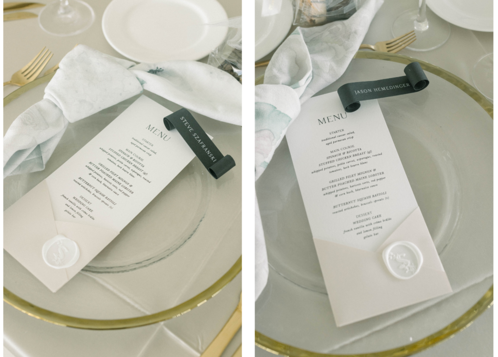
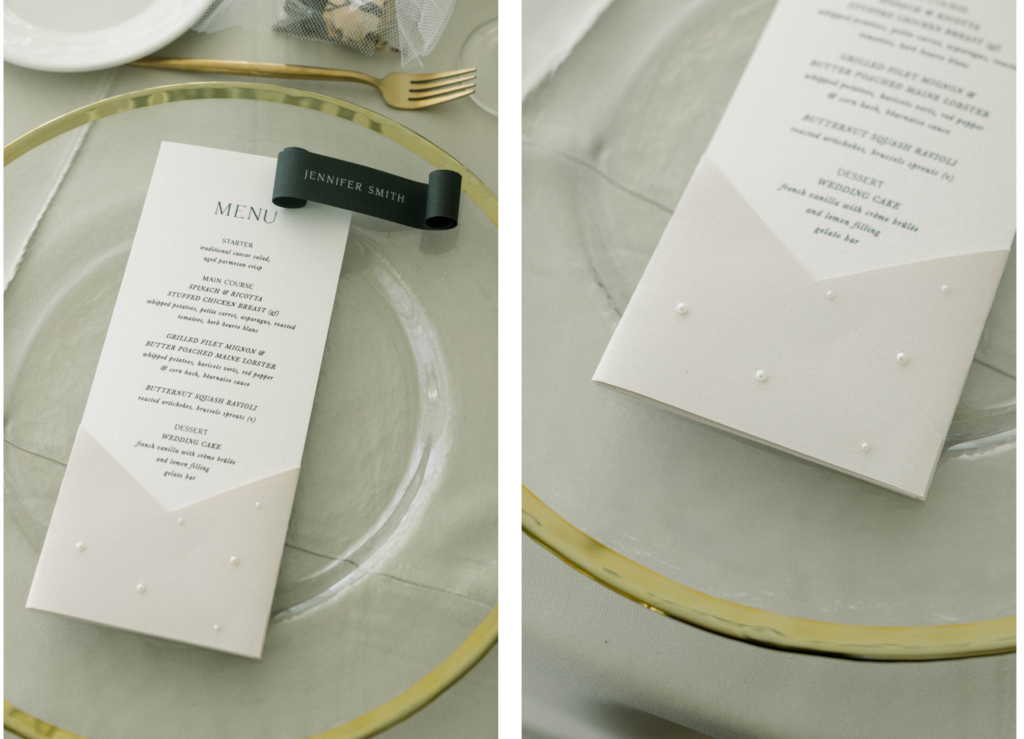
For the table settings, we created two sets of menus. Initially, Taylor ordered pocket menus. But later, during her planning process, she saw a project we posted on our Instagram, which were similar menus, but with inlaid pearls. So she reached out and asked if she could add those for her head table and family. We ✨hand-placed✨ every pearl on forty menus, which is highly intensive work for our team! But it turned out amazingly! The rest of the guests got the same pocket menu but with a wax seal with the couple’s initial. We paired it with our scrolls at each place setting.
Taylor and Robert’s wedding was beautiful proof that a black, taupe, and white color palette can provide elegant and modern contrast and that semi-custom invitation suites can blend with an AM+Co branded wedding experience! If you’d like to find out more about our semi-customs, click here, and if you’d like to learn about branding your upcoming wedding, reach out to us on our contact form!

Leave a Reply
You must be logged in to post a comment.
[…] « Wedding Color Palette: Black, White, and Taupe […]