March 15, 2022
A Winter Wedding at White Rock Canyon
When you think “Florida wedding,” what comes to mind? You most likely think of palm trees, flip flops, sandy beaches, and tropical plants. However, most people don’t realize that the Sunshine State has unique pockets that look nothing like your typical Florida landscape. Danielle and Brandon’s winter wedding at White Rock Canyon was in one of these rare locations. White Rock Canyon is a wedding venue located east of Orlando in Bushnell. Limestone cliffs, lush tree cover, and a winding lake crossed by bridges make this venue a standout. Honestly, the minute you drive on the property, it feels nothing like Florida. It makes you feel like you’ve transported your guests to another place!
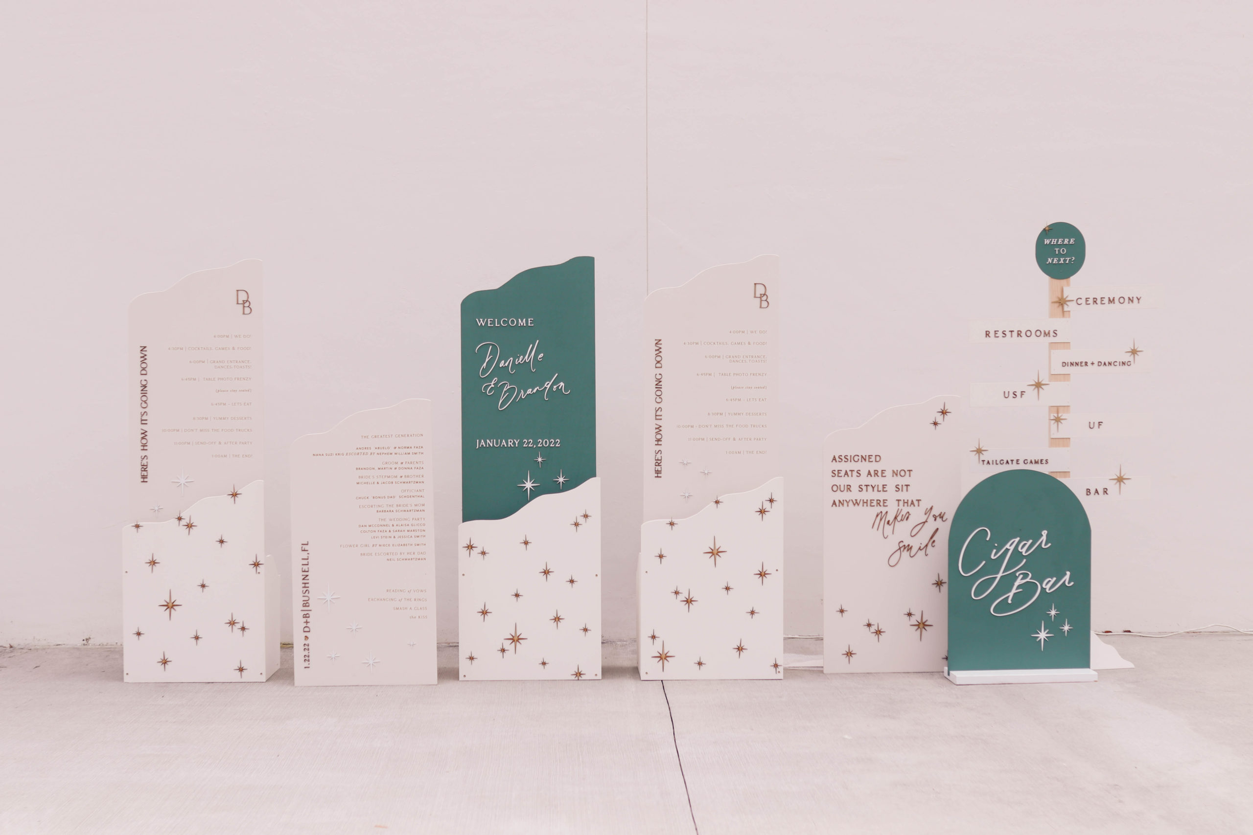
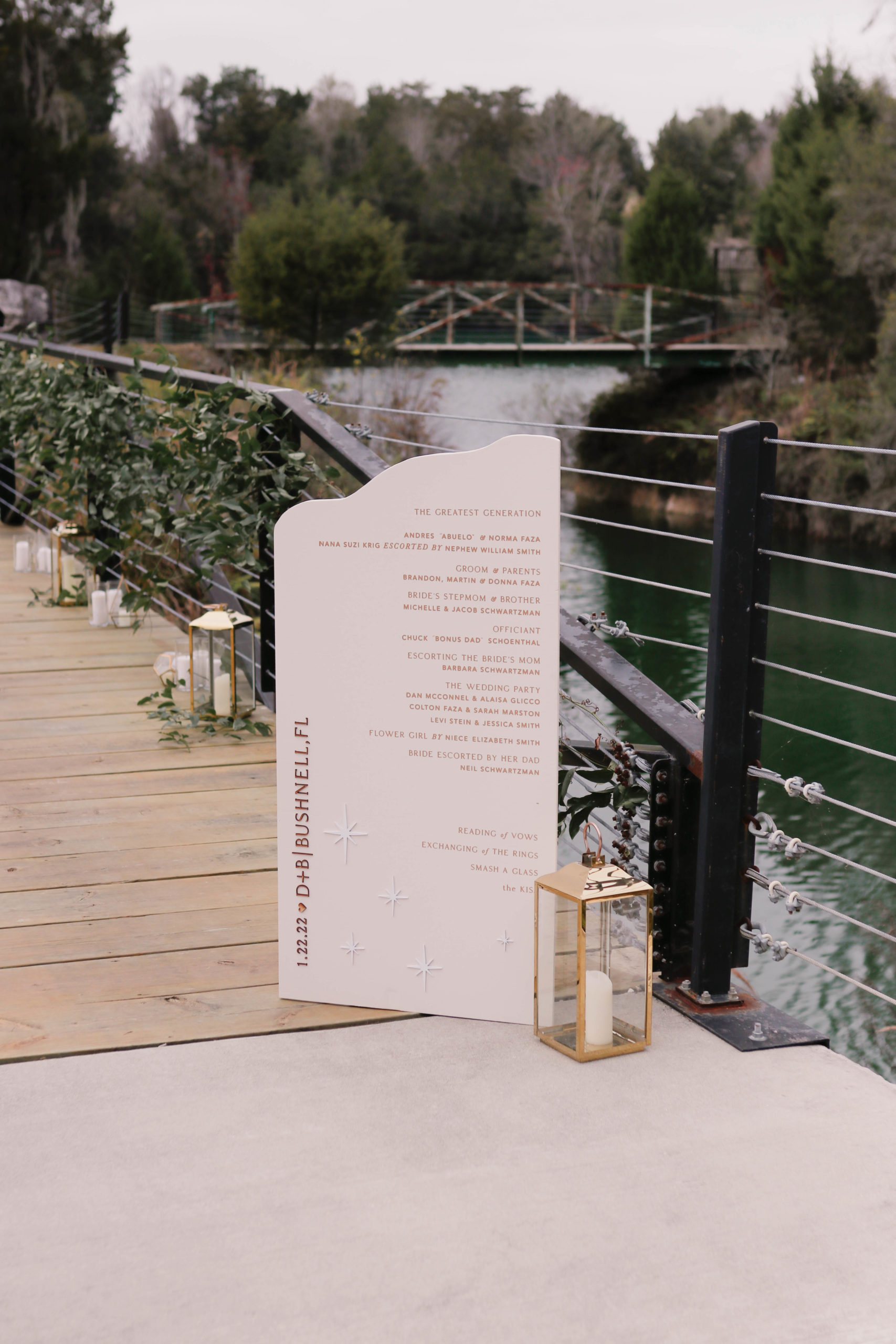
We did quite a few day-of pieces for this wedding, including a vast array of signs: a welcome sign, two schedules of events, a sign for their cigar bar, and a directional sign. They also opted to place their program on a sign. This was a lovely touch and meant their guests didn’t have to worry about paper programs flying away! I loved the emerald color and the gorgeous wood-tone stars, which we carried into every structure we created to create a branded wedding experience (our specialty!).
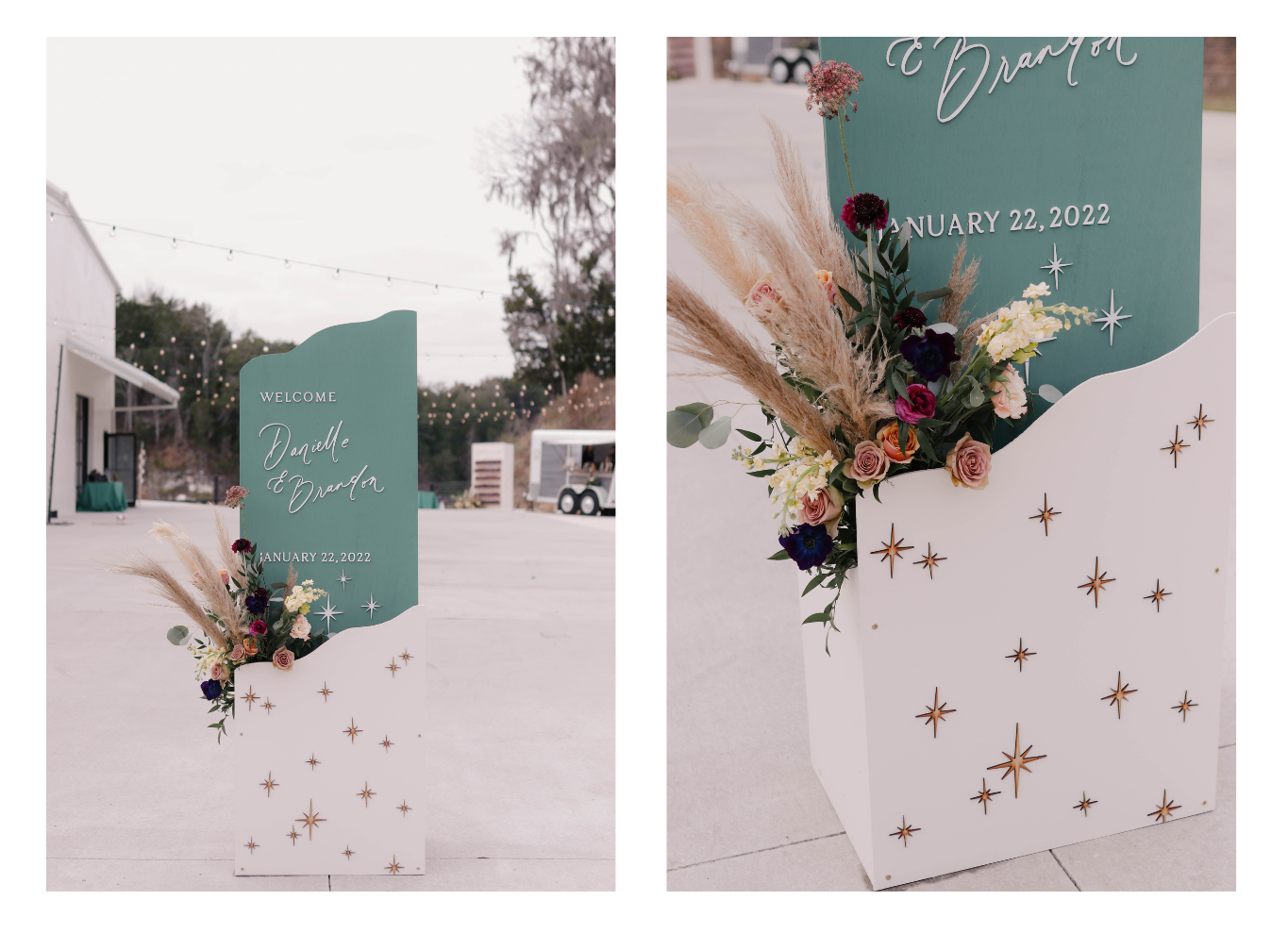
These photos show the power of florals in making wedding signage shine. That’s why we ask that our brides order florals for their welcome signs and seating charts. All three of their large structures had built-in pockets for florals, as you can see here. (By the way, the gorgeous florals for this wedding were by Flower Child of Tampa.) Adding gold-frame lanterns to some of the smaller signs shows intentionality.
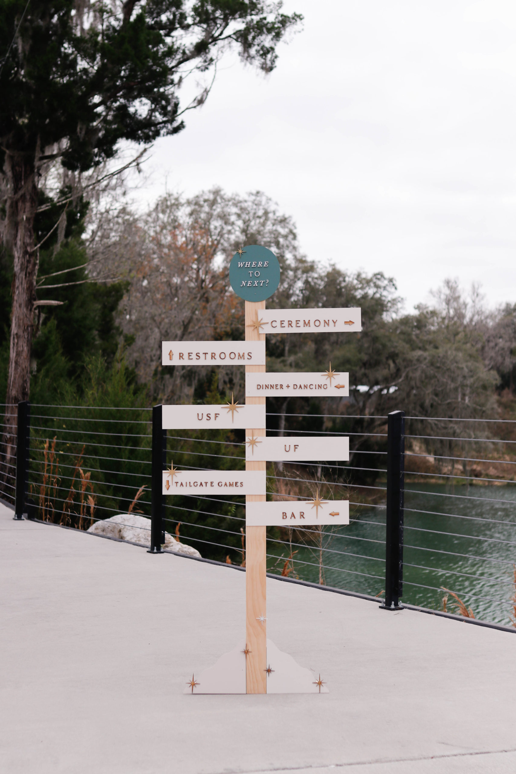
Danielle and Brandon are super fans of the University of Florida and the University of South Florida. It was important to them to include their alma maters in the decor for the day, but we also wanted to keep it classy and on-brand. Our solution was to incorporate the two schools in their directional signage, and also give a subtle nod to USF with the emerald color incorporated in the signage.
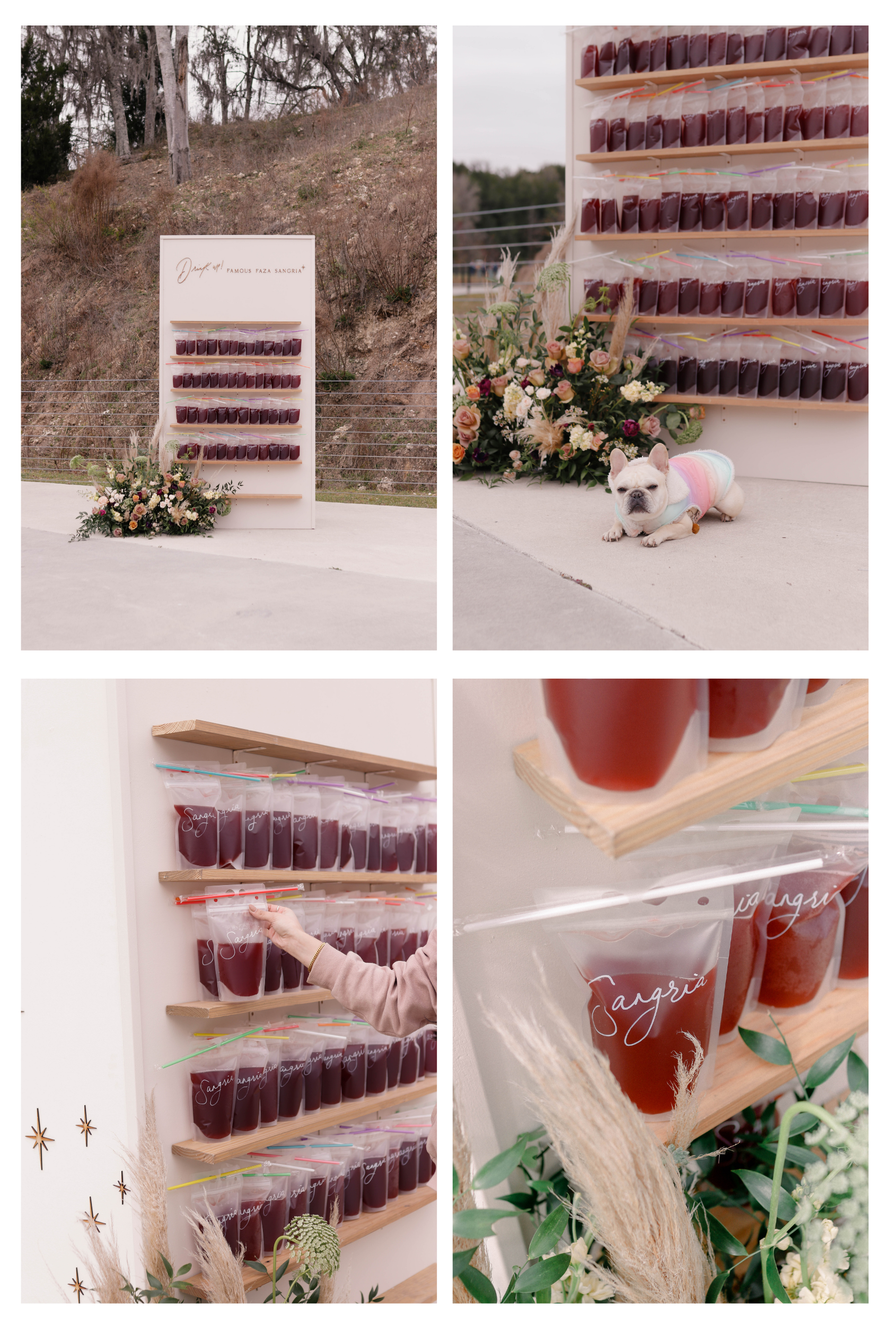
This wedding incorporated a few fun guest experiences around adult beverages. A sangria wall greeted guests (good luck getting past the vicious guard dog, though! 😉
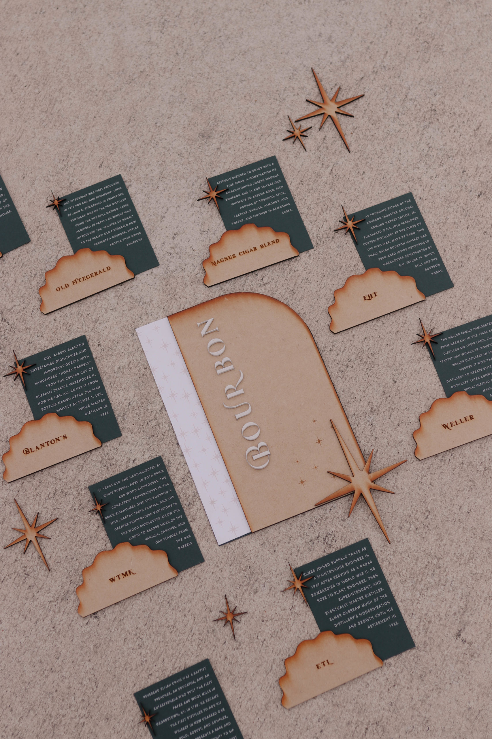
They also had a bourbon tasting station, and we created descriptive signage for each type of bourbon. The wood tones and moody green were a perfect pair to the old-leatherbound-books-in-a-library feeling that bourbon brings to mind.
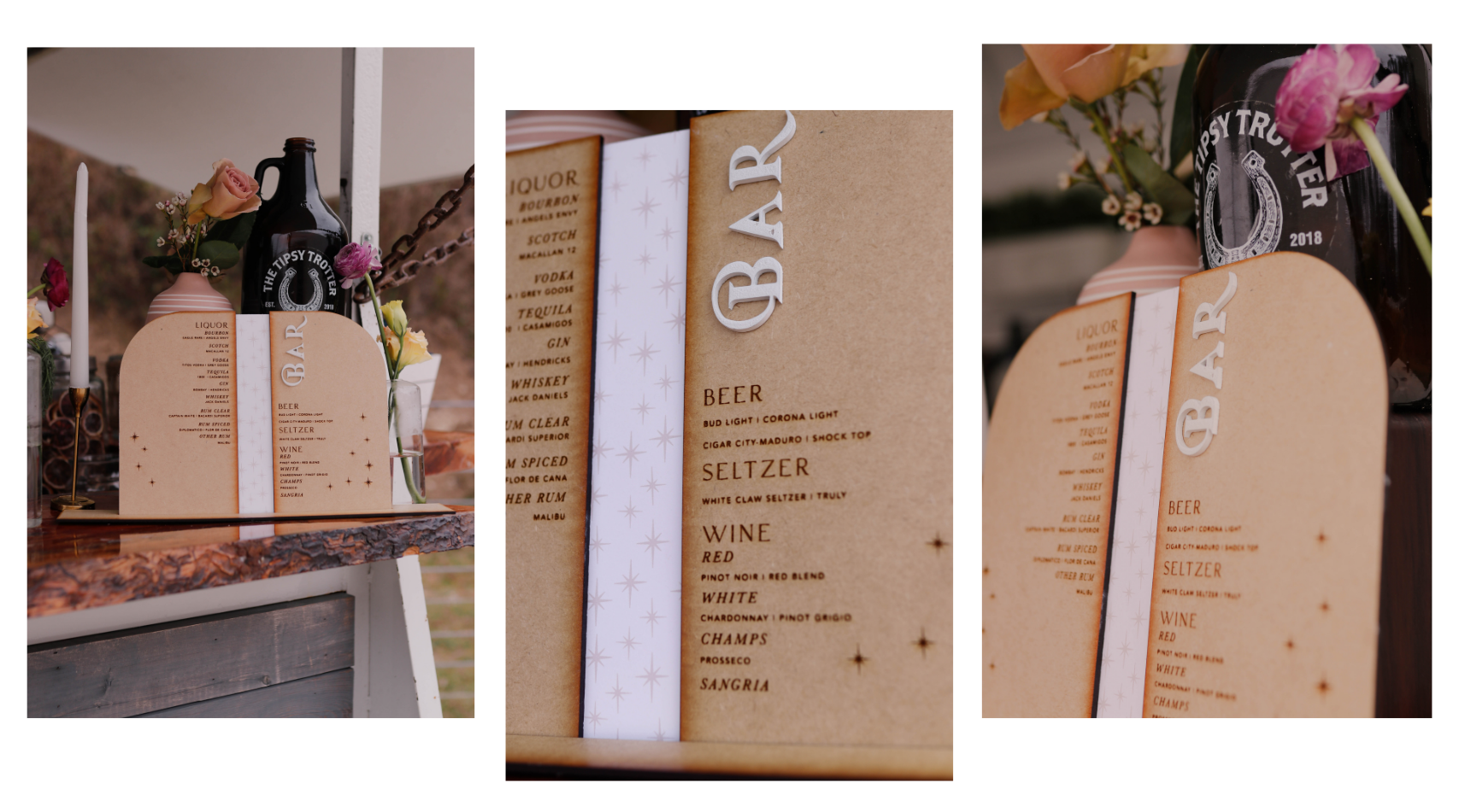
Danielle and Brandon threw an amazing celebration in a gorgeous location. We were so honored to be a part of it! If you’re interested in talking about how AM+Co can help you with signage, invitations, and paper goods for your wedding, fill out our contact form so we can find out more!
