January 28, 2023
Brooke + Matthew: A Classic and Modern Estate Wedding
One essential part of our onboarding process with clients is when they provide us with inspiration for their weddings. We want to see images of other weddings that speak to them and call to their vision for their special day. However, we don’t ask for a Pinterest board of just any randomly sourced images. We ask our clients to share photos of ✨our own✨ past work that they love, from signage to day-of items to custom wedding invitation suites. Since we create from a very defined artistic viewpoint and aesthetic, it’s vital that the couples we work with actually like our work! Therefore, the synergy between our creative studio and the couples we serve is critical to giving them the paper goods and day-of items of their dreams!
Classic, Clean, Modern Custom
The Digney’s felt that their vision aligned with AM+Co’s style, so Brooke and Matthew brought us on board to do their entire wedding, from invitations to day-of items. The wedding was held at the beautiful Adams Estate in Lake Alfred, Florida. The classic and stately mansion on the property was built in the 1940s and overlooks Lake Alfred. It served as an impressive backdrop for the classic, clean, and modern look our creative studio brought to the day.
Custom Wedding Invitation Suites With Eye-Catching Contrast
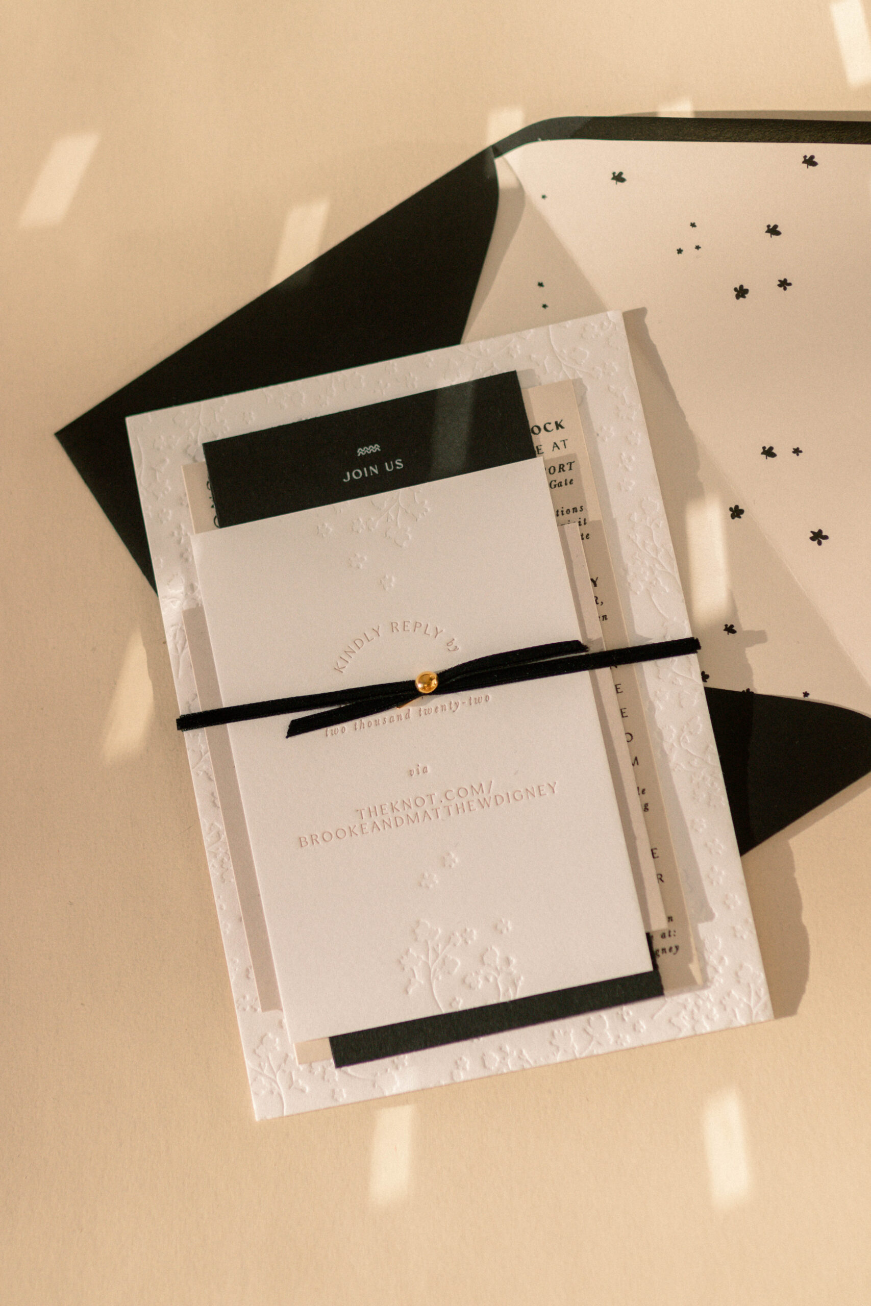
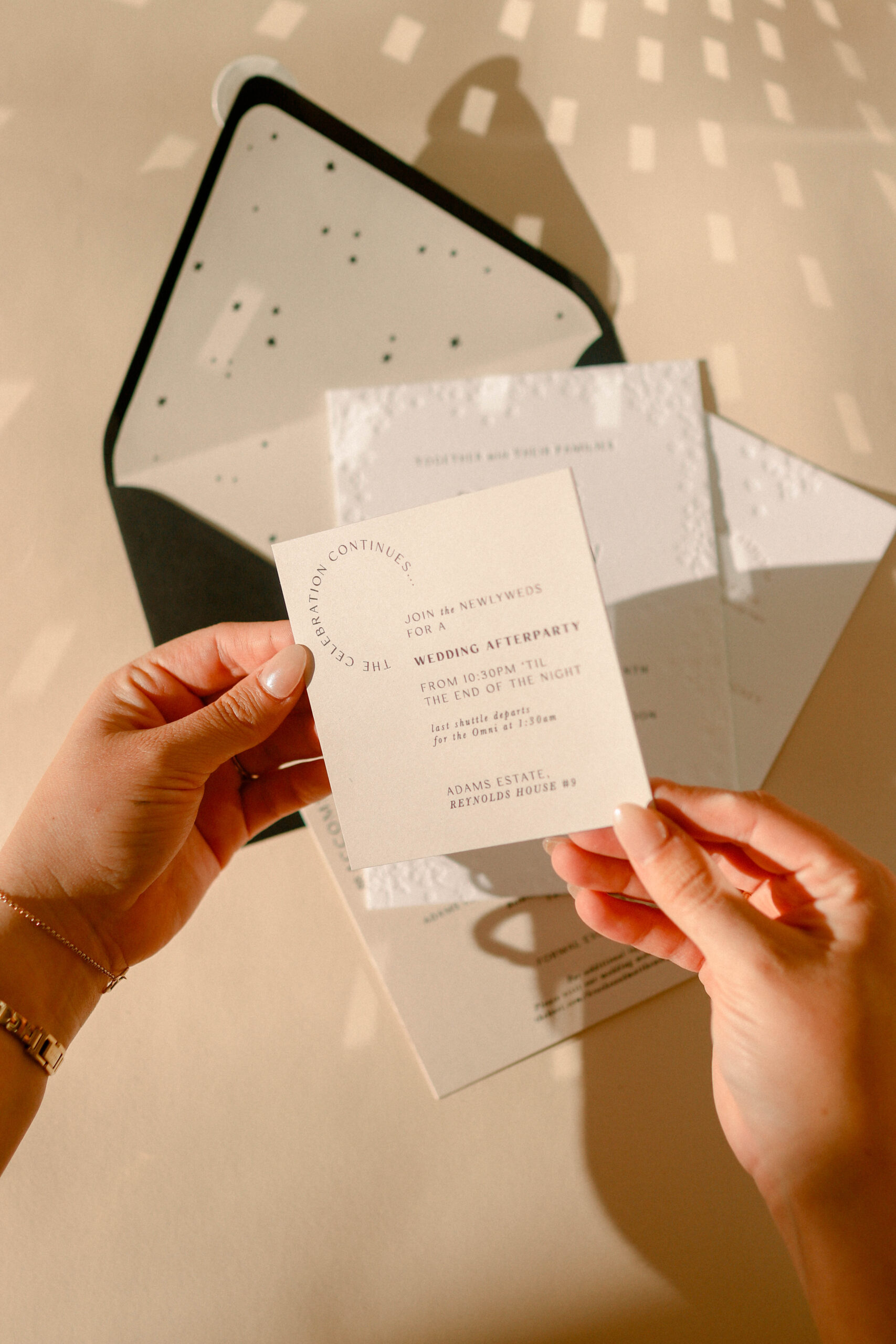
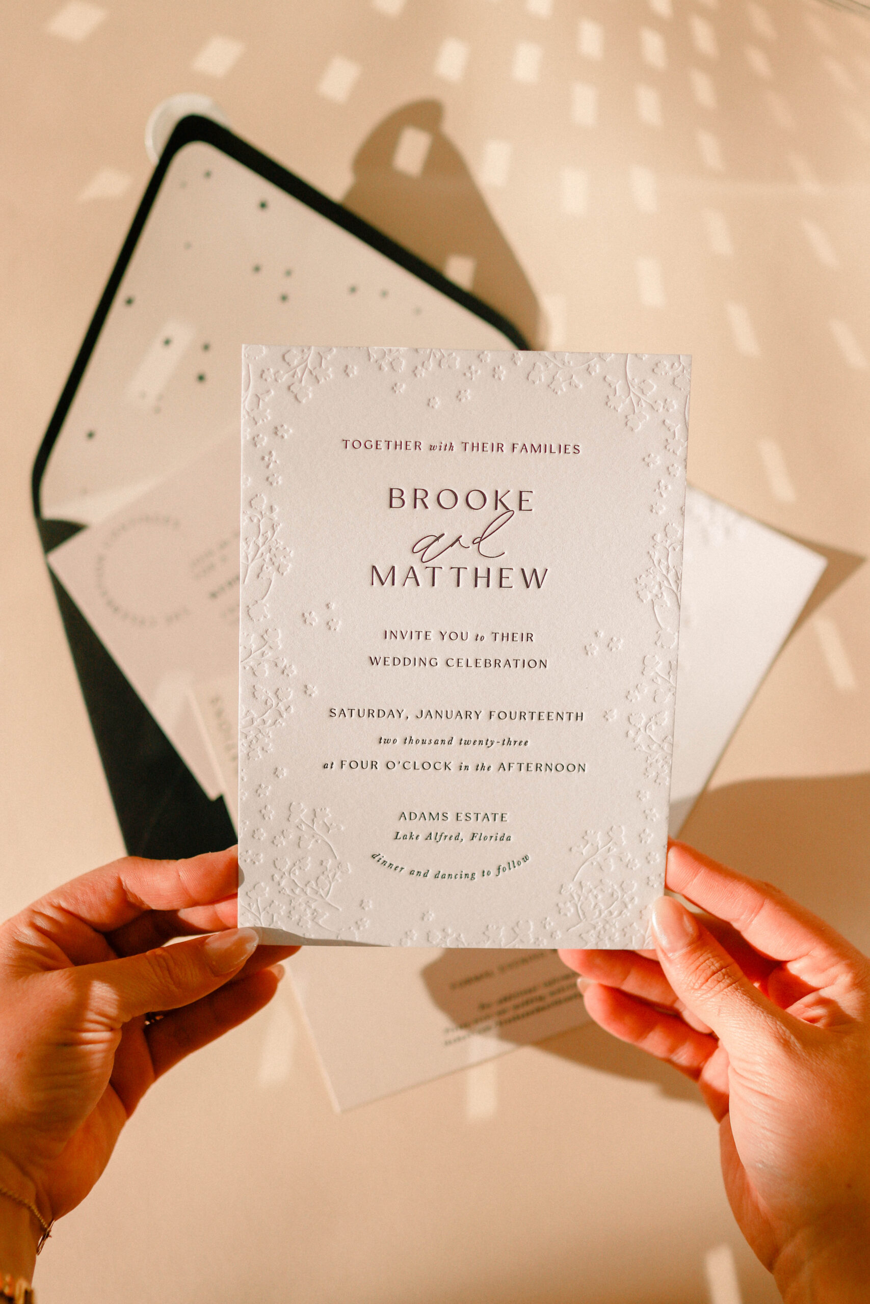
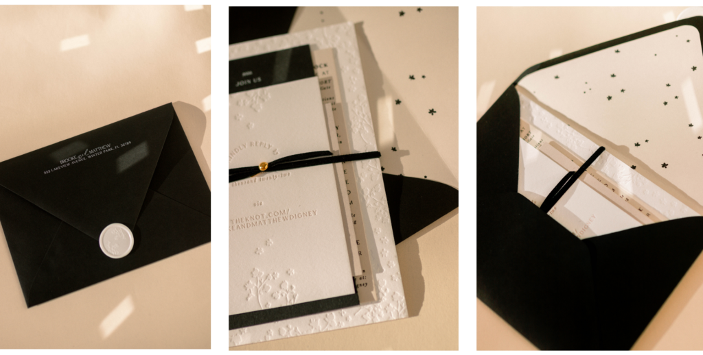
The custom wedding invitation suite included five cards in taupe, black, and white and provided eye-catching contrast when layered in their various shapes. Their main invitation used letterpress with blind deboss. For the rehearsal dinner invitation card, we used white foil. And the afterparty card was a gray square, a shape we had never used for a details card before.
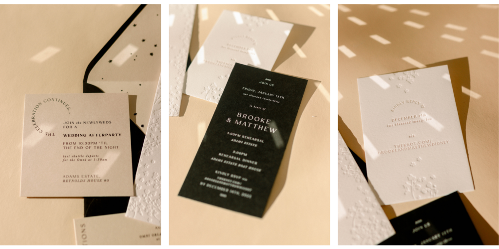
A simple and elegant black velvet band wrapped around the entire suite. We sprinkled their white envelope liners with black stars (you know how I feel about stars!) that complemented their black envelopes. The white wax seal and white printing on the black envelope made for a striking contrast and stunning first impression in their guests’ mailboxes!

The Welcome Sign
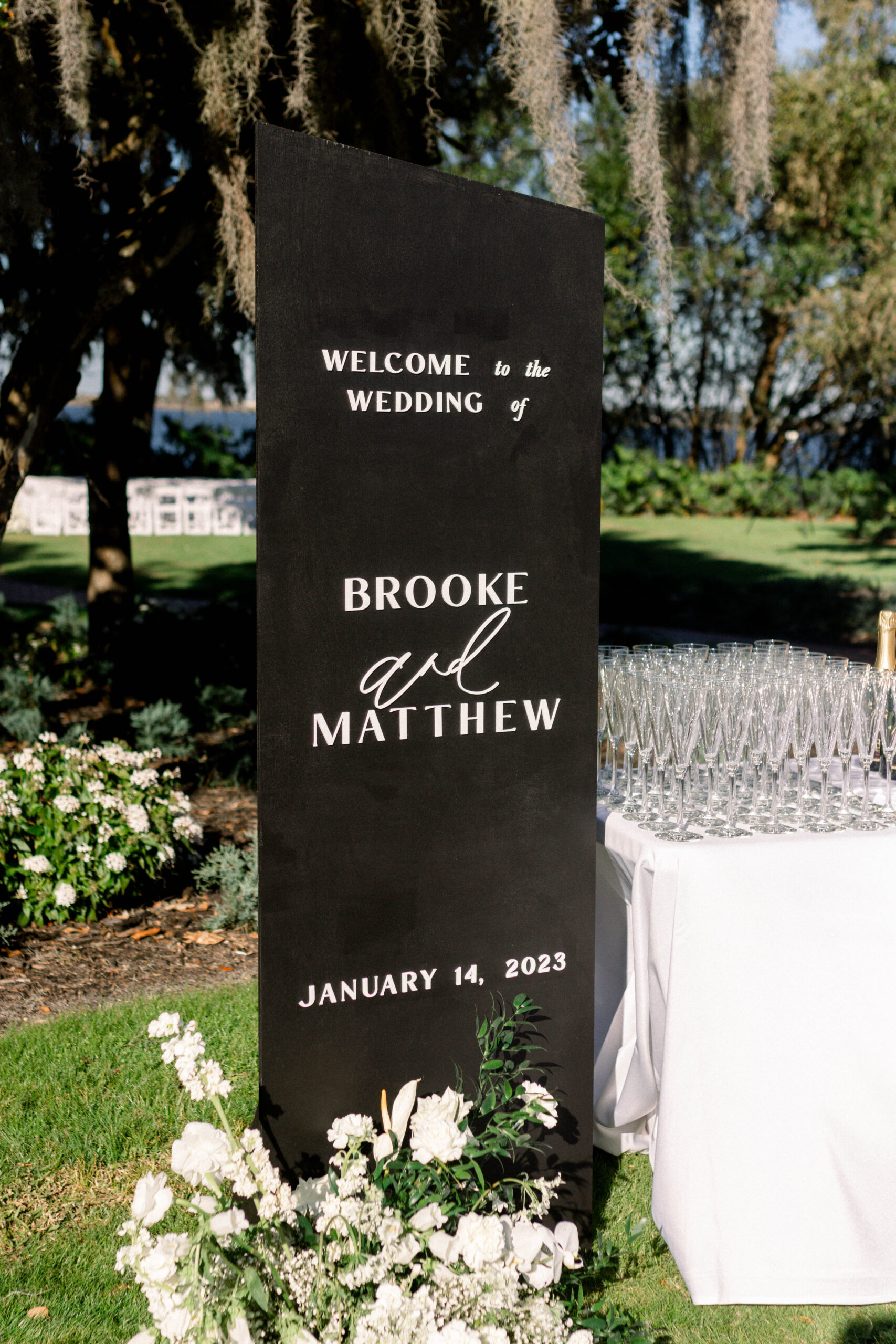
The welcome sign that greeted the guests was black and had a modern angle cut. As guests passed the sign, they could pick up a glass of champagne, which is always a great way to get the party started!
A 360-Structure
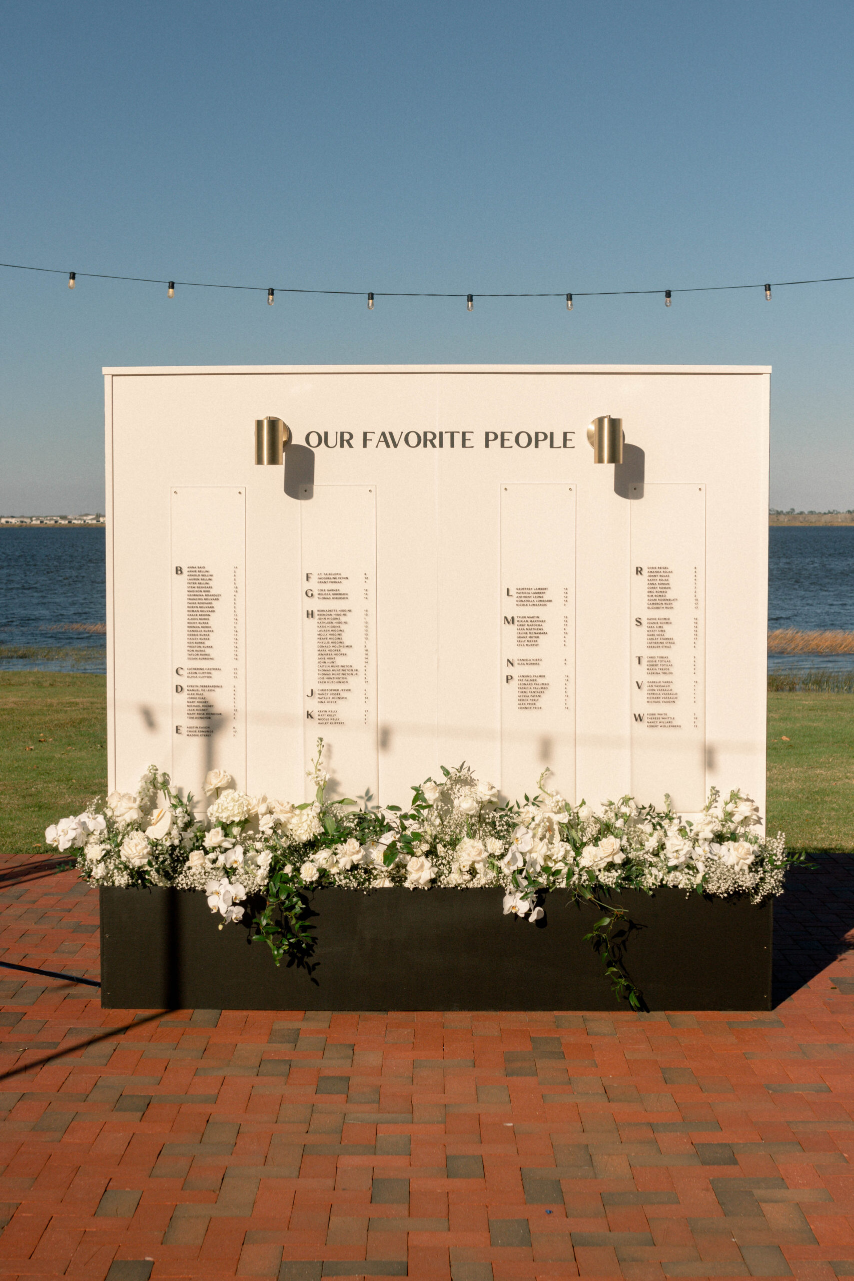
We designed their seating chart as a multi-purpose piece. Since the wedding was outdoors in an expansive space, we created it so that both sides could be used. The front side held their seating chart, with frosted acrylic panels for the guests’ names, accented by modern brass lamps. Gather and Grace Designs filled the 8-foot box underneath the seating chart with wild, romantic monochromatic florals.
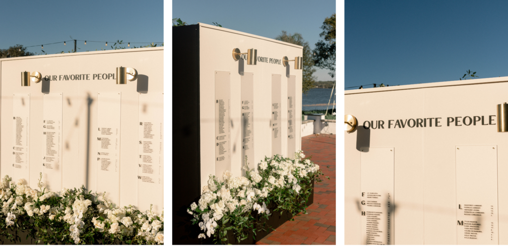
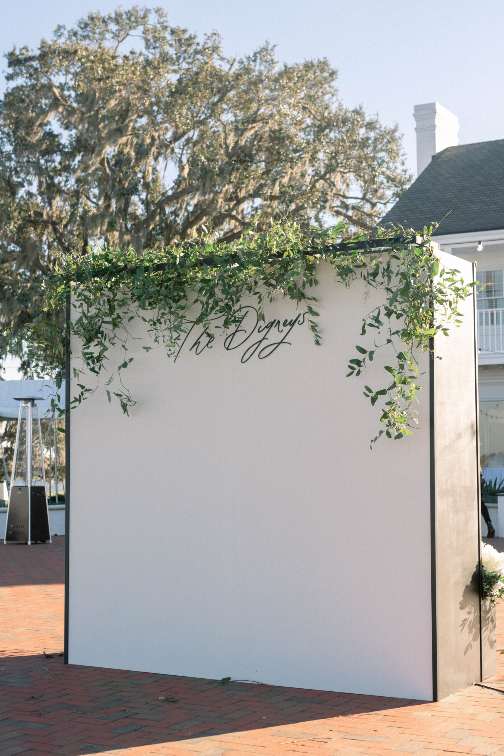
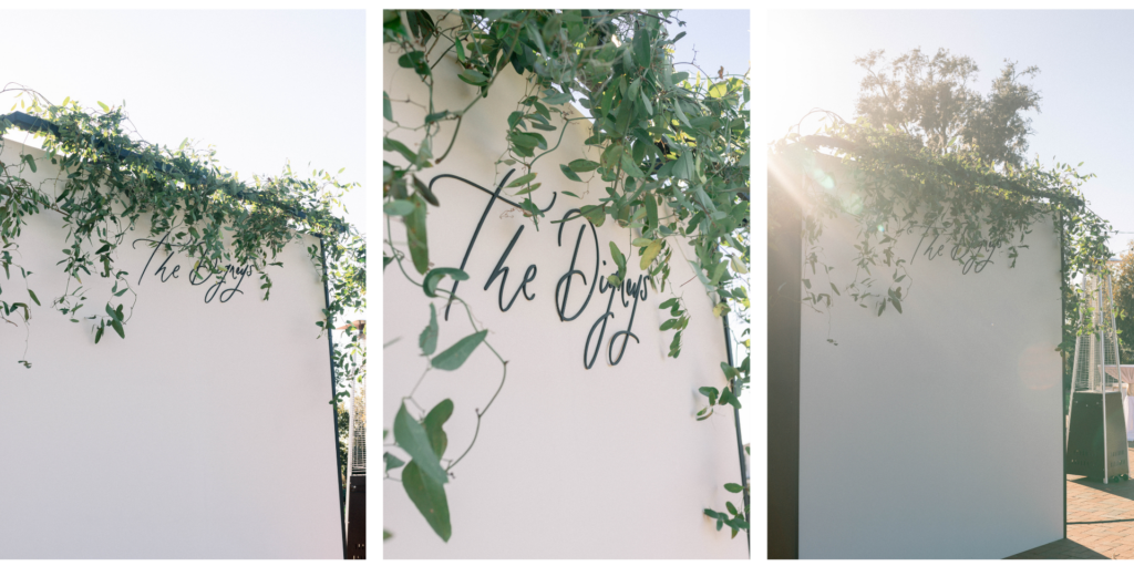
The alternate side of the seating chart was a photo wall that held the couple’s last name, “The Digneys.” Gather and Grace also added untamed greenery to the overhang on the backside. The lake behind the seating chart and the mansion as a backdrop of the photo wall made for a picture-perfect view no matter which side you were on.
For the Tables
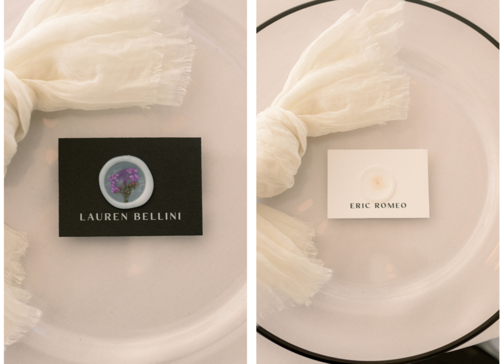
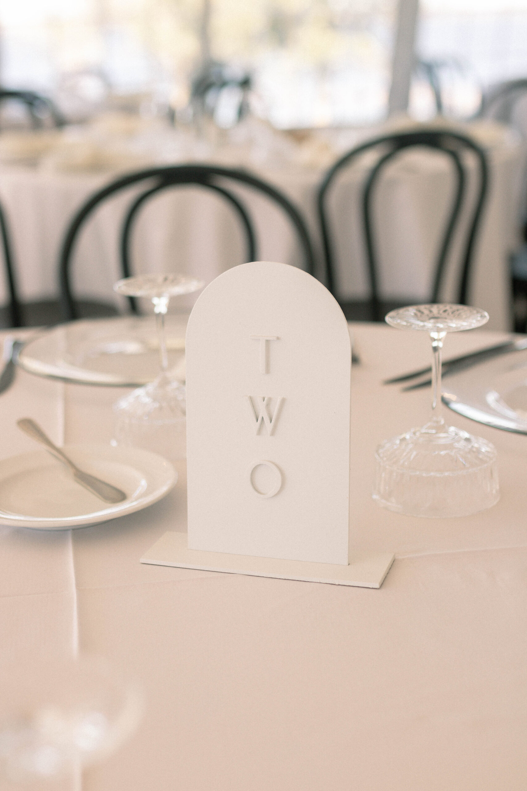
For the tables, we created meal-indicating place cards for each setting, with ghost wax seals and dried flowers inlaid. The color of the place card indicated the meal that the guest ordered, and we used black, taupe, and gray. And we used our white-on-white stone arched table numbers to mark the tables.
A Floating Bar Sign
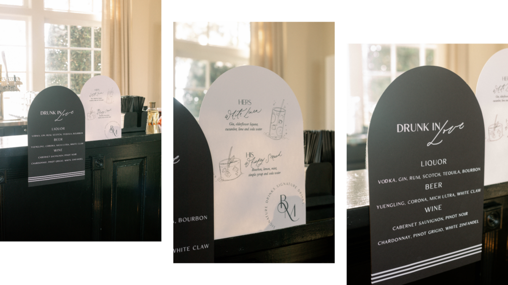
The bar sign was a unique design. In this design, one side of the sign rests on the bar, and the other side appears suspended in mid-air. Pinstripes accented he floating portion, and the part resting on the bar held their monogram.
Leave A Message At the Tone…
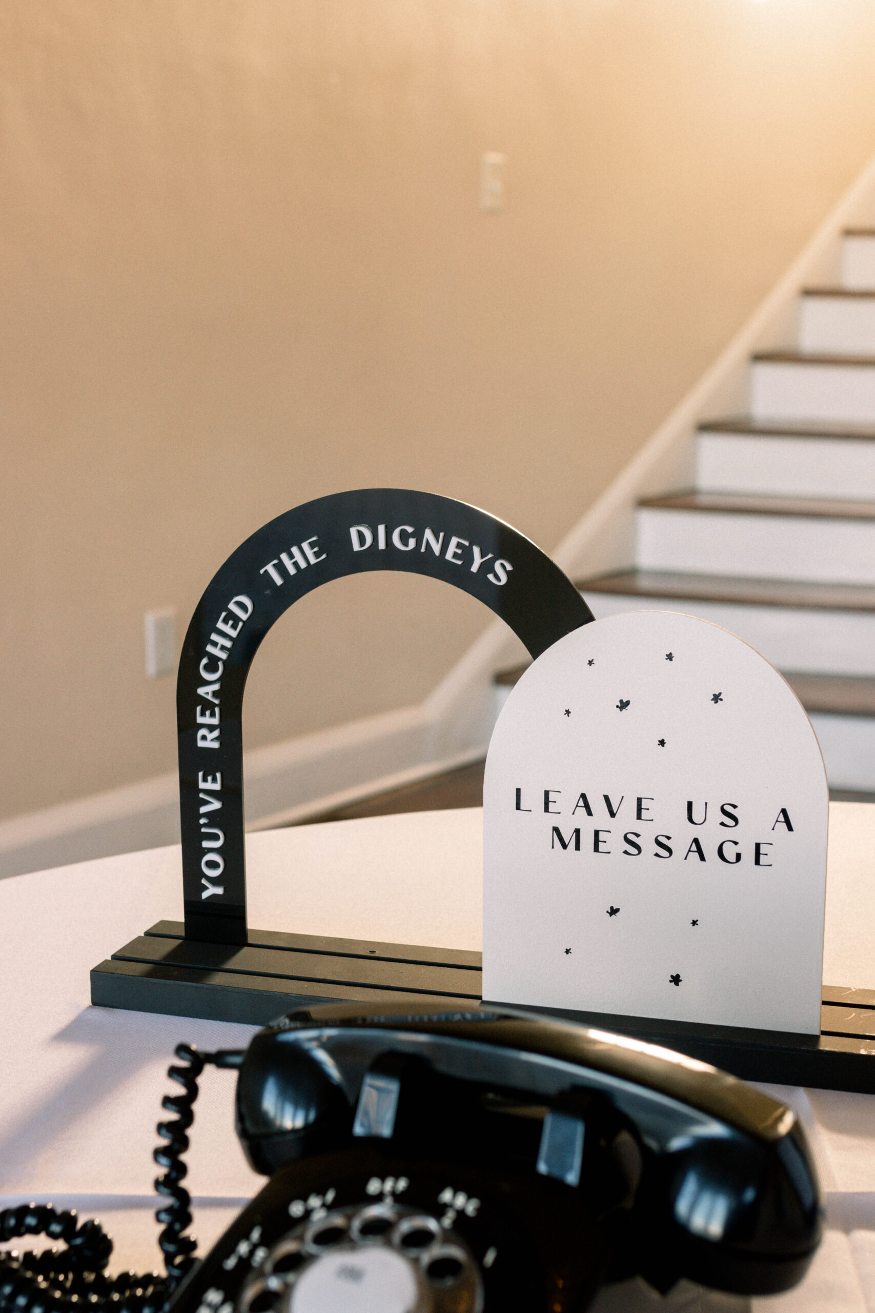
Brooke and Matthew used an audio guest book, where guests at your wedding leave a “voicemail” for the newly married couple on a vintage telephone. Our audio guest book sign perfectly complements these retro rotary phones. We sell these signs in our shop, where you can customize them for your wedding by color and shape. 
When a couple’s vision meets our aesthetic, beautiful things happen! We were so happy to be a part of the Digney’s most special day, and we wish them a happy life together!

P.S. Let’s dream about your wedding together! Reach out today on our contact form and let’s get started!